4 posts were split to a new topic: Outline Moving Logic
Is there a way to disable this while caret is inside Filter box?
  bike.keybindings.addKeybindings({
    keymap: 'block-mode',
    keybindings: {
      left: () => {
        let editor = bike.frontmostOutlineEditor
        editor.collapse(editor.selection.rows)
        return true
      },
      right: () => {
        let editor = bike.frontmostOutlineEditor
        editor.expand(editor.selection.rows)
        return true
      },
    },
  })
  ...
If I add left/right keybinds to expand/collapse to an extension, I cannot move caret inside Filter textbox—left/right controls expand/collapse in the outline. Default controls to operate the outline don’t work while caret is inside filter box, so my thinking is this shouldn’t, either.
Yes, this is a bug, fixed for next release.
2 Likes
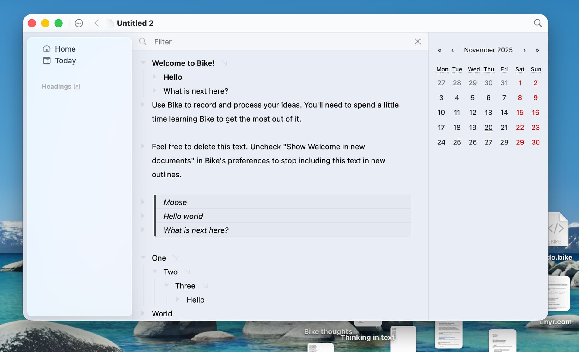
Any ETA on the next preview release for 2.0? ![]()
Hope late this week?
Liquid Glass is driving me crazy. Design in general drives me crazy, and glass adds a bunch of new variables. And parts of it are really great, for my apps it definitely adds to possibly of something better. But at the same time it adds all sorts of problems. And so I keep trying to sort that all out. Over and over!
2 Likes
Heh, makes sense. Take your time — just me being excited! ![]()
It would be interesting to see screenshots and experiments and such on the forum here! (Of your design woes.) So feel free to post those — especially if it could be helpful, of course.
I think I posted these already, but my first big attempt:
I like aspects, such as how nicely theme color shows through.
I was trying hard to implement “standard” glass, but I kept finding things that I could not live with. Such as floating glass toolbar items and gradient blurs into the toolbar… and so I kept modifying those out and got these results.
Not really standard glass, but at least recognizable an I think fit’s with system. I don’t hate it, but I also don’t love it.
So that’s baseline, but I’ve been on a new track last week that I “think” is much more promising, just not sure I can make it all work, so not screenshots yet. It’s not too complex though, I hope by end of week I’ll have something.
3 Likes
That absolutely works, IMO!
When it comes to other ideas, I have two directions:
One is to simply have very little UI. But that comes from someone that loves being in apps like Paper!
The second is to go for something a bit closer to Finder and Ulysses:
(To be clear, I get that this might be something that you’ve tried but not liked!)
Remove the top bar, and have the sidebar go all the way to the top (and include the traffic lights). I’d then put the bread crumbs closer to the way Finder has the name of the folder you’re in.
I also think having the search icon, tabs and Filter bar be hovering and transparent is fine, as Bike has way less buttons and the content is just text. (So I personally wouldn’t mind, and maybe even like it, if the text flows under it, like files and folders do. Does Apple ship an easy way to add a button to make it opaque, though?)
But yeah, that’s also because I’m one of those who currently would like an option to remove the top bar (even though it makes the app look mac-assed). Especially as I always have tabs, I don’t need to see the file name again! (And the Edited bothers me, heh.)
I don’t really use Safari. But when I open it now, I can see how someone could be annoyed by all the information below the top and tab bar. But websites are much more colourful than text! And I assume it’s possible to tone down? Also, Bike’s top wouldn’t be as tall…
So:
- I’d have the main text window at “the bottom” (in terms of depth).
- Title/bread crumbs, tabs and search box above that, in a way that makes them blend together when scrolled all the way to the top.
- With blur/transparency as the text goes under.
- Perhaps with an option to make it opaque.
- I find it very little annoying in something as text heavy as Ulysses! Also, they don’t run it as transparent as Safari.
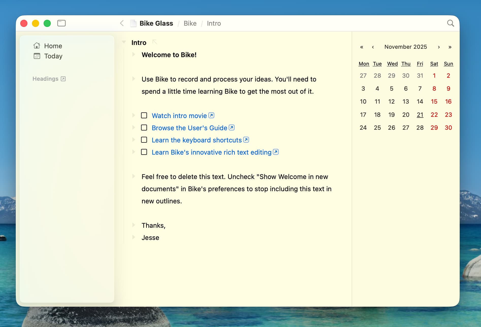
- And then the left toolbar going all the way to the top (including the traffic lights).
- Regarding the right toolbar (which is a calendar in your image), I’d steal Ulysses’ implementation:
- I like that the button sticks out, and that it’s not above as the left sidebar, but instead is separate.
In general, I’d poke around Ulysses if you’re able! I like their implementation — and it’s text based.
This is definitely my fallback if I can’t make anything else work. After all, Bike 1.x takes this approach, so sorta default.
I don’t like Finder, but I agree on Ulysses, for me it is best “pure/standard” glass app that I’ve seen.
In fact after the above screenshots I saw the new Ulysses implementation and I went back to the start to reimplement transparent titlebar. Ulysses had managed to make it look good, Bike could too.
But after trying a second time I came to find that Ulysses design (for me anyway) really depends on Sidebar + List + Content splits. In particular the List means that the text content doesn’t need to be next to be big chunk of glass sidebar. It also allows the text content to be a different color which also helps. Anyway… I tried for multiple days, but couldn’t make it work with Bike’s simpler Sidebar + Content split UI.
Third… Get lucky!
Like I said, I’ve been working on another attempt recently. I generally like, but it still had all the standard glass design issues, just minimized as much as possible. About an hour ago I made a small tweak… and, wow, this is it! Late this week, I’ll make next release. It will be good!
Am I excited? Yes!
(Do I reserve the right to change my mind, yes too, but I do think I finally got it)
3 Likes
Sounds good! ![]() If you like Ulysses, I think you’re on the right track.
If you like Ulysses, I think you’re on the right track. ![]()
Glad to hear you got a win! ![]()
1 Like
Ok, my target for releasing this was today. Missing that. New target Monday (target, not guarantee). Design still looking good from my perspective.
4 Likes
Well now it’s Monday. Not done, design still feels good, just implementing. Fingers crossed for tomorrow.
3 Likes
Well progress continues. Once again, this is why smarter developers never say I can get something done by Friday. Good news is still just implanting, haven’t run into any big problems.
3 Likes
The good news is that I’m an ever optimistic developer! Hope that comes out in the software somehow.
Really thought I would get the next preview release out today. My excuses are:
- Planning a giant batch of tamales and had to go pickup #15 masa and find good lard
- And then Facebook marketplace presented some heavy and not to expensive Christmas presents.
- And then the power went out for a few hours.
Sometime soon though!
6 Likes
Is there a way to use left arrow to collapse a heading when it is selected with Esc? In OmniOutliner, this was a common shortcut I would use. It was easy to just hit escape and left and right to collapse and expand.
This is how it works in the current Bike 1.x release.
In Bike 2.0 I haven’t yet added that shortcut, it’s possible that I will add it in the end, but I’m unsure at this point. In Bike 2.0 you can use the extension system to add this yourself, though at the moment usage of the extension system requires Typescript programming and environment setup.
Unfortunately, I do not know how to do that.
Hi Jesse, this is a key feature IMO. Do you plan to add it to Bike 2.0 soon? If not, could you give me some clue on how to add it via custom extension?
@Nabeel_Siddiqui @vinhqt Good news is this is easier now.
You don’t need custom extension, instead.
- Instead use Bike > Commands Explorer
- Find “Fold: Expand” command
- Double click that commands row
- In the “Block Mode” field type “RightArrow”
You will get a warning, since it’s overriding default behavior for right arrow, but that’s what you want so OK. Then repeat process for “Fold: Collapse” command.
Let me know how that goes!
Edit And I may add this back as a default too. My worry is I wanted it to be easy for people to get out of block mode. But maybe that that big a deal, and I did enjoy using arrow to expand and collapse in 1.0.
1 Like
Not quite there. In Bike 1, we can also jump from a child to its parent using `left arrow` when the parent is expanded. Can we have that in Bike 2 using the workaround above?
Update: never mind, I built a custom extension for that, given your great extension-kit.