Bike Rich Text (Late August)

I’m still messing with ideas related to Bike’s rich text support…

This is taking a long time, I thought rich text would be a month, seems more like it’s going to be a summer. Two factors here… first it’s summer in Maine and it’s been hard to concentrate and get big chunks of work time. The summer party mostly ends Sept 1st when kids go back to school. Second I’ve decided to experiment more with Bike’s rich text implementation.

Rich Text Experiments

Why experiment with rich text implementation?

Standard rich text editing (like TextEdit) is a well known solution. For Bike I think a standard rich text solution is better than the Markdown alternative, I want Bike to have a clean view without mixed in formatting characters. To this point my goal had been to just implement standard rich text editing in Bike.

Of course rich text is a tradeoff. You get a much cleaner view of your text, but it’s harder to view and manipulate the underlying text attributes since they are hidden by default. In particular here are some problems that I’ve been thinking about:

  1. Activating links by clicking with mouse conflicts with normal text selection. Sometimes you want to activate the link, other times you just want to place your cursor in the link text.

  2. Viewing attributes values (such as a links) is problematic. For example to see the link URL you need to hover over the link and wait for a popup. I don’t like hover popups because you need to wait for them when you want to see them, and they will also popup sometimes when you don’t want to see them.

  3. Editing attribute values (such as link) is also problematic, especially when using the mouse. A standard solution in modern editors is a hover popup… that I don’t want. Without the hover popup the only standard solutions are right click to show context menu or use a special keyboard shortcut to show link editing panel, both can be a bit of a pain.

  4. Inserting text at the start or end of an attribute run is frustrating when you don’t want the standard behavior.

    For example imagine you have a bold word and you want to insert a bold letter at the start of that word. Or imagine that you want to insert a non-bold letter at the end. Generally the solution is to insert the character, select the character, and then apply the bold command to toggle bold state. That’s painful enough, but it gets even worse if the formatted text has multiple attributes.

    The standard behavior is also inconsistent. For example inserting text at the start of a bold word will generally insert text that is not bold. On the other hand the text will be bold if that word starts on a new line. Or for another example–inserting text at the end of a link will not extend the link text like it would for bold text. Lots of special rules.

I think I have some solutions to these problems, but need more time to implement these ideas and see if they actually work. I’m also interested in any related thoughts. Do you see the above as problems? Do you consider other aspects of rich text editing problematic? Do you know of any good existing solutions?
1 Like

Perhaps the best ratio of signal to noise (working flow to distraction or surprise) might just come from following patterns that are already familiar ?

I don’t find that I’m distracted by the MS Word pattern:

  1. Icon change + url tooltip on hover over link
  2. Either:
    • just editing link label text by (⌥) left cursor or right cursor movement into it from end or start, or
    • editing label and/or link by hover + ⌘K
1 Like

i.e. I think my first guess might be to separate:

  • the glance-at-url tooltip, from
  • the editing of label and or url

Browsers and MSWord / TextEdit both provide familiar precedent for separating the:

  • look (high speed and frequent)
  • and leap (slower and rarer edit update)

so there should be plenty of cognitive and muscle reflex to draw on in user experience.

Thanks for your feedback.

I will default to standard behavior if I can’t make improvements, but I feel like standard behavior is lacking, and Bike codebase is in unique state to fairly easily try other approaches at this point in time.

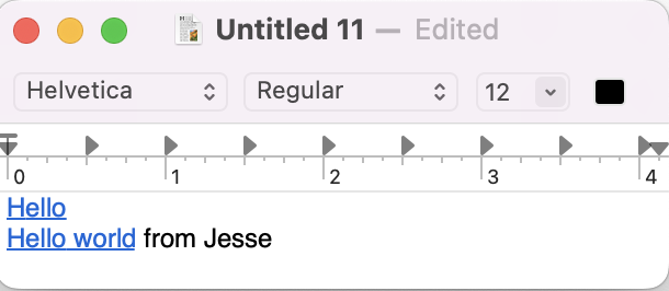
For example say you want to edit the first line here to match the second line:

Screen Shot 2022-08-22 at 2.03.57 PM

I don’t think there’s any easy way to do it. At least nothing as easy as it would be if you were working in Markdown. This is a difficult case, but in general any rich text editing that happens at attribute run endpoints can quickly become painful in rich text.

I “think” a solution for this is to add a text caret affinity (upstream/downstream) at these text attribute run end points. At those positions the text cursor might start in upstream affinity and draw with arrow pointing upstream. Pressing right arrow would transition it to downstream affinity … text caret would stay at same location, but affinity arrow would draw on other side. Pressing right arrow again would move caret forward.

If you type when there is upstream affinity then attributes are taking from upstream run. If you type when downstream affinity then attributes are taken from downstream run.

This interaction would have a cost, in particular when moving through characters with arrow keys it would “stick” for one press at text run boundaries. But the benefit is you always have full control over which attributes are applied to inserted text. Also there would be no need to special case some attribute run behaviors… for example in current editors the way that formatting attributes are applied is different than the way that link attributes are applied.

I haven’t actually implemented this idea yet, but I came to it after thinking through lots of alternatives over the past weeks, and I think it’s a new and useful solution that addresses the source of many rich text editing problems. I’m at least going to try implementing and see how it feels.

This is a useful shortcut, but one that I didn’t know about. I think maybe a more common way (at least how I would have done it) to “Edit Link” is place cursor in link text + ⌘K. Which of course is also a headache since placing cursor in link text is difficult without activating the link if you are using mouse.

In generally I think there can be an easier more discoverable way to gain access to attribute values that are hidden behind text. The idea I’m working on now is to automatically insert a button after attributes that you might want to interact with. Links for example:

Screen Shot 2022-08-22 at 2.45.47 PM

The idea is to automatically insert a button after the attribute run. The button is a separate element outside the outline’s text content. This means there’s no longer a need to disambiguate between clicking on a link and editing link text. Clicking anywhere in “Hello World” will just place the cursor normally. Click the link button to show a popup for opening or editing link. Maybe double-click to activate link immediately… haven’t got that far.

I think this idea is pretty promising so far, but still a ways to go on the implementation.

3 Likes

I keep trying to add/edit links with ⌘K and when it doesn’t work I’m always #sad.

1 Like

In Bike, you mean ?

Yeah. I can add some of the formatting with shortcuts, but not all, and links are the formatting I use the most. It’s so common in other rich text editors that I keep expecting it to work even though I know it doesn’t (in Bike).

The added work being the need to click the rightmost (linked ovals) icon, when you had expected a jump straight to label and url editing, if I’ve understood you properly ?

That is correct.

I am open to suggestions, but first here’s logic for the current behavior:

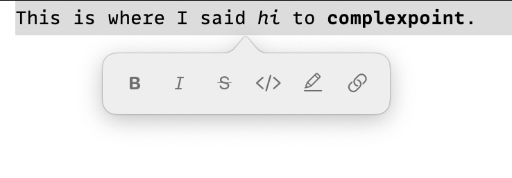
  1. The formatting pallet has single key shortcuts. They are not well advertised in current release but will look like this in next release so they are easier to find/remember:

    formatting

    Too quickly apply a link all you need is ⌘K followed by typing the letter l. So it’s fast and can easily be done with only the keyboard.

  2. The nice thing about the formatting pallet is you can quickly toggle multiple formatting attributes once it’s showing, all with single key shortcuts. It’s slightly slower (one keystroke) then using a dedicated command for each separate attribute, but is faster anytime you need to deal with multiple attributes. It also only requires that you remember the ⌘K shortcut and then you have fast keyboard access to all formatting.

  3. I expect the formatting pallet to become more useful going forward. For example if I add ability to change row types (heading, separator, etc) then I would make those commands accessible through formatting pallet. Same with adding tags to rows or any other associated attributes. Basically formatting pallet will be entrance point to adding metadata to text and rows in Bike.

The reasons that I decided to use ⌘K for the formatting pallet:

  1. It’s one of the easiest shortcuts to type, seems somewhat wasted using it to insert links which I think most people don’t do all that often.

  2. It’s not standardized (at least not in my muscle memory) in quite the same way that say bold and italic are.

  3. If you invoke it expecting to insert a link it at least gets you most of the way there, just type l to finish the insert link gesture.

I think the most obvious alternative is to use ⌘T to show the formatting pallet and then ⌘K can be used for skipping the formatting pallet and editing links directly. I’m not sure that I want to do that for reasons listed above, but am interested to hear what everyone else things.

Edit: ⌘J is another easy to type keyboard shortcut that isn’t really pulling weight, maybe it’s an alternative to ⌘T? Though still personally liking ⌘K at the moment.

2 Likes

Avoiding markdown seems best for Bike, I agree. However I kind of dislike rich text just for the fiddly-ness of it. I would probably prefer that all text styling be set via a stylesheet, essentially. If I can control what the font, font size, color, and styling is on a document level and by row level, that would be enough for me in 90% of cases. Adding the ability to assign custom “styles” to individual rows would take it to 95% of cases. So basically, looking for document-wide CSS down to the level of a row, but not necessarily within a row.

Bike will support rich text, been working on it for a long time, and many other users want it. And it’s pretty easily ignored.

More important though is that I think there are different flavors of “rich text”, and I think Bike is the “good” flavor that’s more flexible and less fiddly.

At one end of the flavor spectrum you have TextEdit rich text mode where you directly format each and every attribute and character. Font, color, etc. This is quite inflexible and very fiddly. There’s not much meaning behind the formatting. It’s just fixing in place what you see.

Bike supports rich text in a pretty different way. In Bike you don’t set fonts and colors directly, instead the intention is you format using semantic values such as “highlight” or “code” and then use a stylesheet (eventually, not in this next release) that maps actual font’s and colors to that formatting. I think this semantic formatting is more useful and less fiddly, you are formatting to add meaning to the outline, not just to change the looks.

2 Likes

Okay, now that I know those palette shortcuts, things feel much better. Are they in the docs already? If they are, I missed them.

No, not really any docs for the rich text preview stuff yet. I think I mentioned them in release notes post and that’s about it. Easy to miss. Will be more discoverable once I add the visual cues as show above.

1 Like

that sounds great.

I’m curious to try this. It’s fiddly, but still less fiddly than Markdown.

I just noticed this approach in Visual Studio Code:

  • Link text is treated primarily as text, and directly editable
  • ⌘ + click to follow

1 Like

I like that approach in many ways, and especially for a programming tool. But I think in a tool where links will maybe be followed often it’s to much to force keyboard shortcuts to open links. Anyway, still good to have a nice reference to other solutions.

1 Like