Bike 1.4 Preview (70) “Rich Text”

Back on track I hope.

BUGS I just noticed there is a bug when interacting with syntax highlighted links such as when you type www.hogbaysoftware.com. Right now to experiment with link buttons please use links that you add from the Formatting menu. Generally lots of code changed in this release, let me know what problems you see.

Summer excitement, kids vacation, and a bunch of rich text editing experiments got the Bike releases off track for a while. Summer’s ending, kids are in school, and I finally have a rich text editing approach that I like. Hope to get these releases moving again!

This release has two big changes for editing rich text:

Link Buttons

To interact with a link click the button after the link text. Click once to preview the link. In the preview popover click “Edit” to remove or edit the link. Click “Open Link” to open the link. You can also open a link quickly by double-clicking on the link button.

Screen Shot 2022-09-09 at 5.10.09 PM

This design solves a few problems:

  1. Link text is normal text. Click, select, edit as you would any other text. There is no conflict between editing the text and activating the link.

  2. Link editing is simpler. There is no right-clicking needed, no special menu item, just click on the link button and perform the edits you want.

Rich text caret affinity

I like rich text because it doesn’t clutter up the view with lots of syntax characters like Markdown. It also doesn’t require that you know any syntax, just use commands to format your text.

What I don’t like about rich text is that it has lots of weird editing cases and conventions. It can feel constrained, like you are not fully in control.

I think the root problem is when you insert between two ranges of formatted text there is no way to specify which range to insert into. This makes for many painful editing scenarios.

To solve this Bike adds a new position between these ranges of rich text. That new positions allows you to control your “caret affinity” to precisely control which attributes will be applied to inserted text. Point the caret to the attributes that you want and then type.

For example:

  • This caret has “upstream” affinity. Any text you type will be inserted as bold. Screen Shot 2022-09-09 at 4.29.26 PM

  • This caret has “downstream” affinity. Any text you insert will be inserted as plain. Screen Shot 2022-09-09 at 4.28.25 PM

  • This caret has “downstream” affinity at end of line. Any text you insert will be plain. Screen Shot 2022-09-09 at 4.49.17 PM

Please try it out and let me know how to improve. I really like it, it makes rich text editing precise like Markdown, but without all the syntax. It is a new concept to learn, but I think worth it.


  • Added link buttons
  • Added rich text caret affinity
  • Added invisibles for selected range
  • Keep links when clearing formatting
  • Updated highlight drawing with underline
  • Fix drawing problems when mixing high and low resolution displays
  • Fix problem where it was possible to read document, but then not save it
  • Fix problem where bike links would not paste into some applications
  • Fix scripting access to expand and collapse lists of rows
  • Fix scripting crash when reading html content of root row

To get preview releases through Bike’s software update select: Bike > Preferences > General > Include “preview” releases.

2 Likes

I wonder if (70) is looking for a font that I lack on macOS 11.6.8, or is that the end-of-link glyph that we are expecting to see ?

Somethings wrong, links should look like this:

Screen Shot 2022-09-09 at 5.10.09 PM

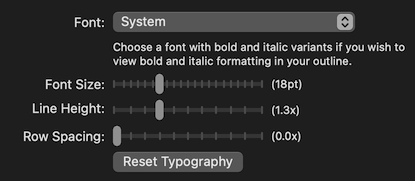
I’m probably doing something wrong with fonts … that’s on my short list to investigate for next release. Do you have system font set as you outline font? From what I can tell that character should be available in SF Symbols on macOS 11.

Screenshot 2022-09-09 at 22.15.55

System font, yes – I’ve experimented with Reset Typography, and switching to a different font and back, but still see the boxed question mark.

The only related thing I notice is that if I apply Format > Code to a word (“Pandoc” in the example below) it also appears flanked by two unfound characters:

1 Like

Perhaps (some ?) users would have to download SF Symbols from:

SF Symbols - Apple Developer ?

Not sure if they are a standard part of later distributions, but macOS 11 apparently doesn’t have them by default.

Having installed SF Symbols 4 here, I can now see:

  • the link box character
  • special parentheses around Code formatted text

Screenshot 2022-09-09 at 22.52.29

1 Like

Hi Jesse, the cursor affinity idea is really elegant – nice work! Haven’t spent a lot of time with it yet, but it seems very promising.

Prompted by the new B/I indicators on the cursor, one thought is that it would be nice if it were possible to disable cursor blinking – it’s much more dramatic when the cursor is more than a lightweight line. I recall reading a post from the Sublime Text devs about how it turned out that the blinking cursor sapped a surprising amount of battery life, so there’s an energy-efficiency argument to be made too :slight_smile:

And a tiny side note, but I wonder if you have considered allowing users to “paste” a link onto existing text, eg. if I have a URL in my clipboard, highlight some text in Bike, then press Cmd+V.

Edit: One more thought – I was one of the folks who previously asked about whether embedding images inside a notebook would be possible. At the time, dragging an image into a Bike document would freeze Bike, as it tried to paste the contents of the image into the document as text. But what if dragging an image into a Bike document would instead create a link to that file, with the link text as the filename?

I think that would help provide the basic facility for my use case, which is to associate images with particular notes – eg. I have a sketch of an idea and want to include it near where I talk about the idea, or I have a visual mockup of a design that I’ve described in an outline, or I have a photo that’s related to a note and I’d like to include a link to it in the text. (The other part would be to ensure that the link keeps working, but I think that’s a bit more complex and can be figured out separately and does not need to happen at the same time.)

3 Likes

Hi,

I want:

[for Rich Text]

  • “Paste and Match Style” (and “Paste without Style”) for Rich Text editing.
  • “Rich Text Mode” and “Plane Text Mode” like Text Edit by Apple.

[General UI]

  • “enter/exit outline editing mode” menu item (with Escape key shortcut hint).
    (Including for future keyboard shortcut customization etc.)

Thanks.

1 Like

I think this less important for Bike’s rich text implementation than it is for an app like TextEdit.

In TextEdit formatting is completely arbitrary/free. Any range of text can have any font/color/etc. When you copy text from another application onto the pasteboard and then paste into TextEdit any copied font will also be pasted into TextEdit.

Bike is quite different. Bike is “semantic” rich text. You format ranges of text with meaning “code”, “highlight”. Not with specific fonts and colors. Bike’s font’s and colors are determined by an internal stylesheet. You can never paste specific font/color formatting from another application into Bike. I think this removes the major use case of Paste and Match Style from Bike.

Paste and Match Style could be useful in Bike to strip all semantic style (for example if you copy some formatted text in Bike and then paste back into the document). Maybe I will add that. But for now my preference is that you use Format > Clear Formatting when you want to remove formatting.

This is somewhat possible now. Save your document using Plain Text file format and once you do that then you’ll be warned anytime you try to apply rich text formatting.

At this point I’m not sure that I want to surface this plain text/rich text distinction more. Right now Bike is really designed as a rich text editor, I see plain text as a secondary use case. I want to support people opening/editing plain text files with Bike, but I don’t think I (at least not yet) want to direct people to use plain text through a visible menu item.

Good idea, just added.

1 Like

I think I can do that. I’ve added to my list.

I have, I even started adding it, just didn’t have time to finish. I’m not sure if I’ll add to next release or not, but I do expect I’ll add eventually.

I think drag and drop an image should no longer crash, and should insert a link right now. The link is a syntax highlighted sort (so link displays in editor), but you can easily (once I fix bug in release 70) click link button to rename as you like so you don’t see full URL.

Generally I think use case of dragging links to images should work in rich text release, but you’ll find bugs in current preview.

1 Like

Just tried it and it works as you say! This is great. Thank you.

Not sure if this is by design, but I’m finding that drag and drop from the file system does create blued text and a follow link button, but there appears to be no associated <a> link with href attribute (i.e. just a link-formatted <p>)

Screenshot 2022-09-11 at 15.44.35

 <li id="yj">
     <p>file:///Users/houthakker/Desktop/bl2.json</p>
 </li>

No, not by design. This is due to link bug. Syntax highlighted links display blue, but you can’t interact with them at the moment.

1 Like

In outline, I see these blue dots between each word and line ending on each selected line. Don’t mind the color green for selected line, but is it possible for it to follow system color?

  • I’m seeing the question marks next to links as well
  • the edit link button for p tags with unformatted links is odd
    • no link displays in the popup when clicking the would-be link icon
    • “open” link on link-formatted p tags points to http://localhost

Not being able to just click and navigate to text links in rows is frustrating. Rolling back to 1.4(69).

Thanks for trying preview and reporting these issues. Both should be fixed in next preview.

Are you talking about following system color for the blue or green?

I’m also not sure if I will continue to show the “invisible” (blue dots for spaces, and paragraph endings) in outline mode. I like showing them for selected text in text mode, outline mode they seem redundant (for paragraph endings) and to much for spaces.

Yes, the color green that marks the selected line in outline. My thought was that this could follow the systems highlight color on the users Mac.

Personally I find the dots and the blue paragraph endings a bit distracting when in outline mode to organise the document.

Yes, I agree re: dots and paragraph endings. Definitely distracting.

Green (for me) is a fine color but following the systems highlight color (at least as an option) would probably be a better fit for many folks.

Thanks for the clear explanation.
I agree to your design.