I’ve used outlining software for decades and have some enormous outlines. I’ve recently found Bike Outliner. I’m thrilled with its efficiency and scalability. Great job, Jesse!
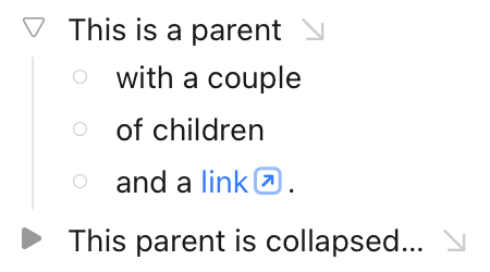
I have one suggestion that I think would significantly improve the user interface. In the current production release, outline rows can have 3 orthogonal states: expanded, collapsed, or no children. These states are currently represented with the following handles: a ghosted downward triangle (expanded), an un-ghosted rightward triangle (collapsed), and a ghosted rightward triangle (no children). Introducing a distinct graphical symbol to represent the no children state would visually clarify these distinctions and avoid the need to ghost anything. Using a solid circle to represent the no children state would work great because rotating a circle doesn’t change its appearance so it conveys the notion that childless rows can’t be expanded. By avoiding ghosting, this change would make state information easier to see. Also, the more consistent visual density along the left edge of the outline would be more aesthetically pleasing.
This can be achieved with the editor styles coming to 2.0! (Which can be tested in preview now.) I totally agree with you — so I did that exact change in my first attempt at an editor style.
Installing them are a bit complicated at the moment, but Jesse has written good guides for how to achieve it. And if you want to try out my style, it’s linked on the link above.
Thanks! That’s pretty close to what I was suggesting. Those three shapes make the expanded/collapsed state completely clear. I prefer solid (filled in) shapes for aesthetics but that’s a minor difference. You’ve demonstrated that the preview release has the flexibility to do what I want. I still recommend a change to the defaults but will happily customize as necessary. -Mark
The reason the circle isn’t filled is that I’ve reserved that for unordered lists.
Lists are of course a bit weird in an outliner, as everything sort of is a list. What Bike does by default is that if you have a list at Level 1 the margins gets set to Level 2, which I always found a bit confusing (as regular “paragraphs” at Level 2 lines up with list items at Level 1).
So in my take I’ve set the margins of list items at Level 1 to “Level 1,5” — in between.
Your comments are interesting. Lists can be weird in outliners because, as you say, every item in an outline really is a list element even if we give them names like body text that suggest that some of them aren’t list elements.
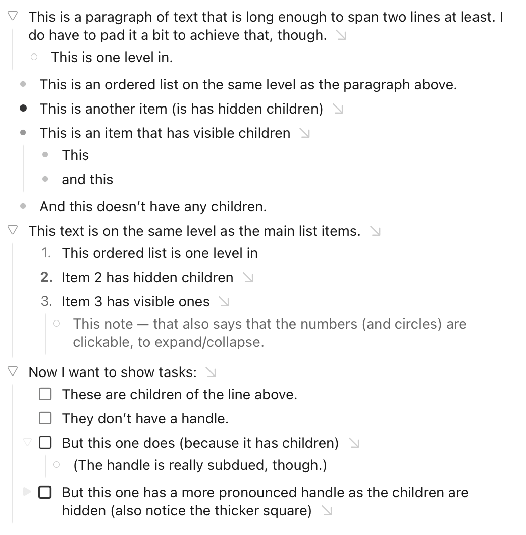
The hierarchical nested list structure of the outline is a fundamental aspect of the information in the outline. Row handles represent this hierarchical organization as well as row collapsed/expanded state. The weirdness begins when we introduce different types of outline elements and give those types names that imply (incorrectly) that some are list items and some aren’t. The structure of the outline requires them all to be list elements, while the different element types allow them to be formatted differently. The formatting of unordered, ordered, and task list items, typically with leading bullets, numbers, and check boxes, often appear to be redundant with row handles, which can lead to considerable confusion.
I avoid this confusion in my outlines by never using unordered list items and rarely using ordered list items and check lists. Because row handles are visually distinct like bullets, the bullet of an unordered list item adds no value for me. Using body text instead of unordered list items works great and, because most of my lists are not enumerated, that takes care of >95% of the potential confusion. It’s occasionally desirable to have automatically numbered ordered list items. In those rare cases, because numbers are visually distinct from row handles, I let them coexist with row handles and don’t find it confusing. I almost never use check list items because I prefer to delete completed tasks or move them to a separate list of completed tasks if keeping a record is important. But if I wanted to use check lists, I’d just let the checkboxes coexist with row handles.
I see that you change the row handles of your unordered, ordered, and task list items to do double duty as both row handles and as element formatting. That’s an interesting approach that preserves the distinction between body text and unordered list elements. It also avoids displaying rows with both row handles and preceding formatting, which can look cleaner, but it complicates the representation of row expanded/collapsed/no children state.
I’m impressed by the level of customization you’ve been able to achieve, but I’m sure you won’t be surprised that I prefer my approach of keeping the representation of the outline structure separate from the formatting. In practice, it’s dead simple and works well. I’m hoping that I won’t need to use customization to clarify the outline structure but, if I do, your examples will be helpful.
My logic when designing this was that I generally want text to be stronger then surrounding UI, so I like and intended the ghosted look… except the collapsed state I want to highlight over the other states, since it represents hidden data, and so it’s not ghosted.
I also like the ghosted look because it visually separates outline control from list decorations such as checkboxes, ordered, and unordered lists. Unordered, as pointed out above, being the not really much wanted and problematic case, but included for consistency in my mind.
I think for now I will leave this system in place as default and will ask you guys to keep making alternative themes that you like better. Eventually I might steal from those ideas