Bike 2 Themes Feedback

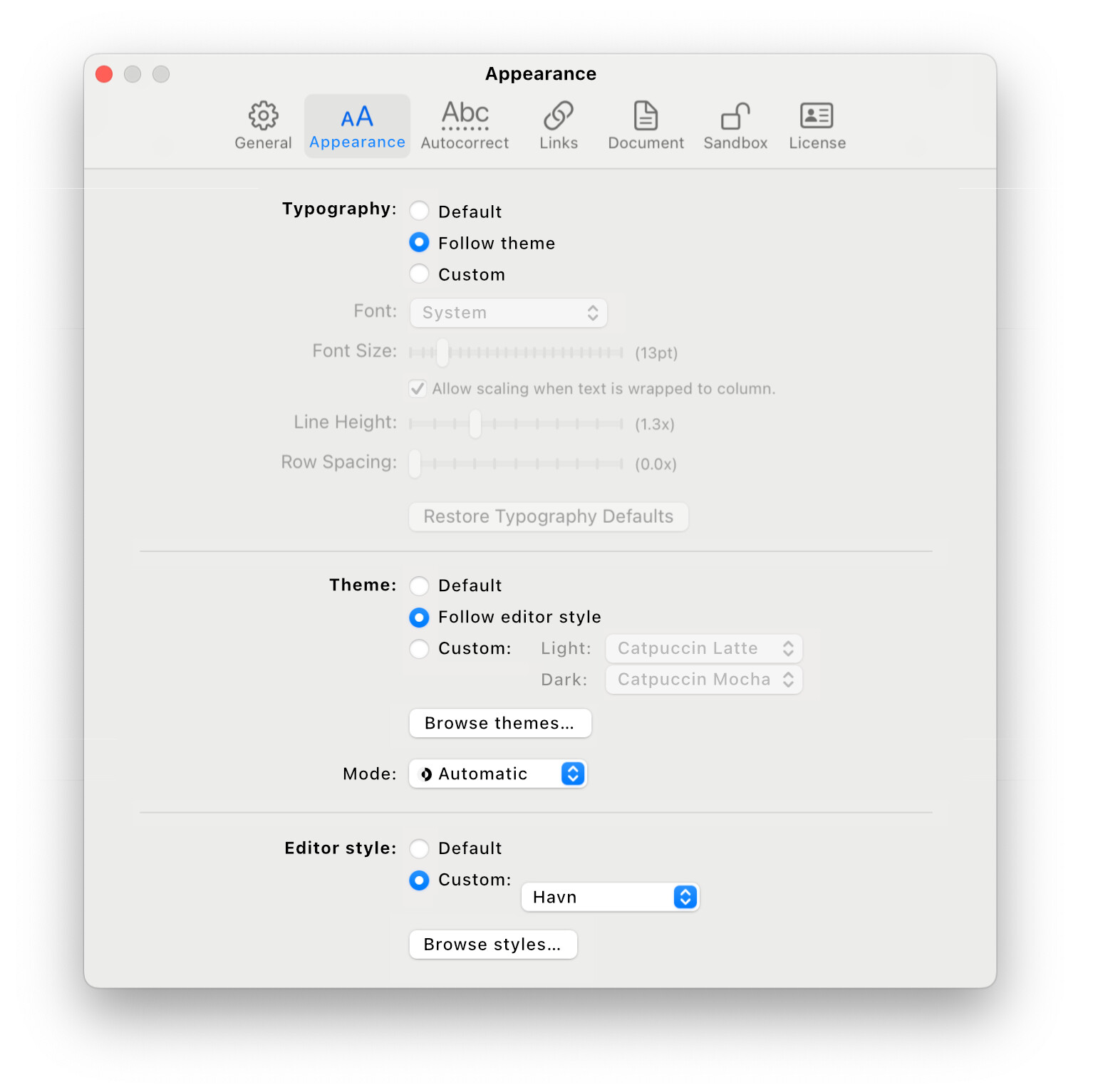
Bike 2’s editor styles allow for a very large amount of customization. They are also difficult to make if you don’t already know javascript/typescript programming.

Bike 2’s settings panes are easy to use, but allow for a minimal amount of customization. Mostly just font and some line spacing.

I’m considering adding “Themes” as a middle ground. For 2.0 themes would be JSON formatted files. They would be “geeky” but not require a build step, or that you setup a development environment. The theme would allow you to set colors and font “adjustments” for various row types.

Here’s an example of what that file might look like:

{
  "metadata": {
    "name": "Example Theme",
    "version": "1.0.0"
  },
  "colors": {
    "foreground": "#2c3e50",
    "foreground-dark": "#ecf0f1",
    "background": "windowBackground",
    "background-dark": "#1e2124"
  },
  "rows": {
    "heading": {
      "fontAdjust": 2,
      "fontWeight": "semibold",
      "fontTraits": ["bold"]
    }
  },
  "runs": {
    "strong": {
      "fontTraits": ["bold"]
    },
    "emphasis": {
      "fontTraits": ["italic"]
    },
    "code": {
      "color": "#e74c3c",
      "fontTraits": ["monospace"]
    },
    "link": {
      "color": "link",
      "color-dark": "systemTeal"
    }
  }
}

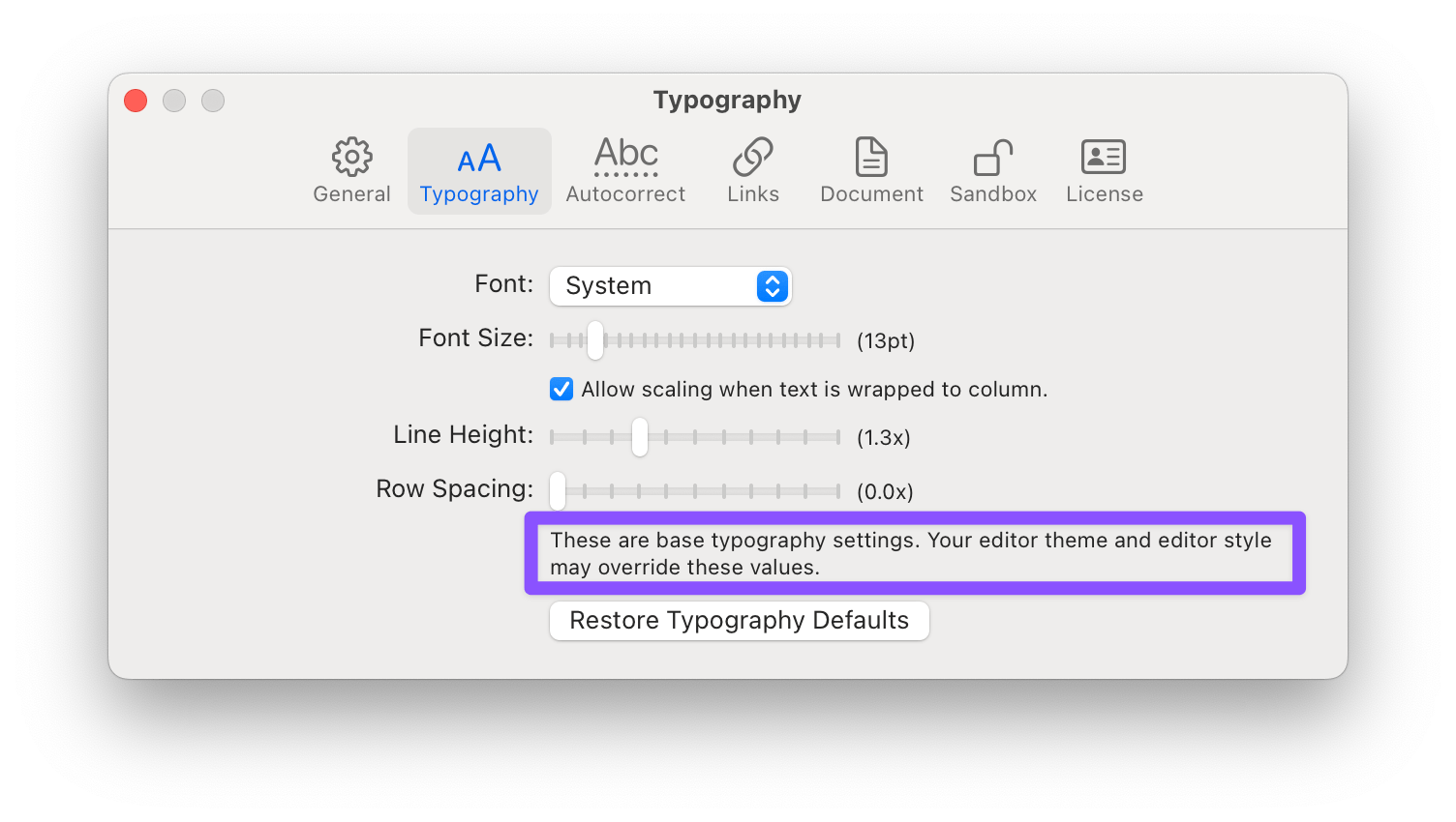
The users (in Setting panel) font is used everywhere by default. But the theme can override various aspects (adjust size, change weight, etc) based on item or run type.

The theme values would then be passed into the editor style functions where the style could use as it sees fit… generally the editor style “should” use everywhere.

Longer term it wouldn’t be too hard to build UI to edit theme files, but I don’t expect that for 2.0. I did spent last week building one using SwiftUI, then I threw it away in anger as it was too darn slow! So I expect just a JSON file UI for now.

Thoughts?

3 Likes

Would love to test this but my mac is unfortunately 4000km away for the next few weeks.

That said, Noteplan, Ulysses, iA writer, Obsidian et al. all require similar approaches to customization, so it’s not uncommon, but most have a nice one-click way to install community-built themes. They also have quality reference manuals to make customization easier for noobs like me. I think this is a nice solution without going overkill on a theming UI.

Sounds like a good plan and is a welcome add alternative to the complex themes. For me I am happy with the current option in Bike 1 to be able to set the foreground and background colours to anything other than the black on white!

I’m definitely not a coder, but based on the example you provided above then I think I’d be just fine. I would certainly take advantage of the opportunity to be able to customize a bit more … so this approach definitely sounds like a good middle ground.

Hmm - interesting! So is the idea to have three layers? :backhand_index_pointing_down:t2:

  • Layer 1 (Settings) that overrides

  • Layer 2 (Themes), that then overrides

  • Layer 3 (Editor styles).

I think that could work. It’s more complex in some ways — as you add an extra layer. However, users would be able to pick their level.

Some quick thoughts:

I think the way overrides work, and where things need to be specified, would need to be thought through…

In the Settings menu, I think I’d like to see a button that says something like Follow theme next to each appearance option. And that this greys out the option — to make it very clear. (The best thing would be if it could get the value from the theme, and set it, whilst still being greyed out.)

In other words, being able to specify some parameters where you “skip” Layer 1 and go straight to Layer 2.

(BTW, if you’re planning on having something similar to the old choice of background and text colour, I’d like to see four squares: Separate pairs for light mode and dark mode.)


However, there’s a similar question when it comes to Themes and Editor Styles.

Let’s take the thing I want to make as an example — which is probably something in-between a theme and an editor style. (Here’s a link to my first try. I haven’t gotten around to rebuilding in, though.)

The way I did it there (as was the style at the time) is that the main file, let’s call it havn_editor_style.file, had both “editor style stuff” and “theme stuff” mixed together. But how should this work in a world were themes are a thing as well?

Potential solution #1** solution could be to force the things covered by themes out of editor styles.** This would be similar to having the CSS be separate from the HTML on a website. Now I would have to move some things out of havn_editor_style.file, and work on them in havn_theme.file It could be a bit annoying, of course, not being able to quickly specify a colour within the editor style file. So perhaps forcing is the wrong choice (and encouraging is a better idea). But it would clean up one part of the confusion between the three different layers…

Best of both worlds here could be if you were able to build something that could extract havn_theme.file out of havn_editor_style.file without me having to faff around with it myself.

There would also need to be a way for users to just install one thing (the editor style) and get both at once.


Potential solution #2 is that I keep the theming in havn_editor_style.file, and then have an option to “set the theme to” Follow editor style. (This option would obviously default to the default for values the editor style might not have specified.) In a similar way as before, we’re here specifying that we want to “skip” Layer 2, and go straight to Layer 3. As I really think there should be an option of skipping layer 1 anyway — this could be the preferred solution. (As you’d re-use the same logic.)

And this would become even nicer if you complete the idea of having a GUI for themes:

  • You’d have two layers of appearance settings in the GUI:

    1. The totally basic stuff, that’s in the settings today,

    2. The option of picking a theme, and a button to go into the larger GUI with all the options governed by themes.

  • Installing a theme will simply set a bunch of parameters in the more advanced settings.

    • These would then be possible to change in the GUI (so you could make small adjustments to a theme) — whilst also having a button to return to the theme default.

    • And here each parameter could have a Follow editor style option, similar to the Follow theme one.

  • You should also be able to set the theme itself to Follow editor style, which would turn on that option for all the parameters.


OK, that’s “all” I have for now… :sweat_smile:

1 Like

Yes, but the overrides are mostly reversed from what you have.

In the end Editor Styles are the layer that performs all actual styling. Settings and Themes are inputs to the editor style functions, the functions can use the values specified in settings and themes as they see fit.

Themes can choose fonts for row types and row runs, but often they will just use the Settings font, or they will specific modified versions (italic for instance) of the settings font.

Hope that makes sense.
2. 3.

The goal of all of this is:

Easy for non technical user to change font and have that change effect complex editor styles that use multiple font faces/sizes/etc in the end. And easiest for medium technical users set color and font combinations that they share as themes. And possible for technical users to build low level themes, that can be customized (through settings and themes) in standard way.


I think the way this will be mainly be handled is by limiting the amount of overlap between the layers.

  • Settings: Only font and some spacing (no colors)
  • Theme: Colors fonts mapped to row types and run types. Most font configuration options modify attributes of the Settings specified font, though there is option to set fully custom font if wanted. Generally the intention is that will be used for heading text (example) while standard row text will use the Settings font.
  • Editor Style: Does whatever it wants, while trying to incorporate theme values.

I guess the most important thing, I don’t want most users to have to think about these layers. I expect most users might want to change font size, and they do that through settings. If someone is adventurous and wants different colors, a theme, then they can dig into docs and start to understand full system.

As above … I think I mostly want to avoid this by not providing many options in settings. (I’m ignoring the fact that at some point I “may” make a theme editing UI).

Still I think the core problem you mention is still there. In particular often the base font is an important part of a theme. It makes sense that the theme has some way to communicate to the user that “I was designed to work with this font”. Same thing for the relation between Editor Style and Theme… If someone goes to the trouble of building an Editor Style, it seems they might often design it to work best with a specific theme.

I don’t know answer, but my thought is:

  1. Editor Styles can also include a preferred theme. When user chooses to use that editor style, then their chosen theme is changed to match the editor styles preferred theme.

  2. Same with Settings font. When theme is changed, Settings font is updated to match theme’s preferred font. The user is free to use that, or they can go to settings to change to their own preferred font. Could also add some checkbox UI in Settings > Typography panel that controls this behavior.


I think the Editor Style will optionally provide a preferred theme as a json file. That means those colors will be in a different place, but I think live updates (as you modify the theme file) should still work.

The mechanics of how the Editor Style read the theme values would be something like.

row(`.codeblock`, (context, _) => {
  row.text.font = context.theme.codeblock.font
  row.text.color = context.theme.codeblock.color
})

Am I making sense?

1 Like

Thanks for a great response!

Am I making sense?

Yeah, I think so! But I don’t agree with all of it… :smiling_face:

I think the way this will be mainly be handled is by limiting the amount of overlap between the layers.

  • Settings: Only font and some spacing (no colors)
  • Theme: Colors fonts mapped to row types and run types. Most font configuration options modify attributes of the Settings specified font, though there is option to set fully custom font if wanted. Generally the intention is that will be used for heading text (example) while standard row text will use the Settings font.
  • Editor Style: Does whatever it wants, while trying to incorporate theme values.

I think this is a good approach! :backhand_index_pointing_up:t2: :ok_hand:t2:

But I don’t agree on the prioritisation. I created a mock-up to better show what I’m envisioning (and also based on your post and some more thinking myself):

  • I’ve named the menu Appearance, and divided it into three.

    • I saw that Pages uses bold in its options, so I tried to use bold to signify a sort of header (Typography/Theme/Editor style) — but that’s not an important part of the idea, hehe.
  • In the example, you can see that I have selected a custom editor style, and then chosen to let the theme follow it, and the typography follow the theme.

    • When shipping, you can just put everything on default.
  • I like that everything is in the same place.

    • The Editor style portion could be moved to the menu bar if you want to — but I think it’s simpler to keep them at the same place as each other.
  • I also like that the more advanced parts (Theme and Editor style) are really simple menus.

    • I agree that we shouldn’t think about whether or not you’ll create a theme menu down the line.
  • And the most important part compared to the image below (and the impression I got about the way you want to solve prioritisation): There are no ambiguities and menu items that doesn’t work.

I get the notion of wanting to not overburden, and confuse, the user with options. But it’s also possible to create a false sense of simplicity, which leads to more confusion. I don’t like what’s in the purple box above. :backhand_index_pointing_up:t2:

NotePlan has this exact problem: Setting the font, as in the screenshot above, quietly doesn’t do anything (because my theme overrides it). And in this context, I really think having menu items that don’t work is more confusing than having settings menu I mocked up above.

Some more thoughts on themes specifically:

I really think you need to design with light and dark mode in mind from the beginning. (Currently the Light/Dark/Automatic is in general settings. That could work, but I moved it in my mockup.) And to keep things simple and clear, I think themes should not have the possibility to swap colours. Instead, if I want to make a theme for both modes I have to ship two files.

Out of the box, the list of themes, where I’ve selected Catpuccin in my mockup, should be populated with a couple of options. And when users download new ones, they get added to the list.

And here’s something I think is a good idea:

Let’s say I install the Havn editor style. Then Bike does the following:

  • Check if the style include theme files:

    • If it does, add them to the list.

    • If it doesn’t extract theme(s) from the style:

      • Check if the theme parameters in the style includes a difference when it comes to light mode and dark mode.

        • If it does, extract Havn_style (Light) and Havn_style (Dark) (or some other naming convention) and add them to the list.

        • If it doesn’t, just extract Havn_Style, and add that to the list.

This would make it so selecting Havn as the theme would do the same as selecting “Follow editor style”. But that’s OK, IMO. And I like that you could keep the theme of a style you’ve downloaded without keeping the style.

I guess one way of making the extraction easier, that combines with the code block you posted above, is to have a separate place in the style file where you define theme variables. :thinking:

1 Like

I’ve been going on for the past hour trying to coalesce my thoughts on this subject into something coherent, but I keep deleting drafts :joy:

On one hand, I get that an out-of-the box Bike installation offers minimal settings because why fiddle with it when actually writing stuff is what counts in the end. But then I keep getting back to this idea:

And I can’t help thinking that this may be a regression from Bike 1.x which did/does offer some color customization without going into theme JSON/editor style builds.

So if I’ve managed to come up with anything coherent, this is what I’d like to see the basic settings be:

  • font
  • Font size
  • Row spacing
  • Dark/light/system mode
  • Basic colors for light/dark modes: background, text, accent (block selection colour, possibly caret, OR this can follow macOS accent colour).

I think this might make it feel more like a 2.0 version compared to 1.0.

Everything else can go into themes/editor styles.

Basic colors for light/dark modes: background, text, accent (block selection colour, possibly caret, OR this can follow macOS accent colour).

I absolutely see the appeal of this — but it would make the settings page more complicated as well. Even if you just take 3 values, background, foreground and accent, you’d need 6 colour boxes in the settings (light and dark mode), and a way to specify how these values interact with a theme that might (or might not) is set.

I think this might make it feel more like a 2.0 version compared to 1.0.

I’d say the inclusion of themes and styles is a pretty good bump from 1.0 to 2.0. But to make things accessible, there should be a bunch of themes available out-of-the-box. And hopefully we’ll make a couple here at the forums as well! I assume the goal isn’t that most people will create their own theme — but that users can easily try out different ones. (If he creates the GUI for themes later, it would be more accessible of course.)

(@jessegrosjean, I’d be willing to volunteer and help you with ports of some popular themes for the “starting pack”. :slight_smile:)

1 Like

Thanks for all the good feedback in this thread. I’ve been distracted by text input bugs last few days, but think I finally have that fixed up now. Hope to get back to thinking about and working on themes today.

Can someone help with theme editing? I’m lost.

My current .bktheme file looks like this:

{
  "metadata": {
    "name": "Burgundy Headings",
    "version": "1.0",
  },
  "colors": {
    "foreground": "#2c3e50",
    "foreground-dark": "#ecf0f1",
    "background": "#f8f8f8",
    "background-dark": "#1e2124"
  },
  "rows": {
    "heading": {
      "color": "#800020",
      "fontWeight": "bold"
    }
  },
  "runs": {
    "link": {
      "color": "#800020",
      "color-dark": "#c06080"
    }
  }
}

What I want to do is change the color of the headings and links to #800020 but only the background color is applied from the json file.

Any help is greatly appreciated.

That first post was what they “might” look like (and I still think they will have that feature set eventually) but as of now they only support three colors:

{
  "$schema": "./theme-schema.json",
  "metadata": {
    "name": "Example Theme",
    "version": "1.0.0",
    "author": "Mr Example",
  },
  "colors": {
    "text": "#000000",
    "accent": "accent",
    "background": "#FFFFFF"
  }
}

In Bike 2 Preview (247) can we yet create a persistent (custom) .bktheme file ?

( I think by default the themes folder is refreshed on restart ? I’ve tried adding a file to the extension kit and rebuilding – but I think I may be putting the custom theme file in the wrong place)

Yes, that should be working.

Two ways to do this:

Go to Settings > Themes > Open Themes Folder, and then place your theme (<themename>.bktheme) at the top level of that folder. The themes setting panel popup options should update immediately, allowing you to choose your theme.

Second way is to include the theme file along with a Bike extension. To do that you need to put the theme file in the path <extensionname>.bkext/theme/<themename>.bktheme

Themes are still pretty weak in terms of features (will change eventually), but I think the basic install and change functionalities should be working. Let me know if you run into issues.

1 Like