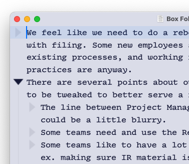
…are much heavier than previously! Is this intentional?
Not intentional, they should look the same I think.
In earlier versions of Bike there was an unsupported way to customize the handle and that broke maybe in 1.4 update. Did you have a custom handle setup? Anyway please include a screenshot of what you are seeing, that will let me know if it’s intentional or not.
Well I don’t know what “custom handle setup” means, although in the context of an app named Bike, it does sound interesting… Please see attached image. I did try clicking “Reset Typography” but that didnt change anything about the triangles. 
That’s a bug, not intended to look like that. Do you have multiple displays with different resolutions?
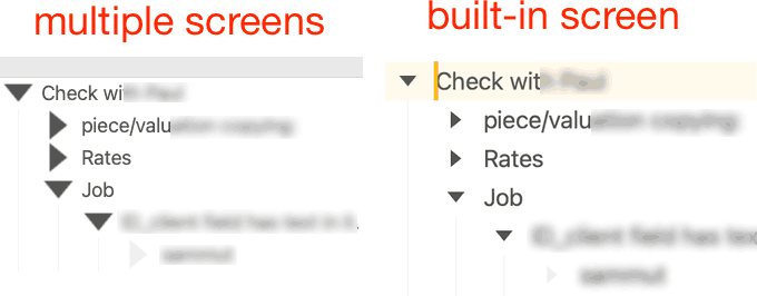
Same spotted here. can confirm it’s with multiple displays at different resolutions. Left snippet is multi-display. right snippet is built in macbookpro screen.

that’s a fun bug. Also affects redrawing while editing text, sample screen recording shows artifacts appearing during backspace operation.
You can grab a copy of the 1mb screen recording temporarily from:
r
I’ve the same problem (three displays, built in retina, two external displays with non retina resolution)
Sorry for the delay in reply — yes, I do.
In case this discussion would benefit from any more data, I have the same problem with expanding triangles on a 2nd display connected to a Retina iMac. Text stays identical in size but triangles double on the external display. (Bike 1.4 Preview [69])
I think this is fixed in: Bike 1.4 Preview (70) “Rich Text”