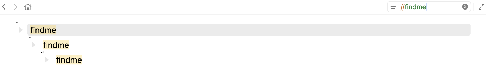
I like the new UI in Bike 2.0, but I think this new row shrinking behavior when I filter is annoying. When I search, the parents collapse down and I lose sight of the full tree structure. I need to see all the rows that matched with their parents, not a compressed version.
It feels like eye-candy that actually makes things worse to use. Is there a way to turn this off?
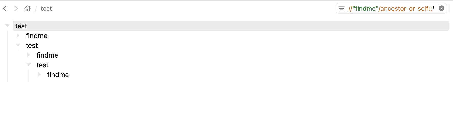
Esentially I just want to have the same view when I filter in Bike as TaskPaper does. No collapsing, no row shrinking, just show me the full outline filtered to rows and their parents.
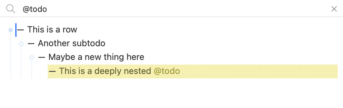
In the case containing the string “@todo” in a row, we just needed the quote to avoid looking for rows with a @todo attribute – something in the .bike file like:
data-todo="1"
data-todo="3", or just
data-todo=""
Which you can set with a bit of extension UI, and filter for – more broadly or more specifically:
e.g.
All rows with a todo attribute,
//@todo
or perhaps rows with a particular level of todo urgency:
//@todo < 3
And perhaps a stylesheet could pair todo levels with text colors,
e.g.
In truth I’ve also not been too excited about the filter UI. But I also wasn’t too excited about TaskPaper’s filter UI either. And in the end I don’t use filtering all that much to start with.
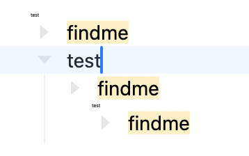
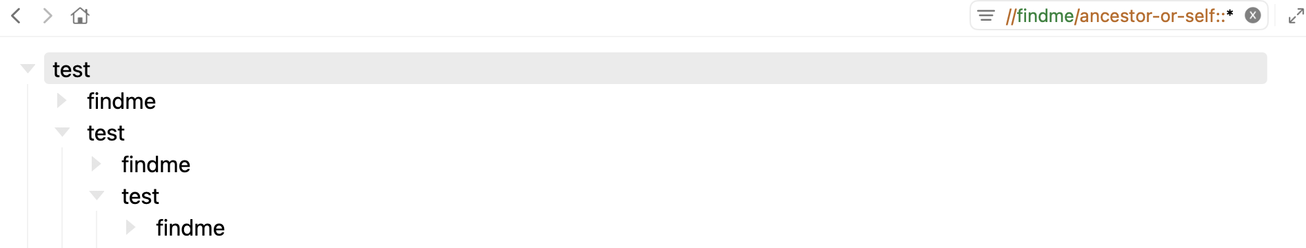
I think in the end the idea to continue showing unmatched siblings is the core problem. For me it works really well in some outlines, but it doesn’t scale to really large outlines. So I think what I’ll do is just filter them out TaskPaper style… but unlike TaskPaper I am trying to replace those filtered regions with a marker. So it’s obvious where the filtered regions are, but they only take up a fixed amount of visual space.
We’ll see. That’s the direction that I’m working at moment.
This thought has wormed its way into my brain and caused much headache! And a bunch of failed implementations. But I think finally got on correct track this morning.
It’s really improving things, even beyond filtering I think. So I take back all my silent curses and say thanks @zeitenhund
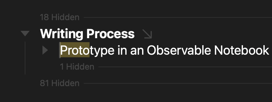
If I click on the “1 Hidden”, the label fades away but the hidden row does not appear. My guess is this is because the selected row is contracted. I was expecting it to show up, but maybe the answer is that the “1 Hidden” label shouldn’t be there since the row is contracted.
If I click the “81 Hidden”, they do appear. I was wondering if there’s a way to hide them again. Not sure it’d be useful, but it might be.
A very minor comment: wile cycling between windows I keep noticing the lack of symmetry between Cmd+`,, which cycles forwards, and Cmd+Shift+`, which enables code mode (but in other apps is the inverse and cycles backwards), though I think that shortcut’s been around for a while…
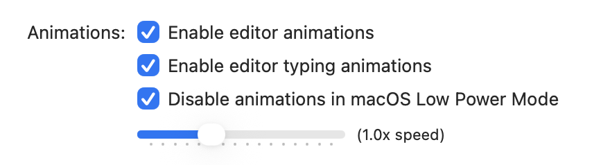
I also noticed that Cmd+. has a bit of a jittery animation (the icons top right) if it’s pressed after “Auto-Hide Toolbar” is enabled.
I collapsed one. Then searched for w. Then clicked to expand the 1 Hidden after the “two” to reveal “three”. Can you give me more details on how to reproduce issue.
Currently not really. There is a “Row: Hide” command that I added, but mostly for debugging. Other then that re-running the filter is only way. It does seem like easier way would be useful. I’ll think on it.
Oh, I didn’t realize that. I’ll change, I definitely don’t want to shadow core window cycling shortcuts.
Oops, my mistake – it turns out the actual outline structure was:
- one
-
With the filter, the second (empty) row was replaced with the “hidden” message. When I clicked it, it “un-hid” the empty row, which confused me since the hidden and unhidden parts took up the same amount of space (1 row), but there’s no bug here.