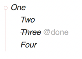
TaskPaper allows you to filter your view in three ways:
Fold a project to hide the items it contains
Focus a project to see only that project and the items it contains
Run a search to filter out items that don’t match
In each of these cases it is not always clear how the text selection interacts with the hidden items. For example if you fold a project, and then select the project and “copy”, do the folded items also get copied? I’m trying to make interaction with these hidden items clearer and more consistent with two changes:
Visible Changes
A light dashed line is drawn when there are “selectable” hidden items
A bold dashed line is drawn when there are “selected” hidden items
Logical Changes
“Selectable” hidden items must have a visible ancestor (this is not actually a change)
“Selected” hidden items must intersect the selection and their visible ancestor must also be selected
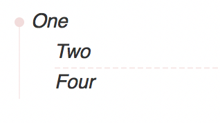
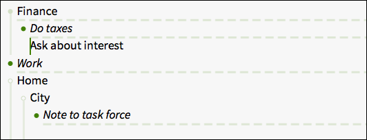
The same outline with item three filtered out. Notice that theres now a light dashed line to let you know that there are selectable hidden items in this view:
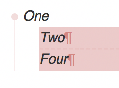
Items “two” and “four” selected. This is a change, not that item “three” is not selected in this case, because it’s visible ancestor “one” is not selected. This makes it possible to work on items in a filtered view without also effecting the hidden items.
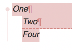
In this last case item “three” is part of the selection, because it’s visible ancestor (item “one”) is also selected. You can tell that the hidden item is selected because the dashed line is bolded and more visible. I think it makes sense to included hidden items in this case, for example if you “cut” the below selection you would want to leave item “three” abandoned… it show be included with it’s visible parent that is also being “cut”.
If you don’t see your problem in the issue tracker then I’ve missed it. Please help by adding an issue or sending me a reminder. Issues in Ready and In Progress states are for v3.5.
Ok, I’ve figured out the problem. TaskPaper in app updates are trigged when I updated a RSS feed file that lists the most recent version of TaskPaper. I have two feeds that I updated–one for preview releases an one for standard releases. This time around I accidentally updated both files, even though I’m only making a preview release available right now.
I just saw this release come in when I opened TP this morning. Wow! Jesse, in a world of (what sometimes feels like) declining software quality, I’m so happy to see you give this project such careful, thoughtful attention at every step. It really makes TP a joy to use.
In my initial post I included four images. Are you talking about case 2 (unselected gap) or case 4 (selected gap) … or both? To me the selected gap case is the more important and should be much of a problem because normally you don’t have your screen fully selected … and when you do it’s important to indicate gaps.
I’m less sure about case 2 … in some cases it’s nice to get a “hint” of those gaps too… but I can see how it would get distracting if you’ve got a long list of collapsed items.
At first I honestly thought that this change was a nonissue, but didn’t want to say anything just in case I discouraged @jessegrosjean or sounded unthankful for the work. Then, as I used TaskPaper, I found myself using this constantly. Great work. Little things like this make a huge difference in the long term!.
Not super thrilled with the UI for this scheme. I saw your original post about it, and I can see why you think this is necessary. First, I personally don’t need it and so think it should be a user-settable option. But second, more important (for everybody) is that the dotted line conveys the wrong meaning. It looks like a separator, not an indicator of something hidden. That’s because long horizontal lines are perceived by most (I’m guessing) people as design elements.
So, I have a list:
Home
	Iron shirts @done
	Bring shirts to cleaner @done
		Pick up shirts @done
Work
Which looks to me like a divider between two sections.
Finally, re the thick/thin distinction: both ugly and at the same time the meaning of the visual difference is not obvious at first glance. You have to know (be told) what it means.
If you want to indicate something is hidden, I think you’d be better off with a small marginal indicator (like a caret >) or some tick mark on the vertical “grouping” lines (whatever they are called) that group levels on the left.
Here’s a snap showing how the dotted lines seem like section markers.
One solution would be to make this marker be controllable in the style sheet. Then I could make it invisible.
It should be that you can just drag and drop an image into the post editor. Alternatively the post editor has an “Upload” control that will allow you to upload an image.
I’m less sure about case 2 … in some cases it’s nice to get a “hint” of those gaps too… but I can see how it would get distracting if you’ve got a long list of collapsed items.
Yeah, while I love having the visual reminder of the selected hidden items, I find the unselected dotted line rather distracting. If there was a way to theme the two different line states (so unselected is invisible but selected is), that would be perfect.
Yeah I think so. I need to carve out some time and figure out what I’ll do with this version. It fixes a bug thats causing some crashes so I need to post it. Problem is I got mixed feedback on the visible changes. I need to decide what to do about that, and that’s what’s been holding up a quick release.
Plus all my energy and excitement has been focused on the new (still a ways to go) work that I’ve been doing on the text editor. So that’s allowed me to let this slip. I’m just heading away for a quick tip with family to Boston for school vacation. But will try to get to this when I get back.