I agree the implementation isn’t ideal for sharing searches between documents. But I think the current approach still covers all the different cases that people might want the best. My thinking is:
The simplest way to use TaskPaper is with one file, so there’s no issue there.
If you have multiple files then there are two cases: you want searches shared between them or you don’t. I think people will have both preferences depending on use case and documents.
As it’s currently implemented it is possible to share searches between files, though it’s a manual copy/paste process. On the other hand if I implemented it the other (global) way then it would be impossible not to share the searches… unless I added a new set of rules.
So the current implementation isn’t ideal for sharing searches, but I feel its good enough and covers all the different cases in the simplest way.
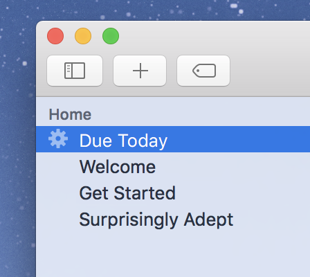
I would like to suggest a change to how searches are displayed in the sidebar.
I use taskpaper in half of my 13" laptop screen, with a different app in the other half.
This means that the sidebar is somewhat width-constrained - yes, I can increase the sidebar’s width but, then, my writing area feels too narrow.
The way in which the suggested search is displayed takes up a lot of sidebar width:
@search(tasks not @done)
… and this means that, in my relatively common setup, the most important part of the phrase (the part that identifies what it does) is partially hidden. At the default width, I can see only this much:
@search(tasks…
If the cog icon was replaced with a search icon, that indicator would allow you to drop the “@search(…)” chrome and display the entire actual search phrase:
tasks not @done
… we not only get to see that it is a search, we also get to see more of what the actual search is.
A changed search icon might improve things… though it seems this is the OS X standard. Used for instance by Mail.app… and the image is actually a standard system image named NSImageNameSmartBadgeTemplate … which I think is pretty much what is being implemented.
But… I think you can solve the problem by including your own search label. Try typing this instead:
Todo @search(tasks not @done)
Then the sidebar will just display your label and not the search.
Yeah that’s buggy… though I think the answer isn’t to try to disable tagging those items with @done, instead I need to make the logic smarter so that it won’t add/remove tags that are inside tag values.
Labeling the search is a neat solution - I’m a Taskpaper newbie, easily impressed
It does, however, add an additional layer and I wonder if most users will naturally think of that. An argument could be made that it would be better if, even in cases where labels are not being used, the search is displayed in a way that conveys more important information.
I am probably misunderstanding what you wrote about the image, I don’t use Mail.app, I just used a unicode character, of which there are variations (slanted the other way etc) that might better distinguish it from whatever Mail.app is doing.
The app crashes, when no network connection is avalaibal at first run. It seems the FirtsRunWizzard (or how you call it) wants internet access and cannot handle the missing network link.
I saw you inserted the magnifier icon in the latest build, I suggest something with a flat look, I’m not very keen on this particular icon. With a search label the smart folder icon wasn’t causing any problems for me.
I agree… and actually I was trying to get the FontAwesome search icon working for the last release, but couldn’t figure it out for some reason (error on my part for sure)… but yeah I don’t love that icon either and agree flatter would be better.


 tasks not