Has there been any thought or discussion about the idea of allowing titles shown in the sidebar to fold? I am still using Scrivener to keep track of my many tasks and research ideas because it does allow this.
The more I have embraced TaskPaper 3 the more I realize that I could really use that feature. Either that or be able to hide items from the sidebar. I am using the sidebar exclusively to focus on what I am doing. I want to keep it simple and focused as I tend to get easily distracted when I am trying to focus on more than one thing at a time.
For example, I am working on a couple of books I want to write. Whether I accomplish this wholly in TP3 is another matter. More than likely I will continue to do research and flesh out my ideas using TP3 and then move the project to scrivener which has much better output formatting and more serious writing tools.
I offer this example because it is OK to see the Books To Write individual titles in the sidebar indented. I can click on any book idea and keep up with it. But, it definitely clutters my sidebar and would be helpful if I could fold the top level on the sidebar when I am not working on any new ideas. I do this to keep the sidebar from over cluttered appearance and to keep me working on everything else.
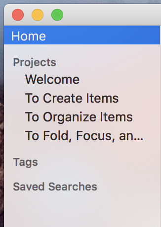
Here’s a screen shot of version 3.5 (in progress and not yet released) 
4 Likes
Exactly so. Thanks Jessie. Knowing how long a new version in progress can take, I wont hold my breath.  But, I will remain optimistic anyway. Happy to see this idea underway.
Looking at this screen shot I would hope that you can also fold tags? You don’t have it shown that way in the screen shot. Right now saved searches migrate to the top which I like since that is the reason I take the time to write a saved search in the first place - to make good and regular use of it.
Expanding the list of tags when on occasion I want to look through them on the sidebar and select any related items of a particular tag is probably useful as well. But contracting or expanding the tags list when it is not of interest to me, which is likely to grow large as a list, makes a lot of sense.
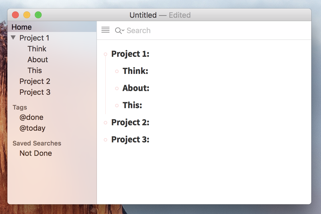
The project list will always show, but both Tags and Searches are collapsable.
Are you sure? Your graphic does show the projects as collapsible, so it will not always show. That is, the top level shown as Project 1 collapses to hide its sub sets.
Would you also consider collapsing the Home title so that in fact only searches or tags could be shown?
I hope to get the first preview of 3.5 out by Friday, parts will be rough, but at least you’ll get to actually try it out. At this point I don’t expect to make Home collapsable. I think top level projects should always be visible, but besides that it would mean all the project text needs to be shifted to the right to make room for Home disclosure button. Seems like wasted space, especially since I think top level projects should be visible.
This reminds me of the days when I learned to operate a console to run two banks of mainframes. The console was not the computer, yet you controlled the computer from console. Similarly, different users might use the sidebar for different purposes. Like using a console, sometimes you want to see everything the system is doing, and sometimes if you show everything the system is doing it would be way too much information. You only want to see the data that you have already set up search parameters to look at. Making Home collapsible, and tags, and searches, would make the focus area very clear. And, it would allow you to change focus whenever you wanted to depending on what project or which set of subsets you wanted to look at. I hope this was clear?
In this case I think persistence paid off 
I just realized that I could split “Home” into it’s own group, and then put projects into a there own collapsable “Projects” group… I tried lots of combinations when creating the sidebar, but never came up with this one till now. It keeps my mental model of what’s possible in the sidebar intact, while making good use of space and allowing you to hide the projects list if you want.
Great Jessie. Thanks for being both brilliant enough to create such nice software and persistent enough to find a solution. And most important, thanks for being open to listening to your customers. Some developers will and some wont. Hooray for you.
Jessie, I’d like to offer one other tidBit. Please do not take the following as a direct suggestion as I don’t expect it to be in your software design. I don’t even know if it’s possible in TaskPaper3. But now that I am using TP3 more, I find I am missing an old feature I used to use, long ago with another organizer package which “may” be something you would find useful to include in TP3 (or not).
The feature is double clicking any heading in the document would create a focus by moving that heading to the top of the page and showing just that heading and its sub sets. To get back out of it there would be a pop up menu of hierarchical levels so when you were done focusing on that heading and its tasks, you would simply click on it and take it back to whatever level you were on. Or use the sidebar.
This was something that I was used to doing to my first Mac OS software, Fair Witness (later Info Depot but essentially the same package). FW did other things that I sorely miss which I am pretty certain are out of the scope of your development of TP3. The idea of double clicking a heading and having the instant full page focus however, was very useful.
I don’t think double-click makes sense for TaskPaper as it’s also a text editor and double-click already means select word. But not that you can Option-Click on an items handle to focus it. You can also use the View > Go In menu item shortcut.
Great tips, thanks. I have to a my brain that “Go” = “Focus”.
Hi Jesse, it´s great that you are so transparent about the development/design process!
Having said that, i have to say i´m not sure of the direction of the sidebar. My Taskpaper files get very large, so a 1:1 representation of the tree in the sidebar is pretty overwhelming (especially with “Archives” visible). To me, the sidebar should offer flexibility to access user-defined “Favorites”, like saved searches, projects, tags… e.g. work like the Finder sidebar “Favorites” section. I don´t need to see all projects or all tags, just the ones i care about.
So my ideal sidebar would work like this:
- Projects (representation of the tree) should have a collapsible headline, too
- It would be great if i can drag+drop-reorder the headlines (sections)
- Add a “Pin to Favorites” command (essentially: saved searches), so i could add any state (Searched, Project “opened”, Tag filtered) to the sidebar
I don’t have the “Pin to Favorites” feature, but I think I have all the other’s implemented in version 3.5. The project list is now collapsable. Was hoping to release the first beta today… but then stayed up all last night watching Meteors … but coming soon then you can actually try it out and see if were are on same page.
 But, I will remain optimistic anyway. Happy to see this idea underway.