Search ideas for Bike 2

I’ve been working on search since the last Bike 2 preview release, but have been having a hard time settling on how it should work.

At one end of the spectrum you have TaskPaper style search… where your outline is filtered to only show matching rows and ancestors. Powerful, but it makes editing confusing, since sibling context is missing.

At the other end of the spectrum you have Find/Find Next style search… where no rows are hidden in your outline, instead matching rows are just highlighted. Easy to understand, but this makes it hard to see all your results together. A simple view of just your todos isn’t possible.

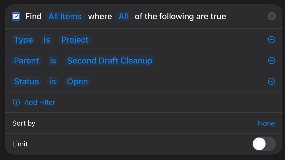
Another consideration is that search becomes a lot more useful once you have easy to access saved searches. Then search can be used more like navigation… go to this matched set of rows.


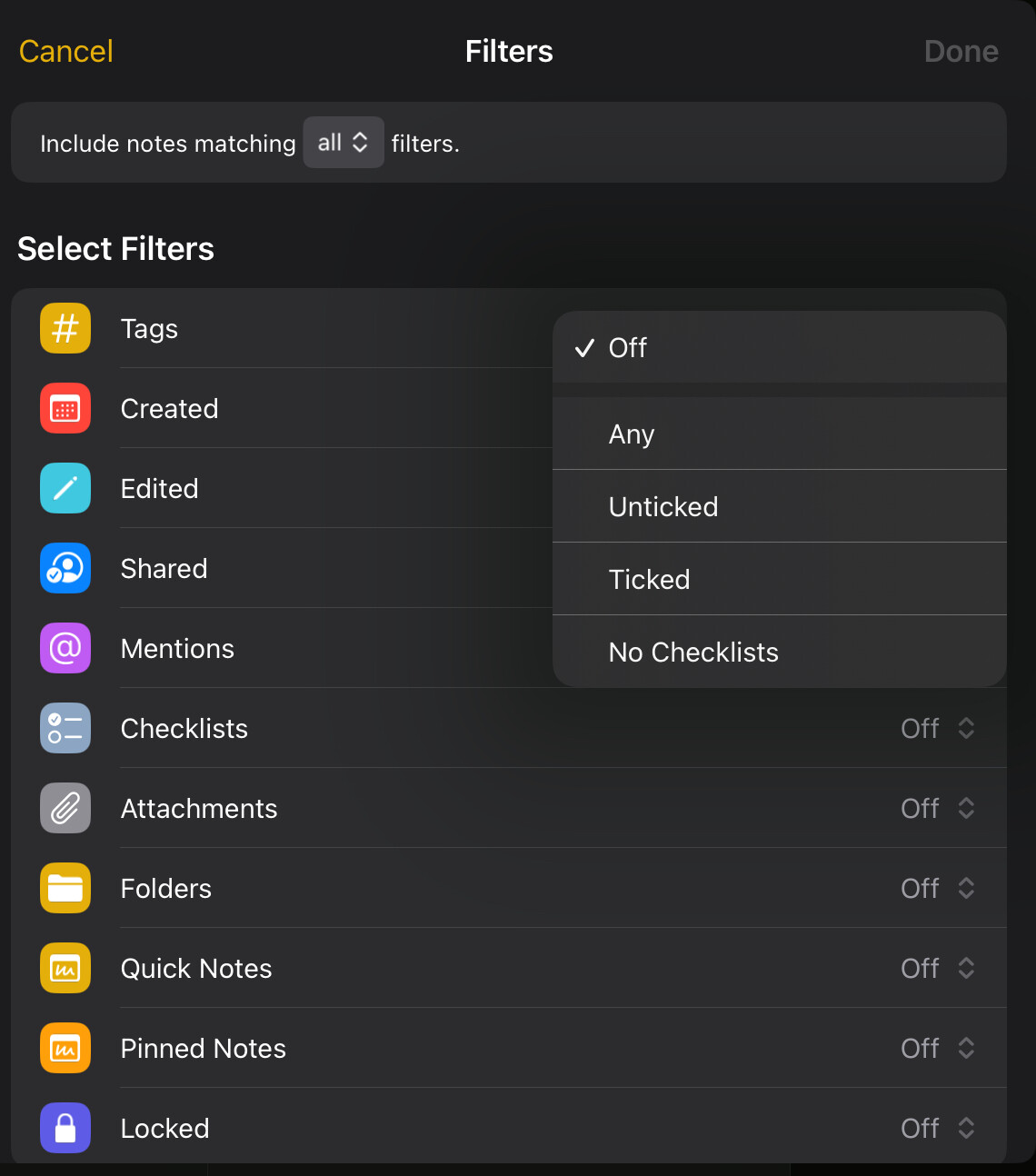
With those thoughts in mind here’s a mockup solution:

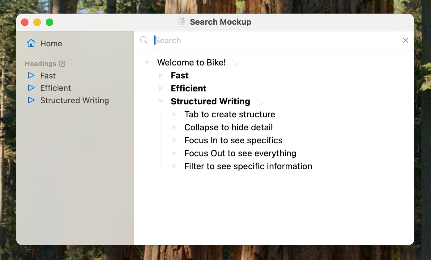
First in the sidebar there is a saved “Headings” search. The underlying outline path is //heading and it shows live matches for that search in the sidebar under the search.

Here you can see direct matches in one place. Clicking on a match will reveal it in the outline editor where you can then edit it.

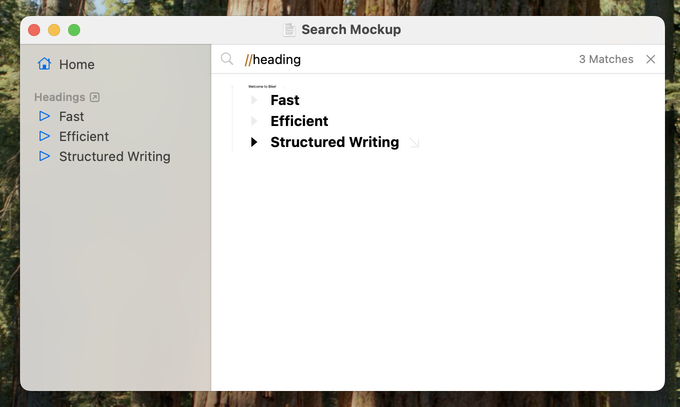
If you want to see the search results with more context you can also click on the “Headings” sidebar item. That will set the outline editor’s search to the saved //heading search as shown in this second image.

The editor is folded to hide branches that don’t contain matches, but generally matching rows in the editor are shown in full context (Find/Find Next style).

A twist in this example is that Bike is scaling down non-matching rows. This is controlled by the stylesheet, an alternative would be to not use scale and instead highlight the matches in yellow.

The key point is that the full row context is always shown when editing. No rows are filtered out of the outline editor except when using standard folds.


At the moment I’m liking this design, but it only came together yesterday. Thoughts and feedback welcome.


2 Likes

For me, there’s a fundamental difference between asking “Where did I write this?” or “Did I put this term/phrase in here?” and “I want to display my outline in a different way”.

In the first example, seeing sibling context could be important (but not always): it’s like sifting through prose, usually looking for a particular spot in the body of the text, not necessarily manipulating the structure of the outline. IMHO the worst possible iteration of this in an outliner app is a flat list of rows with highlighted text.

In the second, excluding unrelated content is intentional, like a focus mode. So if I did something like //"#ChapterSummary"/@type=body (or //@ChatperSummary if tags were supported), I would expect to only see the chapter summaries and nothing else ancestor paths, and then be able to copy this (filtered state) to another outline.

So I’m thinking perhaps a difference between simple searches vs. outline filtering?

But if I had to choose one, I’d always go for option 2, even if I lose sibling context while searching. I’m not sure how the miniature scaling of unrelated content would work for longer outlines. How long can the outline be before text scaling becomes a distraction?

2 Likes

Thanks for your feedback and example.

The current design idea can already support some of what you describe. When you perform a search in the editor it shows a “# Matches” label in the search field. If you click on the label you’ll get a popup menu to Cut/Copy/Copy (without children). That allows you to extract the search results into a new outline.

Hard to say.

For example if you search Moby Dick for a unique word then what happens is:

  1. All branches (except the path to matching row) are collapsed
  2. All remaining rows are miniaturized, except for match
  3. Match is selected and scroll into view

So in this case you of course see lots of miniaturized text. At the same time the match is clearly distinct and easy to see and edit. You also have a clear context of where it is in your outline and don’t have to worry that some structure is hidden while you edit.

As another example, you search Moby Dick for a word that shows in two far apart rows. Same basic pattern as above, except two matches, far apart enough that you need to scroll to see the next.

At first you are scrolled to the first. If you press Return in the search field you are scrolled to the next, Shift-Return to go backward. So it’s always easy to navigate through the matches.

For seeing the matches “together” this setup is worst case scenario… I think in most outlines it is difficult to get into this situation (they are smaller and would have more matches). Even so in this example you would still have option to extract the matches with Cut/Copy.

And again the matches would be much easier to edit in this case.

For example in the chapter summary case… let’s say you have 10 chapters and your goal is to edit the summaries. (If goal is to extract then I think Cut/Copy option has you covered). If you are editing 10 different summaries I think at some point you will want to refer to the chapter content and see the generate shape if what chapter 5 looked like compared to chapter 2.

If the results are pruned (ie non-matching siblings hidden) the only way to actually peek into the chapter content would be to jump all the way out and cancel search. With zoomed results it’s much simpler… there is an additional style rule that says selected row is also 100% zoom… so you just move selection into non-matching chapter content and then can read it. Move it back out and it minifies again.

I do have that filtered version of the view mostly working. I may add it back if it really seemed needed in the end. The issue is that it’s just a confusing view with many hard to describe details such as:

  • You have two matching siblings with an unmatched sibling in between. What happens to the hidden sibling when you select those two siblings and cut/copy/delete.
  • When you move and insert rows where are they positioned relative to hidden siblings.
  • How can show filtered siblings without having to cancel the entire search? In TaskPaper I add an extra state to expand/collapse (expand: show filtered children, force expand: show all children even non-matches, collapse: hide all children, even matches). It sorta works, but it’s confusing and complex to understand.

Anyway please do try out the next few previews and share example search scenarios and outlines that don’t work well. I’ll see what I can change to accommodate them better.

1 Like

Although MSWord is generally a horrible place to live, I do think the way they use a sidebar for search is pretty nice for large documents. So, on the left you have a 2-line (depending on how big the sidebar is) snippet that includes the word in question and it’s highlighted in bright yellow.

Then you can click on any item in the sidebar list and it will scroll to the location in the document that contains that word, so you can see the full context and edit there as needed.

With an outliner, the question becomes what you do with collapsed sections that contain the word? Obviously you’ll have to uncollapse to show the result but is that transient, and the state of all your collapses goes back to what you had before? Maybe if you then edit the main text you leave it uncollapsed?

Now, since I know you’re thinking that Bike will eventually have some kind of file organization pane on the left for multiple documents/notes (as with, for example, Dynalist), you need to be considering how this all fits in with search if you’re also using a sidebar for that.

My feeling is that the sidebar would still show your top-level documents and within each one you’d see the results of the search as shown before, i.e. snippets that contain the word.

This way the sidebar is always, whether you’re in search mode or not, use only for navigation and the main pane on the right is for editing.

2 Likes

Agree, the only way to see is to try :slightly_smiling_face:

For the record I’m still going for a release every two weeks… but I’m also counting this post and discussion as a release. I’m in process of making search a bit more real right now. I’m also in the process of feature creep for Bike 2.

3 Likes

Continuing this topic based on discussion in Bike 2.0 (Preview 211-212) - #14 by jessegrosjean.

I’ve given this some serious thought, and looked at how things are handled by similar apps.

Many follow some kind of natural language model for text-based input, like Workflowy, Legend, Dynalist. What is also common is that there is some form of autocomplete available that takes care of the syntax. This makes it easy to chain together multiple searches without worrying about typos.

Other apps offer saved searches that you can build with the help of a dedicated UI element. This is Apple Notes/Reminders Smart lists, this is Omnifocus advanced perspectives, Ulysses Group filters etc. I’m showing iOS equivalent here, but principle is similar on macOS. There’s a surprising amount of depth to this.

[grid]


Then there’s the exotics like Remnote which offers dynamic search buttons based on existing attributes in the outline.

Then, there’s the monstrosities like Tana and Roam/Logseq with dedicated query builders, all of which have a button-based UI that is as confusing as it is detailed.

On the super simple side of things, there’s Things, which has a few ‘secret’ predefined searches all based on autocomplete, and Notes/Reminders that allow you to quickly search for tags (or exclude them):

So, what to do?

Some ideas:

  • some kind of nicer autocomplete, like typing in highlight and heading, and that would get converted to //*/run::@highlight.. intersect //heading. Maybe even switch off outline paths from the UI unless the user chooses an advanced mode and all that’s available is basic autocomplete and operators.
  • for beginner-intermediate operation, a Shortcuts/Reminders/Notes-like Saved Search builder that has limited options but covers most basic cases and converts friendly UI to outline paths.

  • Barring that, there’s predefined searches like in Things, but I suppose it makes sense to do a vote on those, choose only a handful and give them super nice icons :sunglasses:. Off the top of my head:

    • Open tasks
    • Done/Archived tasks
    • Level 1/2/3/X headings
    • Notes
    • Highlights

Not sure if any of this is helpful, but anything more natural-languagey and/or tappable (iOS!) would be welcome.

1 Like