I notice that, with some settings, it’s possible to get low enough levels of contrast in the window file name for legibility to take a bit of effort:
- Dark background color
-
Bike Preferences > Appearance > Light(orAutomatic→ daytime Light)
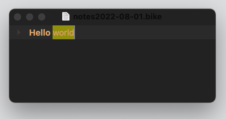
This is easily fixed by making sure that dark backgrounds are only used with Bike Preferences > Appearance > Dark
(which makes it perfectly legible, and not too brightly intrusive either)
but I wonder whether there is scope for making sure that there is always a minimum level of background ⇄ font color contrast for the window file name – just enough to be able to read it ?
The colors used in these examples (tho perhaps that irrelevant ?) are:
- background:
222222 - editing font:
E2A467