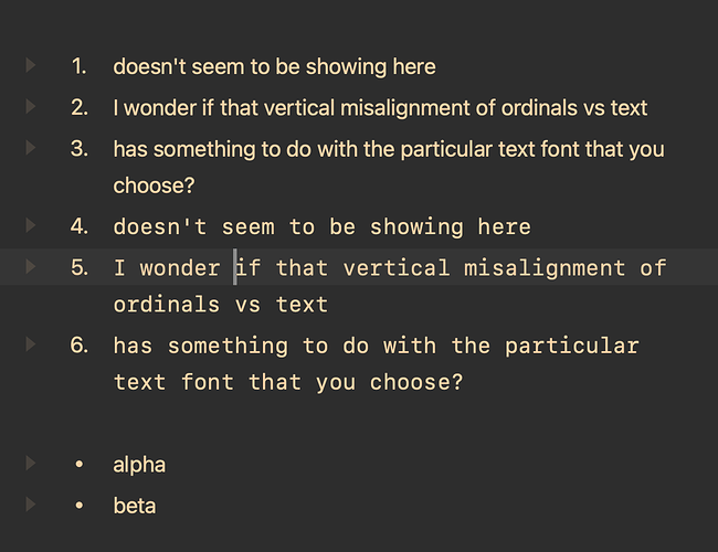
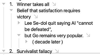
Perhaps an artefact of that particular font ?
(Not seeing it here with the system font, or the default code monospace)
ha you might be on to something there!
when i change to helvetica it looks ok but
i should say ‘a peculiarity of some fixed width space fonts’
but my eyes are old ![]()
ps and thanks for changing the title of the post to something more meaningful!
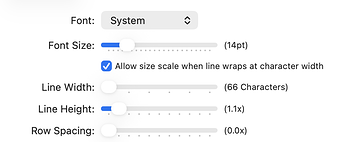
@human1958 I’m not sure if I’ll be able to fix, but let me know what font/size (and any other custom text settings) that you are using.
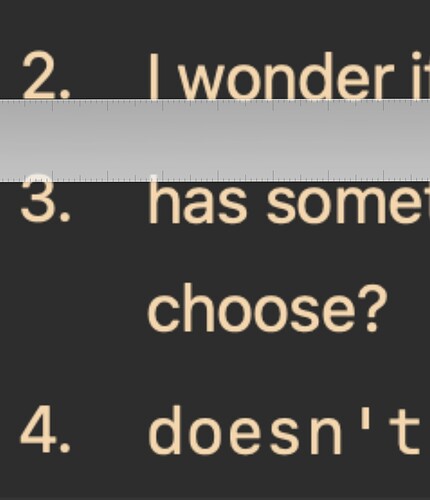
there! you don’t need eyes. just a good ruler ![]() thank you @Gorgonzola
thank you @Gorgonzola
hey @jessegrosjean i was using monaspace neon and before that menlo but thanks to @Gorgonzola we can see that the misalignment is in fact also there with a plain system font like helvetica. so i am not sure if the font and font settings (which apart from the font itself are the deault in my case) or that it just becomes more obvious with certain fonts?
Please try latest preview release. I think it fixes, or at least much improves these alignments. I’m using a different text layout path in the label text and the paragraph text, so it’s a little hard to tell if alignment is perfect, but let me know what you see:
it still looks off to me.
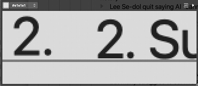
Can you send screenshot. This is what I see. Where first 1. is number and second is a “1.” that I typed in the body text:
Monospace Neon:

System:

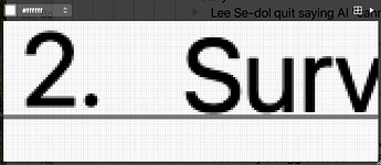
Probably (as discussed above) font-dependent, and not really distracting, but FWIW in 2.0 Preview (270) the lower edges of ordinal and text seem about 2 pixels off.
Or inserting a 2. at the start of the text:
Main settings:
I think this is fixed (or at least improved) in latest release. Give it a try.
Looking good ![]()

