Any thoughts on the worth of having separate modes for “Find” and for “Find and Replace”. The current macOS interface has two modes. Find is Command-F and only shows find text area. Find and Replace is Option-Command-F and shows both find and replace text fields.
It seems more reasonable to me to always show the full find and replace UI. My logic being that if I want a completely “distraction free” screen then I don’t want to see any panel (I’ll close it)… so the somewhat simpler look of “Find Only” doesn’t really help. And on the other side I always default to Command-F to “Find” and then it’s a pain when I decide I want to replace to remember the separate command to bring the full interface up.
Am I missing something? Reasonable to always show full Find and Replace?
I’d vote for two separate UIs. I use CMD-F regularly, to help navigate my complicated list of projects. Having a replace field alongside a ‘search’ field would be confusing/distracting, since when I’m in ‘search mode’, replacing text doesn’t really have anything to do with my intention.
I think it might not be so bad in Bike for a few reasons.
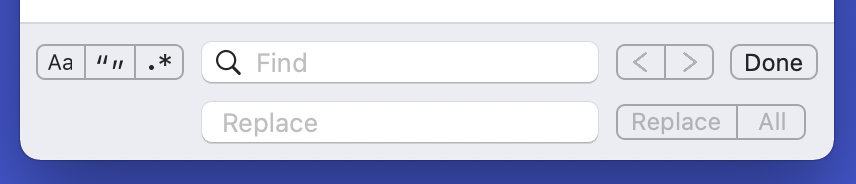
First the find is at bottom of screen. So the “replace” row is at bottom of window and I think easier to ignore then if interface is at top.
Second when you close the Find & Replace panel I clear any text in the replace field. So that whole replace row is in light ignorable colors by default (since field is empty and buttons are disabled), no bright black pixels.
Third I can’t come up with a good alternative design. If there are two modes then I feel like I also need to show a “ Replace” checkbox like macOS Text Edit does. But to me that adds almost as much visual distraction as the separate replace row. Also I will have multiple bottom panel options in the futures and I want “Done” to always be in upper right corner of panel… and replace looks odd unless it’s in upper right.
Anyway please try the next Bike release and see how it goes.
I also have in mind a separate navigation find mode that would be separate from the find and replace that I’m implementing now. The goal is to implement something like Cannon Cat’s Leap feature.
It’s tricky because what makes it really work on Cannon Cat is they have dedicated keyboard keys. But I think something similar can be done without. Once (if… I haven’t actually started work on it yet) that feature is in place I think it would be the preferable way to navigate using “find”.
FWIW I’d be very happy with the TaskPaper style of:
CMD-F for Find and Replace
CMD-SHIFT-F for search
It sounds like that’s maybe what you have in mind with that “separate navigation find mode”. It’s CMD-SHIFT-F that I use all the time in TaskPaper, and that’s the thing I care more about.
Ah, that’s actually a third kind of search compared to what I’ve talked about here. That’s also planned, but again won’t make it into 1.0. And I agree when doing that style of “filtering search” replace doesn’t make any sense to put in UI.
@jessegrosjean +1 for Leap-like functionality! Implemented as a proper pseudomode it would have the potential to make navigating larger documents much more intuitive.
Unlike a mode […] which is “engaged” until it is explicitly disengaged, a pseudomode is “maintained” by the user’s holding down of a modifier key (such as ‹❮SHIFT›❯ or ‹❮LEAP›❯) and exists only for so long as the user holds down such modifier key.
I wonder if there is a way to build such a pseudomode upon the existing “Find and Replace” functionality — especially the Command + G and Command + Shift + G shortcuts which can already be used to find the previous and next occurrence of an item with relative ease.
A small, potentially quick to implement, improvement would be to map Shift + Return to “Find the previous occurrence of an item” while the find and replace mode is active.
It has always bugged me that in macOS’ “Find / Find and Replace” mode Return makes it possible to go to the next occurrence of an item but a completely unrelated shortcut Command + Shift + G is required to go back to the previous item.
I’ve added this to my list. For next weeks my focus will be on implementing rich text, but then I’ll try to get back to other smaller features like this for a bit.
Thanks for adding it to your list and, more importantly, thank you for making Bike! Looking forward to rich text support! Also: No rush. I love Bike the way it is!