Not a bug – a question about space, perception, and an analogue of the old TaskPaper gotcha about bullet points that “look like” children of a topic node but are structurally just its peers.
Is the space allocated to the bullets in Bike unordered lists perhaps large enough to risk a similar confusion at the moment ?
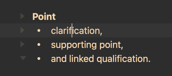
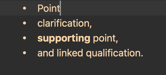
This looks to me perhaps uncomfortably close to a parent ⇄ children relationship:

(especially during text entry when the expansion triangles are – with my settings – out of view)

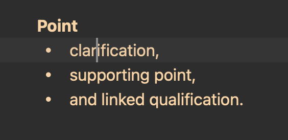
In fact, of course, the bullet points above are peers of the Point line. (Not foldable under it).
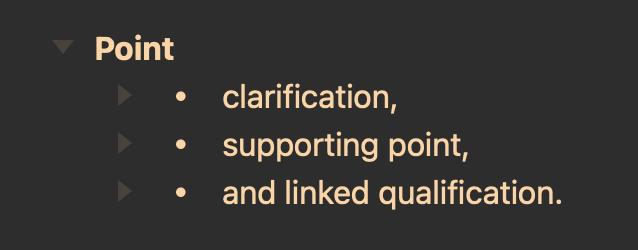
Once we have indented properly, however (to make the three bullets children rather than peers) it looks intuitively a little over-indented to me, and I notice myself occasionally tempted to correct an imagined over-indentation – inadvertently breaking the structure.

I’m not sure if there’s any scope for adjustment there ?
(Perhaps it’s constrained by a need to allow enough space for numbering in ordered lists ?)
3 Likes
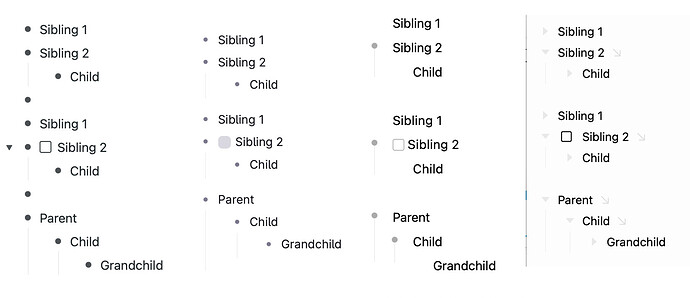
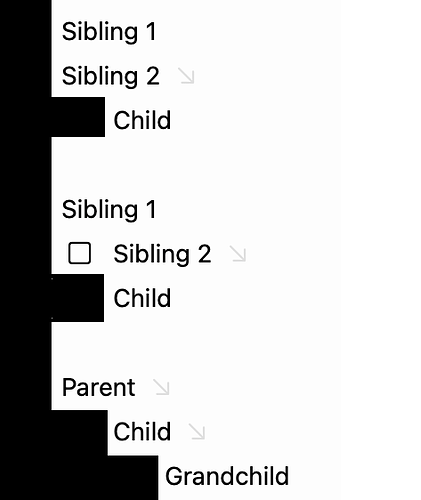
Yes, but I don’t see a great alternative, and I think Bike’s approach has some benefits. No promise that I won’t change my mind later. Here are some alternatives, with Bike on the far right:
All the other outliners take the approach of giving less space to the mark. To me that approach looks a bit better on its own, but doesn’t really solve the problem. In fact I started this example outline in one of those other outliners and got some of the labels wrong because I was visually confused.
To me, in all the approaches, “sibling 2” hierarchical positioning isn’t very clear.
What I like about Bike’s approach is that it maintains a stronger grid. Text always starts at fixed increment. That just seems good to me, and has the nice effect that children of checkbox items align with the parent text… which isn’t outliner standard, but I think makes sense typographically for longer form writing.
For example in Bike you can create nice looking multi-paragraph list items, which you can’t do in the out approaches:
I think in the end it’s the job of the outline handles and guides to solve this problem. In the first set of examples I think image one is clearest (Workflowy) because it has the most prominent bullets. Of course prominent bullets are not always a wanted thing, but it makes the hierarchy clear.
One approach that I have wanted to try is to make the guides much more prominent… so prominent that maybe they are a completely separate visual element and therefore maybe ignorable:
Anyway, not a project for today, but thoughts and opinions welcome.
1 Like
Understood.
Perhaps the nesting is visually clearer where parents have a prefixed type

than where their type is unprefixed ?

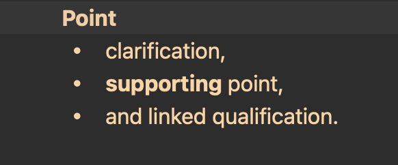
The two examples above have the same structure (four peers) under the hood,
but hard, I think, to avoid the visual impression that they differ structurally.
(Same Point, just unordered ⇄ heading)
Yeah, I think that’s definitely true. It’s making the switch from prefixed rows to non (or back) where there will (always I think) be some confusion. Another approach would be to merge the list marker and the outline handle. I considered that, but in the end I think that brings in more compromises.
I think one way to somewhat alleviate the problem is to separate rows with list marks from other rows with an empty line.
1 Like
Some apps (e.g. Bear and Craft) just display indented bullets differently to help make that distinction, like so:
Maybe that would be a simple solution.
This sounds like a potentially attractive solution. I’ll be curious to see the result.
What I mean here is just inserting an empty line manually.
