Summary: More UI controls. Always allow Escape key to dismiss.
I’ve long tried to build apps with “minimal UI”. Don’t show a control if it’s not absolutely necessary. And if some UI is necessary show the minimal amount possible. But this has a cost, because sometimes you need to turn those UI knobs!
I still like the minimal aesthetic, but I dislike hard to use UI.
A few examples were I see a conflict:
-
In old days on macOS
Command-Fwould always show a full Find & Replace panel. Now in many apps the command just shows “Find”, no replace. To get “Replace” you need a new commandOption-Command-F. I expect this change is done in the name of minimal UI, but it also makes the UI harder to use. Two commands were there was one.I also wonder if it really helps with minimal UI? The thing with the “new” inline Find interface is that I often find myself unconsciously leaving it open. It’s not a big deal… only a single text field and a few buttons so I don’t really notice it that much. But that’s the thing I end up cluttering my content with UI because the UI isn’t THAT noticeable, but it’s still there getting in my way.
-
Spell checking UI on macOS has always bothered me. It has both too much and not enough UI for my needs.
First not enough UI … for a long time I never even noticed the checking panel UI. I mean I knew about them, but would never use them. Instead would just look for errors underlined in red. This was Ok, but a little cumbersome, needed mouse to go right click and fix problems. Also sometimes I would want to turn off, or turn back on error highlighting. And each time I need to go into main menu, and then deep into spell checking submenu. Painful!
Second to much UI… if you use
Command-:then you get the system spell checking panel. That makes it easier to jump through corrections and fix using keyboard. But it also pops up in some unknown location away from my text. It doesn’t even seem to have keyboard focus so I need to mouse into it! And generally since its this weird popup window thing I now need to manage that window and I end up leaving it open and I just get more clutter to deal with.
So what to do?
With Bike I’m coming to a new approach. Show lots of UI and use Escape as a universal way to close out that UI and bring you back to your content. I started thinking about this with Bike’s Find and Replace panel. From 1.) above… should I have one command for Find and another for Find & Replace, or just a single Find & Replace command. I decided on one command.
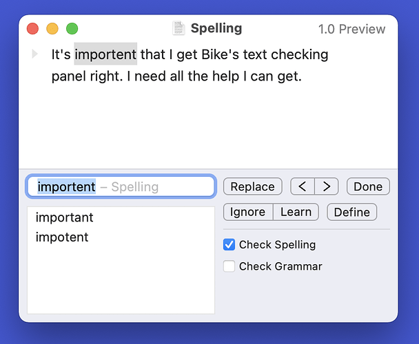
The text checking panel design this week has made this more clear. Initially I spent a lot of time trying to figure out which controls I really needed and which I could remove. In the end I kept them all, and in the future I plan to add more. For example once I implement “Check while typing” I’ll put that checkbox in the same panel. I also plan to put more options in the panel post 1.0.
The point being when I’m “Finding” or when I’m “Checking” I want to see all the controls. The full interface for the task. How does that not turn into a mess:
- Escape key. In Bike escape key should always get you back to just your outline.
- Only one bottom panel at a time. So if I’m viewing the Text Checking panel and then open the Find & Replace panel… the checking panel is hidden.
I think with this approach Bike can keep getting lots of UI controls, but in a manageable way. At least I hope so!
Here’s what checking panel currently looks like:
