Bike Outliner (1.x) runs well on macOS 26 (Tahoe).
This is a companion discussion topic for the original entry at https://www.hogbaysoftware.com/posts/bike-tahoe
Bike Outliner (1.x) runs well on macOS 26 (Tahoe).
this standard macOS 26 Liquid Glass treatment muddies the boundary between UI and content way too much.
![]() I feel the same
I feel the same
This kind of design logic seems to be pretty popular—making main content look like a sheet of paper laid out on a flat surface, probably where GPT gets its inspiration from. I don’t think it’s a bad choice.
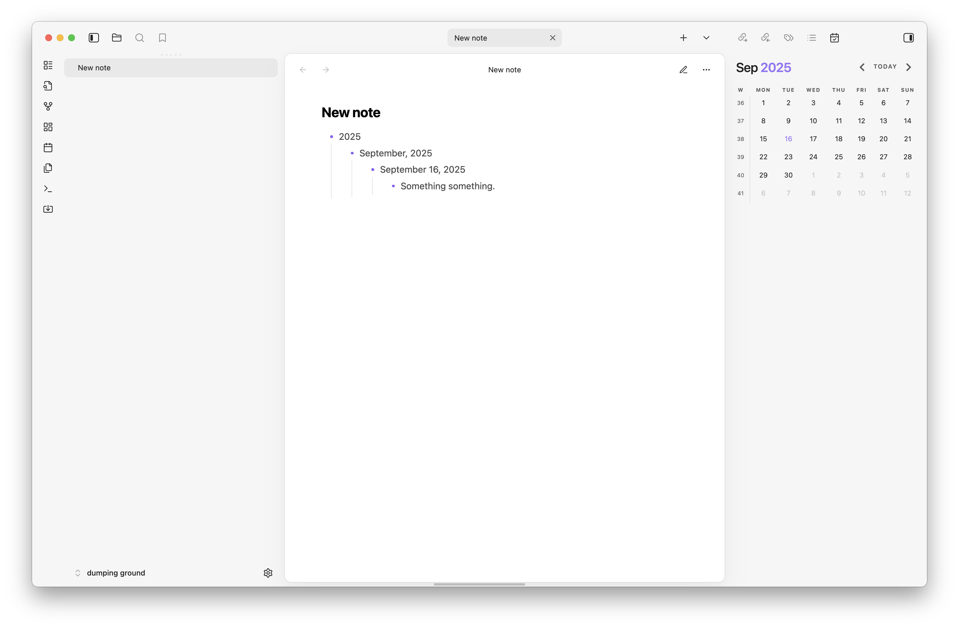
Obsidian with the latest version of the Cupertino theme:
Craft w/ Liquid Glass:
Roam Research w/ an older but clearly similar theme:
What I mainly care about is being able to make the UI go completely away, turning it into a blank piece of paper that can be a little scratchpad or take up the entire screen.
In the Apple Notes treatment, the sidebar and toolbar icons get emphasis over the content, which seems backward. Whereas designs like the Cupertino theme for Obsidian (which I also use) place an emphasis on content. I think that’s always the better move.
Things 3 is looking good. Similar to many of the previous suggestions. I like the content looking distinct from the sidebars like this. It seems to naturally focus the eyes.
Yeah, a paper on a glass surface could look really good. I like that the titlebar is integrated with the rest of the window. Something like this?
I too like the look ChatGPT envisioned. But I would like the ability to control the transparency and color of the content area and UI areas, each independently.
I like the look of the ChatGPT-esque design with all the tools exposed, but I also mostly run Bike with no tools/UI showing most of the time. I also usually have multiple tabs open in my simple window. If the title bar is part of the glass background, what happens when all the UI is hidden and there are tabs in the one window? A strange glass title bar/tab bar poking out at the top? For visual consistency of the core Bike files with tools showing and hidden, I’d prefer the titlebar area to be connected more with the bike document, and the UI tools to be visually distinct out to the sides. We all have our wishes with how Liquid Glass could have been, but I wish the glass UI slid out in distinct drawers from underneath the document, like in the earliest days of OS X (if anyone still recalls that).
+1 for the ChatGPT rendering, as well as the mockup @alfred has posted.
I like to look at screen workspace in the same view as an ordinary desk. Seems the middle is the workspace and what around it are the options.
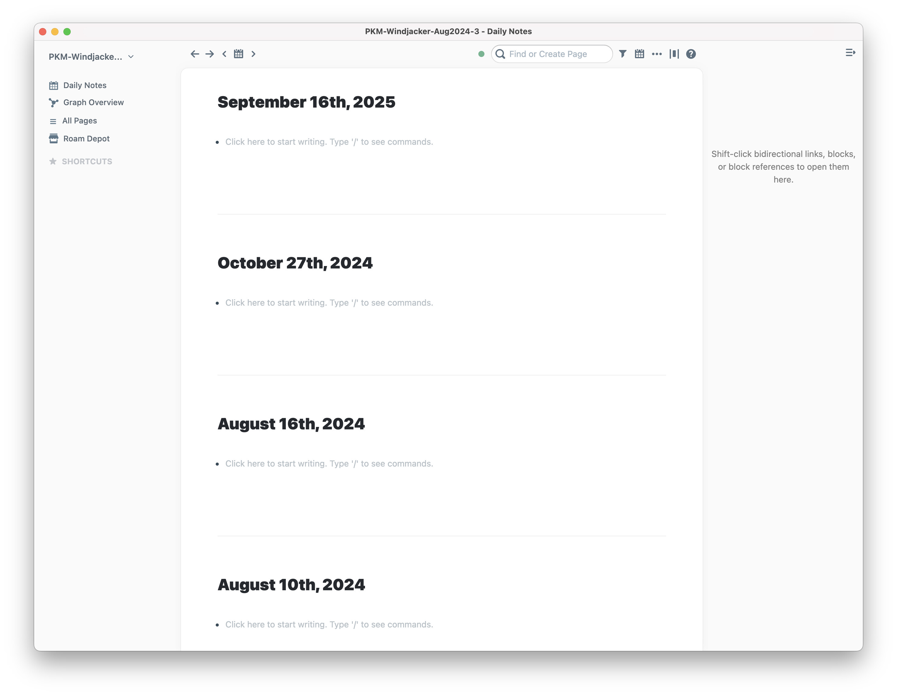
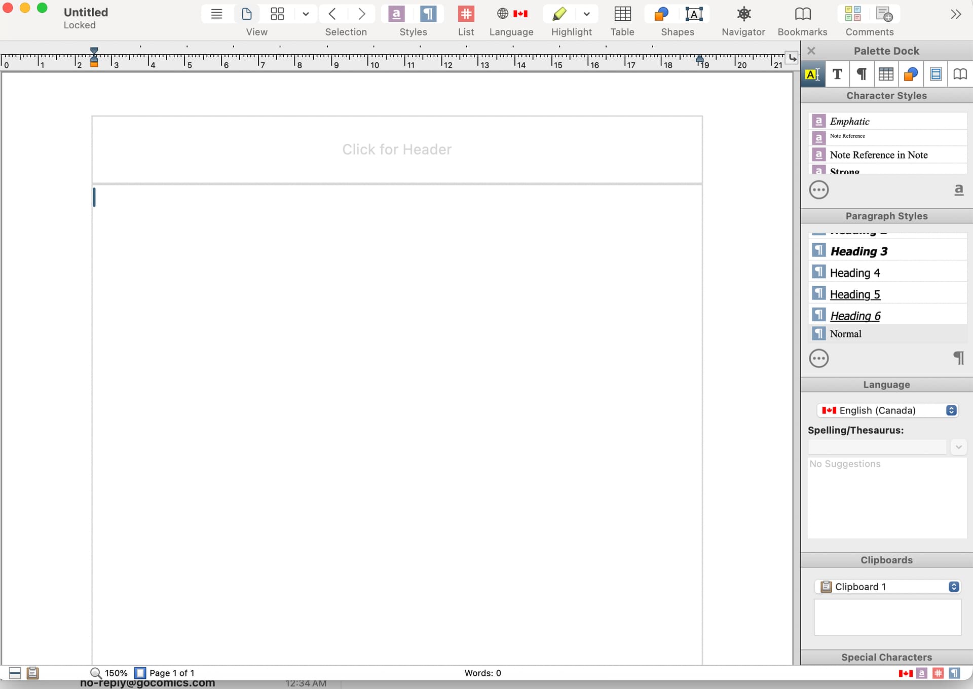
This is an old word processing program I still use after decades from Nisus. The far right sidebar could be changed to 7 different submenus. The top menu are the items I use the most. Bottom one is for information.
I think what works best is the ability to add and change what you use the most on the top menu bar.
+1 on the alfred version: paper on glass is good.
I’m personally a sucker for this with how it hoists navigation to the topmost layer while leaving the bulk of the app, technically in the background of this navigation window, taking up most of the space and thus my attention. I’ll be explicit with hoping alfred’s idea isn’t pursued, but the example below leaves the window layout opt-in. I don’t think I have words to explain why the right sidebar works for me, but its supplemental nature and thus not-always-needing-to-be-present nature would fit Bike (as I am not sure how much I would use a calendar in the app as I’m giving Fantastical another shot).
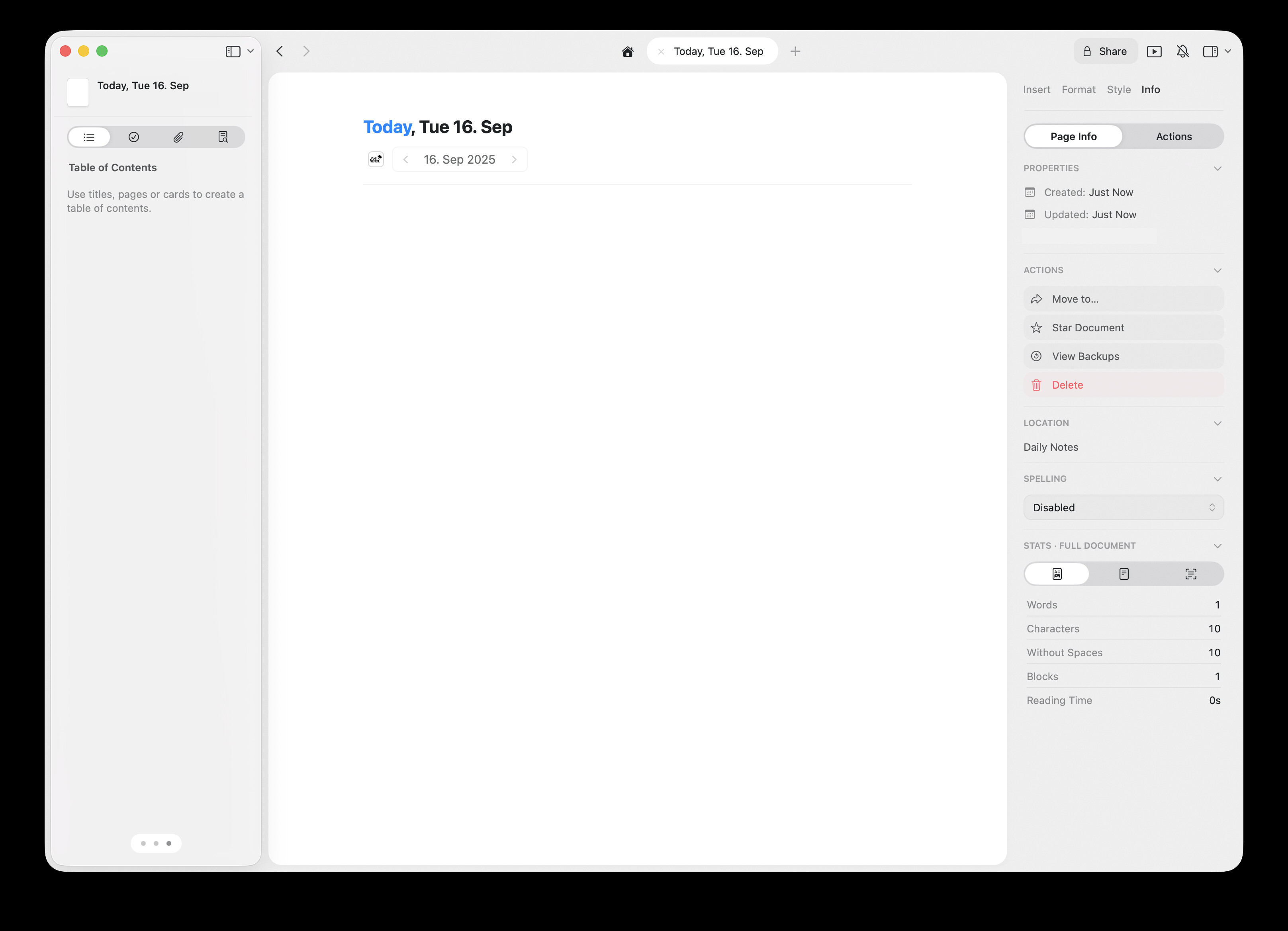
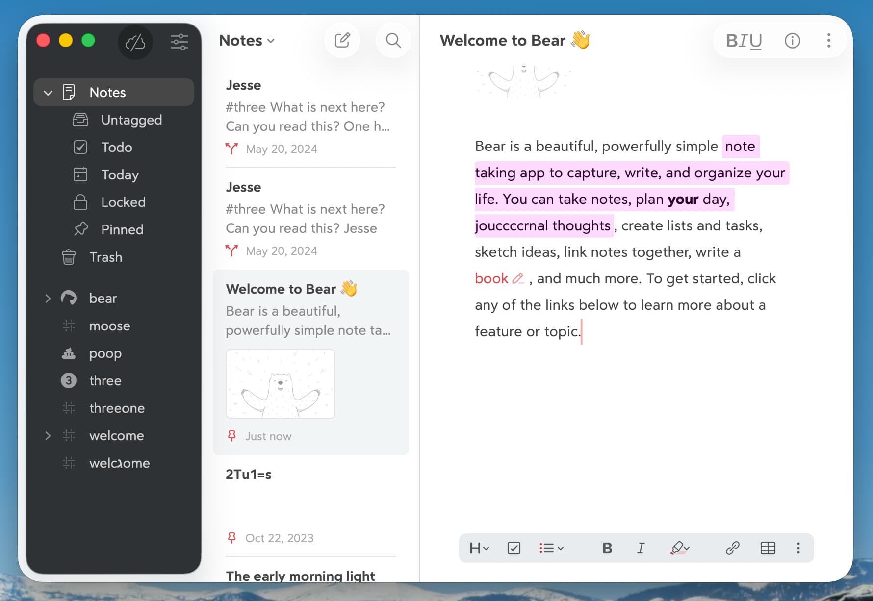
Here’s how I have it set up on Obsidian through Cupertino 2:
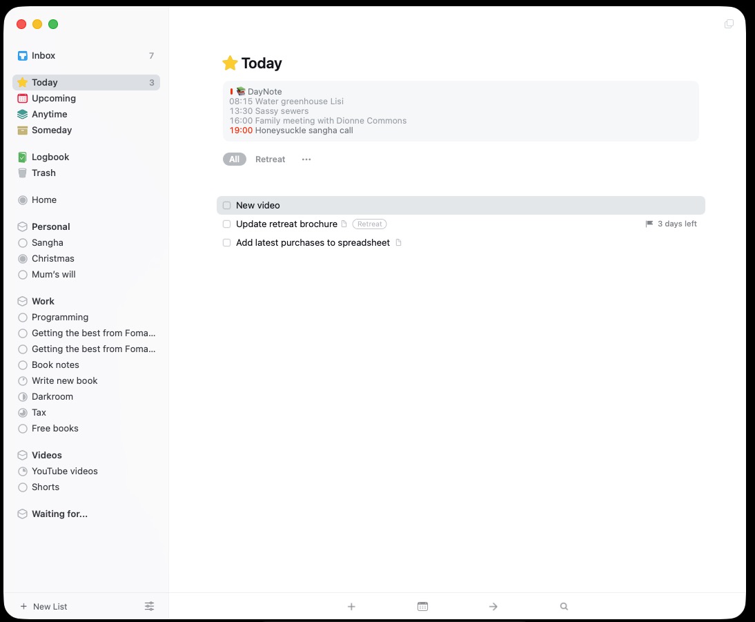
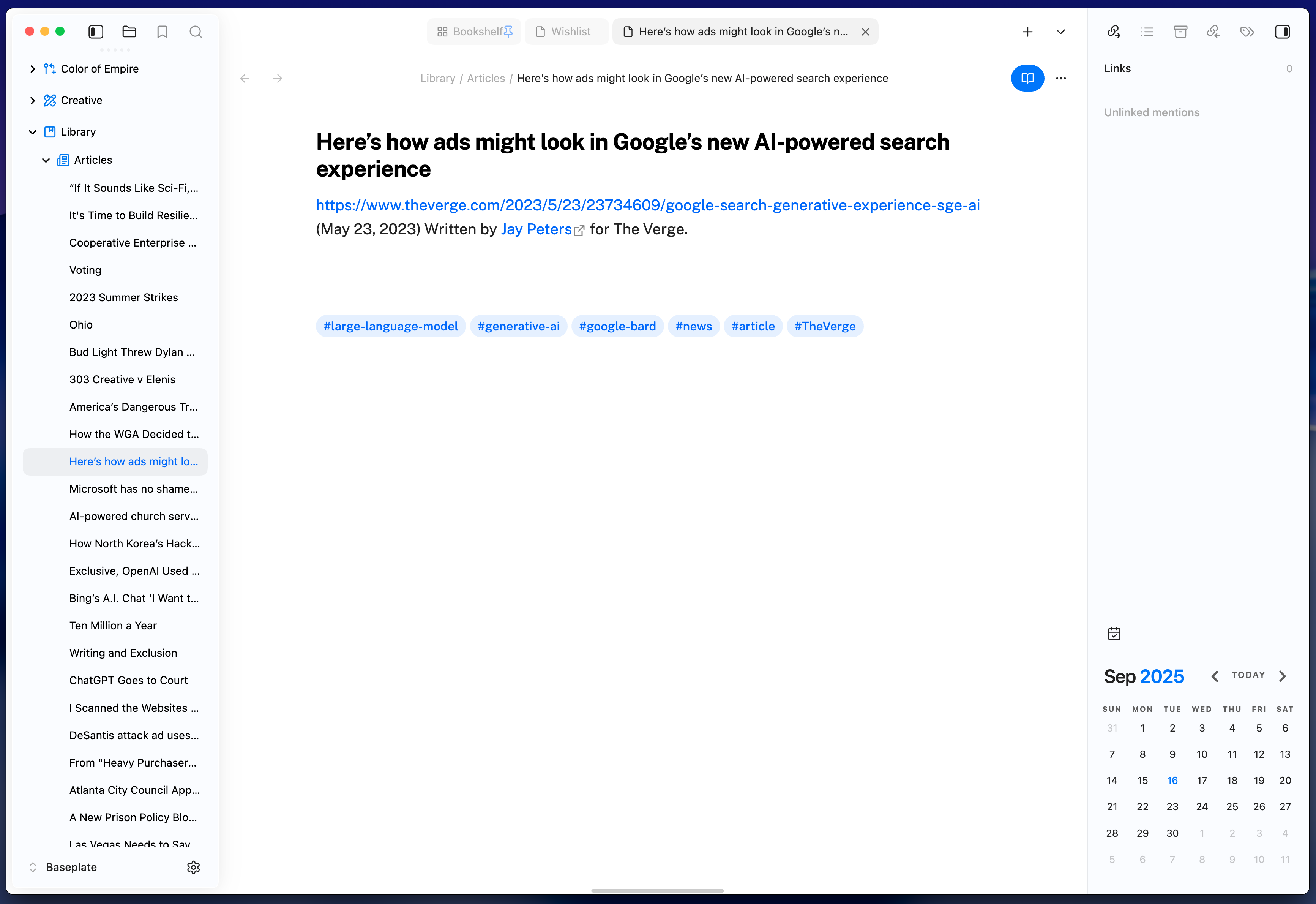
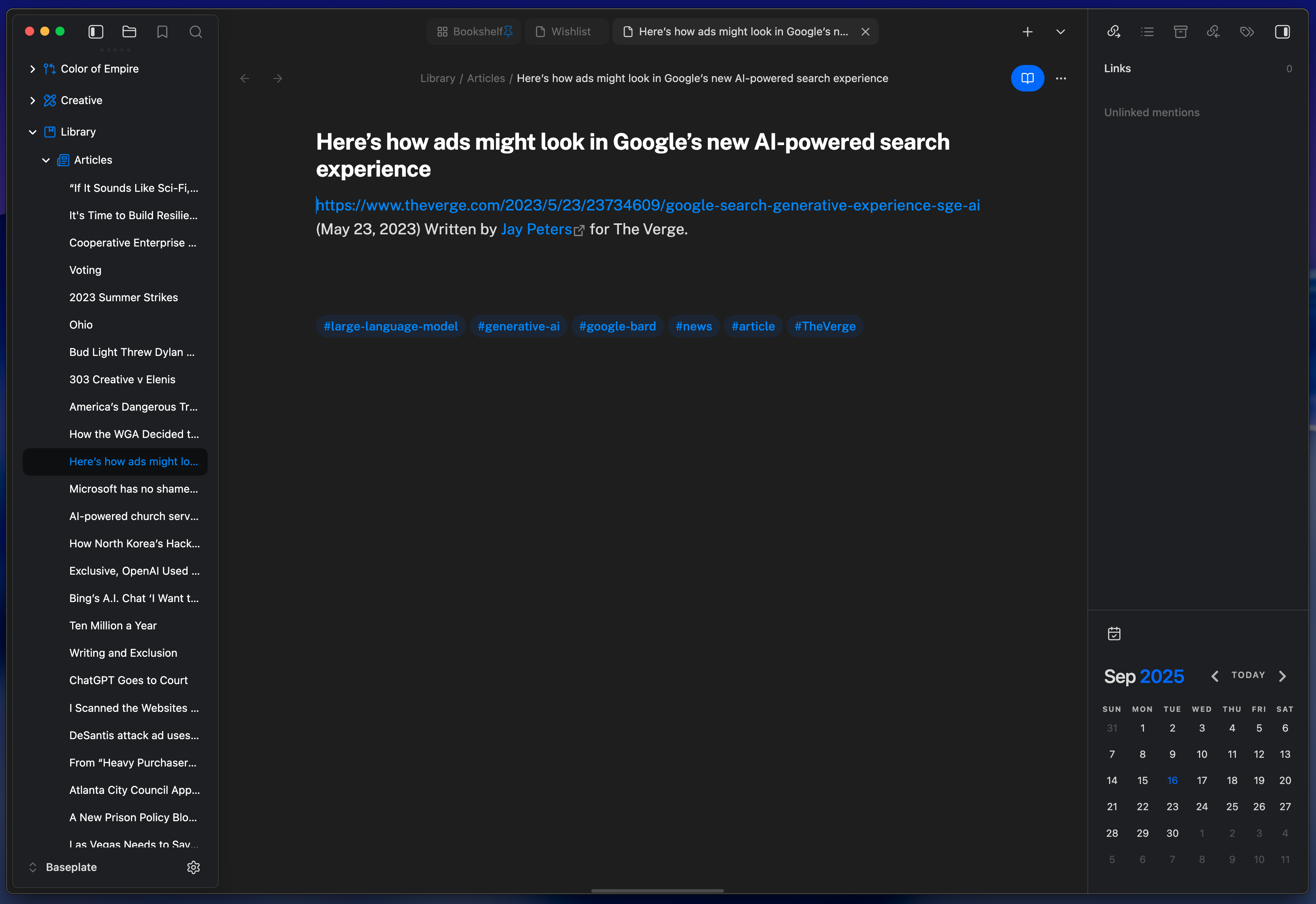
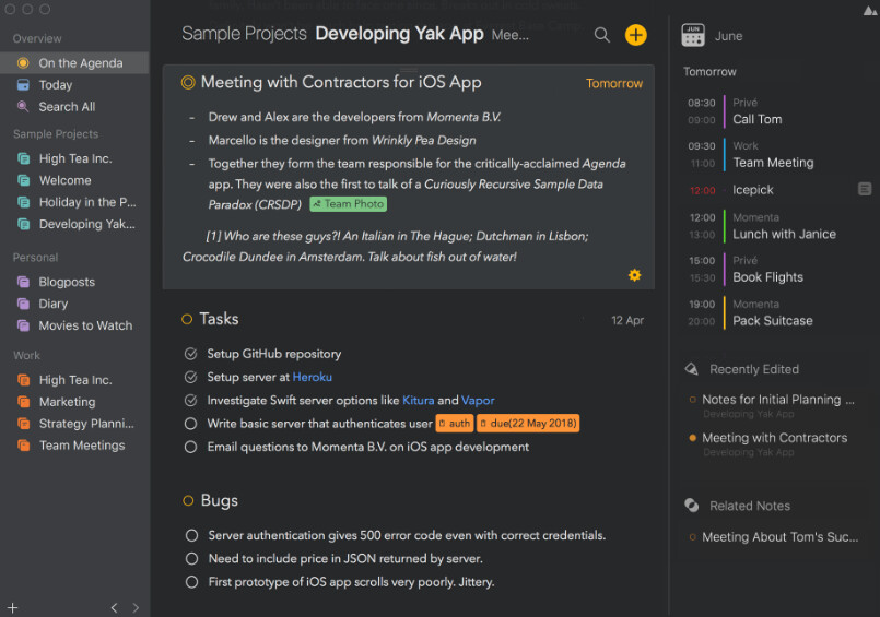
I have been using Agenda, and I really like the layout (screenshot is from agenda.com)… very similar to other screenshots people have posted.
Thanks for opening this up for discussion and suggestion. My main request would be similar to Axeman2u, to have an option to reduce/eliminate transparency (and gloss/shine and anything else Liquid Glass-derived, TBH; not a fan of Apple’s choice there). It would really interfere with my ability to see my content in a consistent and clear way. While the focus on main content and “paper on glass” look are aspects of the ChatGPT rendering that are fine by me, the level of transparency in that rendering would be very off-putting to me. Most of the other renderings folks have suggested here look great, though @alfred’s rendering would still be more transparency on the side bars than I’d care for (though like some others I don’t really use sidebars/inspectors in Bike, so maybe a non-issue for me).
I think Bear’s glass adoption is quite nice, though again they sidestep on the sidebar, but in a way that still feels compatible with glass:
I think Bear did it well, though the duotone look was never one of my favorites. I’d love to wait and see what iA do with Writer for Liquid Glass but that might take a while.
What irks me is that what came out in the end as Liquid Glass has very little to do with actual glass, much less liquid. Instead of some kind of fun refractive translucency we pretty much got frosty/flat panes and oversized (flat!) buttons with some shadowing, and interfaces that feel much more cramped because of all the rounded edges.
I couldn’t agree more.
However: An app that conforms to Liquid Glass has the advantage of not forcing users to adapt to a different paradigm when switching apps. How much tweaking would be required to re-establish a clear separation between UI and content? I’ve created a few mockups. Just food for thought — I’m not claiming to solve any real problems.
1. Showing Titlebar, Search and Status Bar with separators, combined with Tahoe’s full height Sidebar and Inspector, as they might look out of the box. IMO, it’s primarily the Sidebar’s faint, fuzzy appearance that fails to establish a clear hierarchy:
2. As above, with a modified Sidebar. No need to invert things — it takes very little. The background is just a little darker and not entirely neutral / gray (regardless of any tints it may pick up from its environment). The border is darker, the drop shadow is lighter. The selection’s background is more accented:
This isn’t directly related to the Tahoe conversation… Jesse, is the calendar here an extension? If so, is it possible to share a link to it?
Ah, it’s available on the bike-extensions-kit repo! GitHub - jessegrosjean/bike-extension-kit