Bike 2.0 (Preview 254)

Holiday cooking is upon me—today: 15 lb of masa into tamales.

Unfortunately, this preview release is not fully baked, but it has already been in prep far too long, so I am releasing it anyway. One major missing feature is outline filtering. Lots of other rough edges too. If you are using preview builds for real work, you may want to downgrade to build 253 after giving this version a quick try.

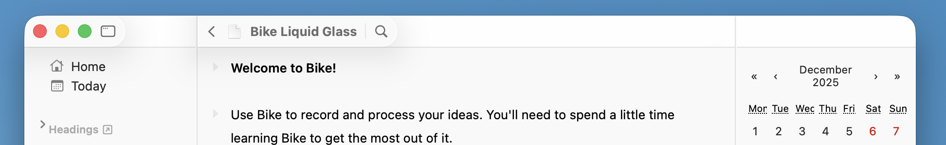
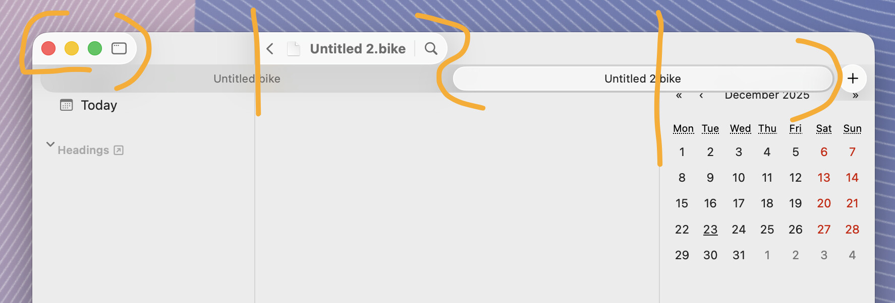
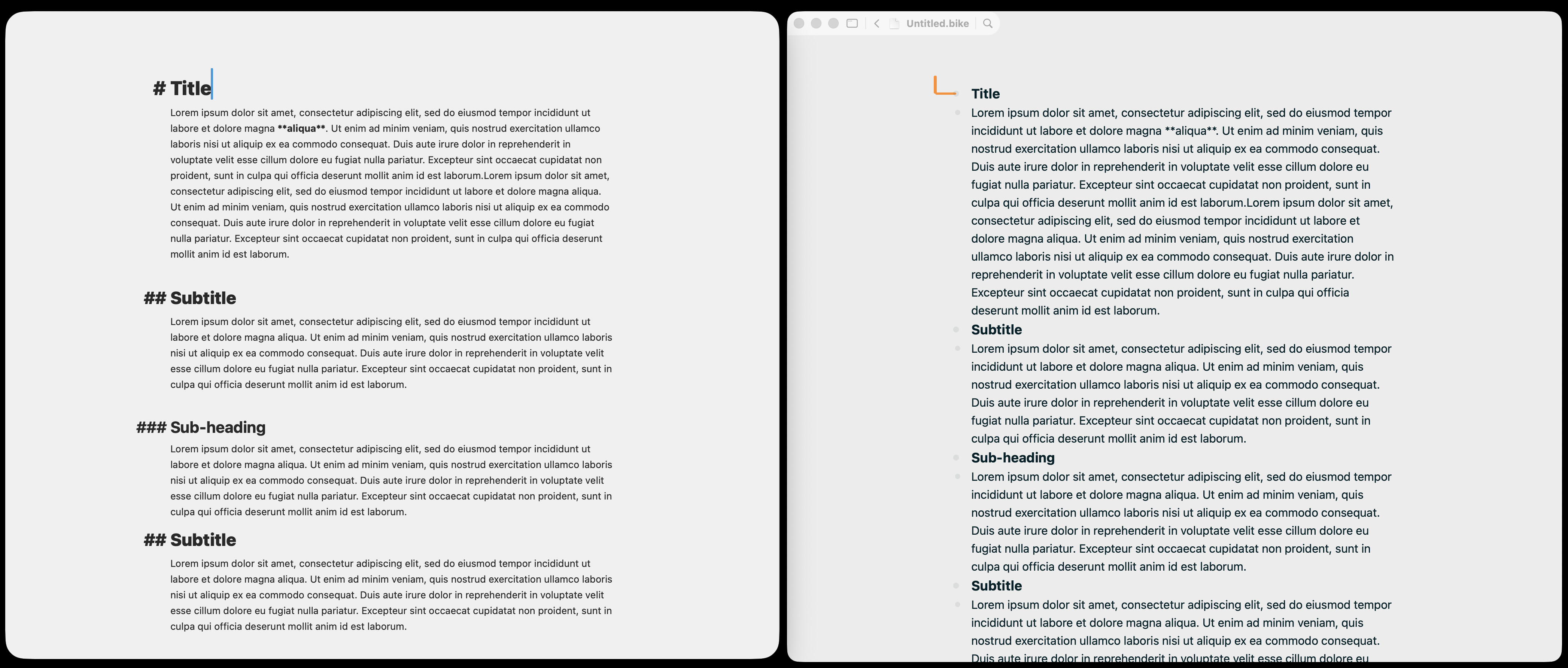
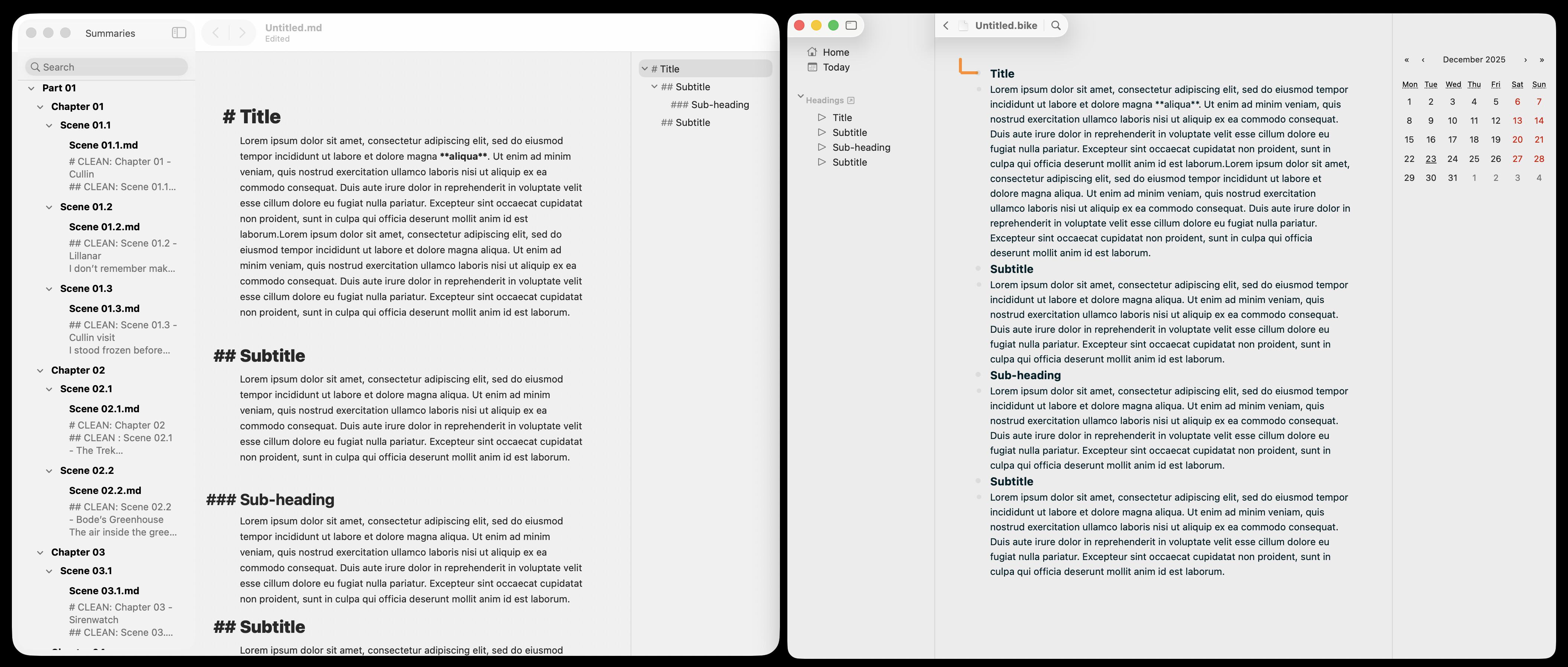
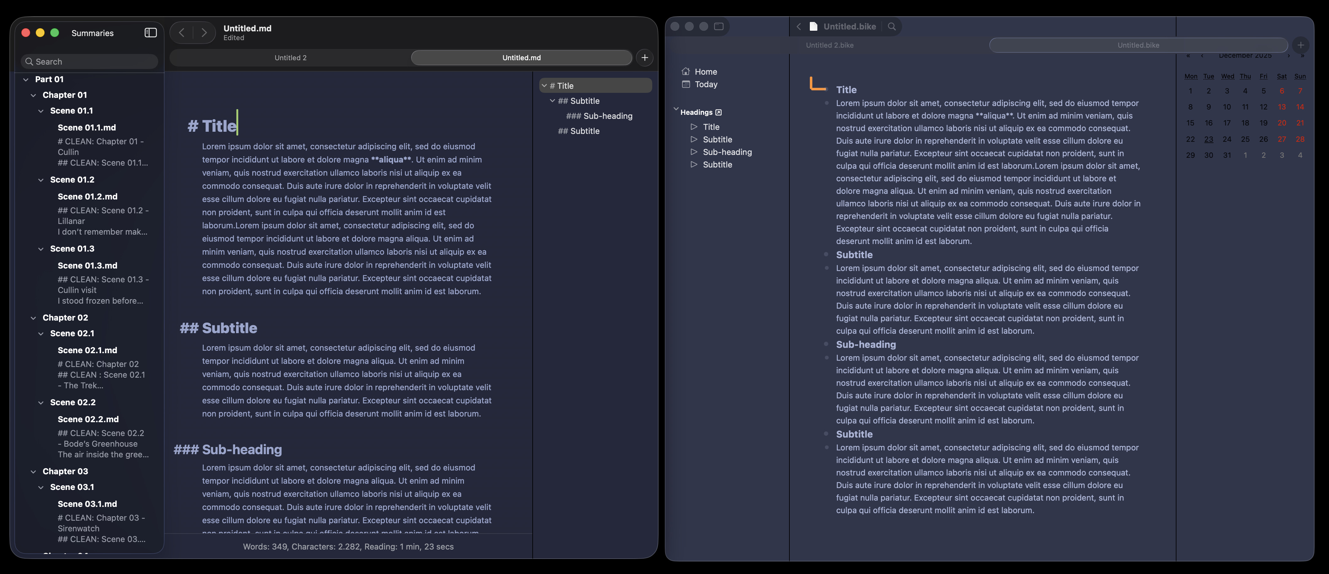
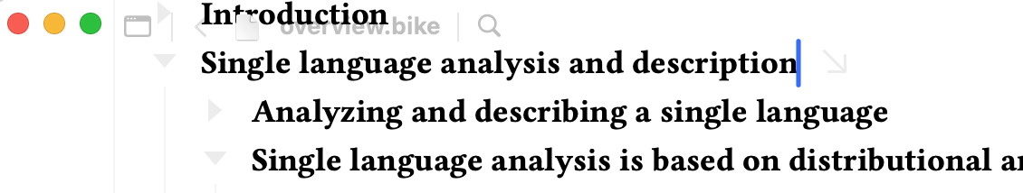
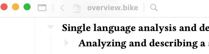
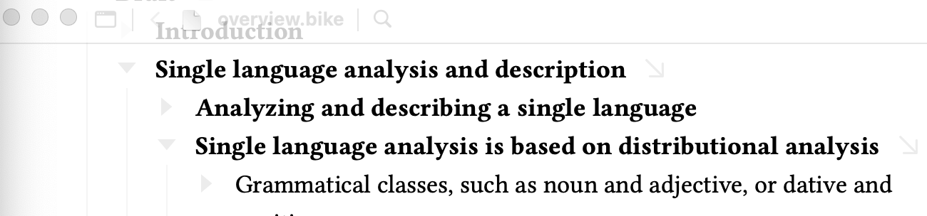
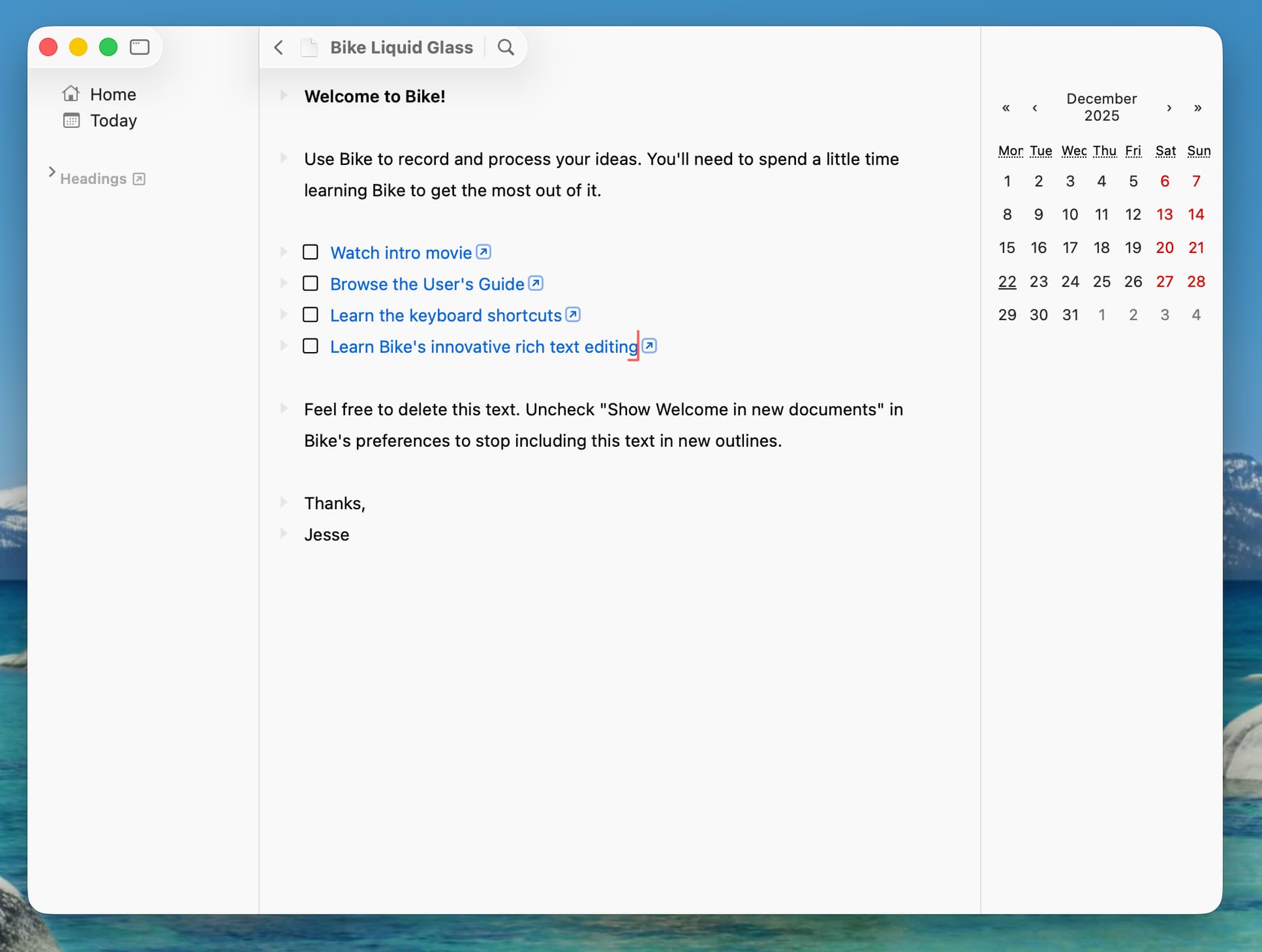
The biggest change in this release is the adoption of Apple’s new Liquid Glass UI in Bike. I have arrived at a design that I like, but feedback is always welcome. Hopefully it can be made even better. See discussion below for what I like about it.

Added

  • Empty row in new documents
  • Move up/down (maintain level) commands
  • Text wrapping keybindings (quotes, brackets, parentheses)
  • Editor style functions: selection-ancestor(), selection-descendant()
  • New Row API properties (level, prevBranch, nextBranch, isAncestor, isDescendant)
  • Improved transaction options (labels, spring timing)

Fixed

  • Markdown code span escaping
  • Mouse cursor icon update issues
  • attributedString.replace API bug
  • Keybinding prefix matching (full prefix required)
  • Crashes evaluating some outline paths
  • Pasting short (<4 char) plain text
  • Outline path queries with multibyte quoted chars (e.g. "ü")
  • Bikemd formatting: no escape after numbers like 1 hello
  • Delete-forward on empty line now reattaches children correctly
  • Outline keybindings only activate when the Outline Editor has focus
  • Editor redraw when moving between displays with different resolutions
  • Multiple API crashes caused by invalid values (null, undefined)

Changed

  • Removed selection-covered() editor style function
  • .bike files now require markup; empty files created via touch will not open
  • Updated API definitions to reflect new Row properties and transaction options

Download:

It’s a Christmas miracle! :folded_hands:t2:

Will check it out later. And I hope you’ll get some holiday rest in time as well.

1 Like

Ok, new UI! My first thought: minimalist UI screenshots are hard to take. To me, it feels much better than the screenshot above looks.

The design path went like this:

  1. I need adopt liquid glass
  2. I tried many variations. I think glass looks cool, but I can’t stand so much mixing of content and UI and the compromises that come with that.
  3. Finally I realize that if I put glass in bigger pieces and in predictable places–especially up against the screen edge–I could get a nice glass effect while also keeping it easy for my brain to chunk as UI.

The above screenshot is of “full glass” UI. I also like that the design can transition to a more traditional look while still looking good on Tahoe. In General Settings you can uncheck “Show background on hover only” and you get this:

This gives total separation of UI and content, but still has a nice glass effect. I think it looks particularly nice when you start using themes with different background colors.

Another feature I like is this UI feels about the same weight as Bike’s previous titlebar, but adds in a lot more functionality. There is easy access to window configuration. (Right-click, long-click, or just click and pull down for a menu). Navigation buttons, and the outline filtering UI is also integrated. More prominent then before, while also taking up less space. (it’s also not connected to actual functionality at the moment, but you can play with it and see how it looks anyway)

Not implemented yet, but themes will allow you even more control. You’ll be able to set the material used for toolbar, toolbar background, sidebar, document controls, and inspector. Available materials will be glass, blurred materials, gradients, and flat colors. So if you want really clean and simple that will be possible. It will also be possible to make everything poop in a nice smooth way.

The one feature that I could not successfully integrate into the titlebar is the navigation path. It’s just too much horizontal text. It fits nice in carefully setup scenarios, but was always a mess in the general case in my documents.

I have two solutions that I think will work.

First if you click the document title it currently opens a popup that shows document’s location in the Finder. I will also add your navigation path to that list. So click document name to see where you are in the document and to navigation to new places.

Second if you do want to see the navigation path open as you work I will be adding it to the sidebar. My real world document hierarchies fit vertically in the sidebar in a much more ordered fishing then they fit when trying to show them horizontally in the toolbar. I think it will work well.

Hope you are as excited about new UI as I am. I feel like it’s adding a bunch new functionality, still puts content first, and does this while making good use of Liquid Glass material.

Ideas for improving it are welcome.

1 Like

I installed quickly now, and I think I found a bug, heh…

The text is visible above the tab bar… However, if I mouse over that area, it gets blurry (which I assume is intended).

(I’m on Tahoe 26.3 Beta, BTW.)

Edit: NVM, it’s the “show background on hover” thing! It just looks very bad when you have tabs open, heh.

Yes, when tabs are used the toolbar needs a background. You can (ahh you found it), but yes, I need to automatically force toolbar background when tabs are shown.

1 Like

Good idea to have that option without tabs, though! :+1:t2:

I just installed it, but there’s no date on the right side. How is that achieved?

Ah, that’s an extension that I installed. Currently it’s a pretty technical Typescript/Javascript task to build/install. If that doesn’t scare you then see Creating Extensions | Bike 2 (Preview) | Bike and that calendar extension is part of the bike-extension-kit linked there.

This design looks pretty weird, It’s like using Liquid Glass wrong. Why elevate the window controls alone, and half of the title bar? It would be way better without lifting up elements.

TBH: using the proper lifted sidebar design would be more than enough to make it “modern”. What I love about Bike (and also TaskPaper) is the pretty minimal UI.

These new additions feels like adding noise to the UI, just because the system toolbar has lifted controls.

Finished a full day of tamale cooking!

Thanks for taking the time to try it out and give feedback.

I think maybe our core difference in thought on the UI is that you are OK with Tahoe’s default Glass design patterns while I really don’t like them?

There is a great argument for just adopting Tahoe style and being done with it. Probably the smart thing to do, but ugh I just don’t like it. So whatever I do it is going to be different in some respects because I’m trying to avoid the problems I see in the default design.

I’m not trying to avoid it all. I do like the general idea of Liquid Glass which I interpret as: UI floating above content in separate layer. Neat idea, I think it could work… and it makes some really nice theme effects.

But as implemented on macOS it doesn’t make much sense to me. Too many edges, to hard to distinguish UI from content. To many effects where the effect is the point. I don’t like.


I do think you are right that the top screenshot has some weirdness in the way that the window buttons float on a tiny little island, but I don’t like the idea of not floating those controls. To me they are clearly important window UI that should float over content.

I think instead it could be improved if I always extend the toolbar that’s above the sidebar to full split width. Normally I use Bike with sidebar collapsed and my view is:

I like that view a lot more, where the controls are all on a single island. It has a lot of functionality. It floats above content. It’s easy to pick out. And it takes very little space both physically and visually.

I’ll try to make it look like this when the sidebar is both expanded and collapsed.

There is more function/controls in the toolbar, but for me the interface (excluding the issue with the window button’s island) feels really clean. Bike 1 has fewer titlebar controls (just titlebar), but that meant if you wanted search or a back button then you would have to add larger chunks of UI below the titlebar.

Thanks again for the feedback, and keep complaining where you think it’s warranted!

2 Likes

I really appreciate devs trying to make good sense of this trainwreck that is Liquid Glass. I’m trying to like your version, where it starts to break down for me is when tabs are introduced into the full double-sidebar interface. It reminds me of a jigsaw puzzle that doesn’t quite fit together. I’m also not sure if combining traffic lights with document title portion would fix that. The way it’s currently set up, my eyes expect title bar = tab bar. I haven’t seen many apps try to adopt that.

Even with the minimal title bar squished all the way to the left, I’d still want it to go away while writing (leaving nothing but traffic lights, or nothing if it’s in full-screen mode).

Here’s a visual comparison b/n Bike and uFocus, which is probably the only writing app I know that kind of has a similar interface to Bike (sidebar w/o list + inspector on the right).

Bottom line is I think Bike looks sick in dark mode. Just…do something with the tab bar and you’ll be good :rofl:


Thanks for reference images with uFocus, useful to flip between the two.

I think in tabs showing case I will just drop the glass effect and draw separator under the tab controls.

1 Like

Almost the new year, getting back to coding again soon!

I’m trying to decide on next steps for Bike’s glass UI. I think first I want to focus on a flat UI option, that will be used on earlier versions of macOS, but can also be used on latest Tahoe.

Here’s my proposal:


Good/Bad/Thoughts?

3 Likes

And here are some glass effect variations (when tabs are showing will always use above plain background design, no glass):

Can also combine the background bar with glass effect:

More Good/Bad/Thoughts?

Thanks!

1 Like

Yeah, that “flat UI” would work! :+1:t2:


There seems to be, what I would call, a fundamental issue with the Liquid Glass design: The traffic lights want to either incorporate with the sidebar (which seems like the default) or the top bar. But it can’t be both.

You can see that Safari struggles with this as well, if you turn on/off the sidebar (showing tab groups etc). It will then add in the sidebar, which then takes over the traffic lights, and puts itself over the top bar.

IMO it looks like what they prefer is to have the sidebar be on top, and then not have a top bar at all — but instead having the tools and stuff float over the content. However, Apple break this themselves all the time, as tabs (and a lot of other stuff) makes this not work well!


I know you said you don’t love Finder (and I don’t either, really) — but maybe something like what it looks like in the columns view could be of inspiration?

Intentionally messy screenshot: :backhand_index_pointing_down:t2:

Having more tabs open forces Finder to create a proper top bar. And it seems to be built up like this:

  • The content at the bottom,
  • then the top bar background + tabs,
  • and then buttons on the top bar and the sidebar on the level above this.

When removing the sidebar, things would look very similar (identical?) to your flat UI screenshot. Here you can see how Finder styles the traffic lights with a top bar, without the sidebar:

And for the right sidebar I’d steal the look of Ulysses!

1 Like

If another reference helps, there is currently a bug in the Ulysses UI that makes the sheet/note list disappear from the left side, so layout is similar to Bike’s (left SB/content/right SB).

IMHO the full Ulysses interface isn’t minimal at all-in fact it’s pretty cramped. I honestly don’t care because there is a cmd+. shortcut that makes it all go away instantly.

Jesse, still unsure what bugs you about the default glass UI, but these latest screenshots look OK, if deliberately different than any other native macOS app. I still maintain that the top bar, even when shrunk to the left, should go away while typing (like it does in Bear).

2 Likes

Interesting bug! And then it looks exactly like what I was trying to explain above, hehe. :ok_hand:t2:

1 Like

Oh, I didn’t know about that shortcut, I really like that. Do other apps use Command-. to toggle UI, it’s a nice idea?

1 Like

I think Craft did this first and Ulysses borrowed during adoption of Liquid Glass. I’m not aware of any other that do a similar thing. Maybe Muse, which also makes the UI go away in a similar way, but that’s a canvas app.

1 Like

Hi! I just got a chance to update since coming back from break. Is there any chance/way to make it so that the toolbar isn’t transparent on macOS 15? The other apps that I use which have adopted Liquid Glass for macOS 26+ don’t have transparency like this on 15 if they still support it.

Edit: I just discovered I could disable Show background on hover only for the Title Bar. That seems to work better, but it still has a measure of transparency where the content blurs the title bar, and the title itself is washed out:

And for inactive windows, it still comes through completely, even with the setting disabled: