Horizontal scanning back and forth turns out, in vitro, to be cognitively and physiologically more expensive than you would expect. (Much more than vertical scanning up and down)
1 Like
I just tried another layout where the focus arrows were placed to the left of the fold handles, but it didn’t look right … to much going on when those different control types were right next to each other. I’ll try to get controls to fade as when you start typing this afternoon and see how that feels.
1 Like
I’m hesitant to agree with the idea that it would make vertical scanning a worse experience without trying it out first, though I’d be curious to hear more of the idea that horizontal is worse than vertical.
On first glance I actually really like the structure of the additional pixel lines on screen, I think the lines could help further anchor my vertical scanning, like how I find the setting to ‘mark the current line’ helpful for the same reason. And, I think it helps communicate the idea of “this button will focus in here” better that a solitary arrow.
Even though the clear downside would be more clutter. Would love to try it though!
Oh and I think that’s a cool idea!
Long-form writer here. As I’m acutely allergic to any visual clutter when doing focused writing, my question is why double-clicking the fold-unfold triangle wouldn’t be a good solution?
Also, to mark focus mode, maybe the top triangle could get a box around it while focused in?
I’ve thought about this… it would match really well with the Finder’s basic behavior of double-click to open. The problem is to distinguish between single and double-click would require that single click actions aren’t recognized until after whatever the max double-click time period is. Maybe this wouldn’t be the end of the world, but I don’t think that delay would be very satisfying.
I’m leaning toward settings at the moment.
It didn’t feel right to me to add a setting to just hide these focus arrows, but adding a setting to hide “outline controls” feels better. Instead of just hiding one new thing, it’s hiding the new thing, plus a bunch of old things that we’ve all gotten used to, but that are not outline content.
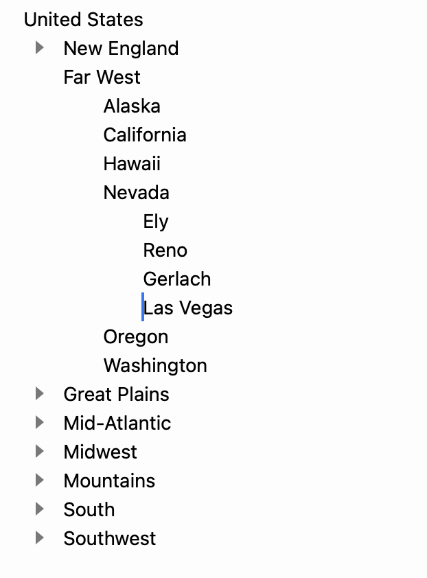
Here’s what it looks like at the moment when you have enabled the hide controls when typing:
1 Like
I like that.
- Enough information to show where lines are hidden by folding,
- and nothing redundant for the eye to decode.
Very good for focusing attention on the thoughts and words themselves.
I suppose my question was fundamentally about what’s wrong with using the existing outline handles as focus buttons. Plus, now that you’ve killed the hover-over effect, you’ve freed the graphic up to denote focused handles, haha.
My thinking is (and I’m probably wrong, I know nothing about app design) that basic outline navigation should be a function of the outline handles, not the “text” section. A really badass solution would be to have a little magnifying glass slide out of the triangle to the left when you hover over it. Double- or even single-clicking the vertical lines could also do the same job. Part of the reason I’m considering this is if there is ever a companion iOS app, the focus arrows may not be too popular on tiny screens.
That said, I don’t think they’re that intrusive on mac. Plus, ‘hide when typing’ in conjunction with focus mode should do the trick for everyone. It’s one more setting to remember, but hey… ![]()
Please try preview release 131. It cleans up a number of things and adds and editor setting to hide secondary controls when typing. “Secondary controls” are the outline controls that are grayed out by default since they do not indicate folded or focused rows.
This is a reasonable design, and it’s the design that many web outlining apps use. For example in workflowly the default click on handle behavior is to focus that row… but when you mouse over the handle another arrow pops out that you can click to expand/collapse the row.
With that said I don’t really like that design! ![]() It just feels to finicky to have to first mouse over handle, and then second move mouse sideways to click arrow. I would rather just have a simple visible button to click on.
It just feels to finicky to have to first mouse over handle, and then second move mouse sideways to click arrow. I would rather just have a simple visible button to click on.
It also is reasonable to want to use the row handle for all outline structure interactions… that’s where I started, but I just don’t see a clean way to do it. After a while assigning to many behaviors to a single element starts to make things more complex then just adding two elements.
For what it’s worth I am looking at the focus arrows as a form of auto-linking. Right now Bike hyperlinks work by placing a clickable arrow at the end of the link text. Focus arrows are similar… they place a link arrow at the end of a row.
@jessegrosjean Love the new preview! The option in preferences to “Hide secondary controls when typing” works so well! I didn’t think I would use that option, but tried it out and it works very smoothly. Very nice that the little symbols are gone when I’m typing, there when I’m “fiddling” or “editing”. Thanks!
3 Likes
I like the new preview as well! Buttons hiding while typing is a nice addition, and it being toggle-able feels like the right decision. I do notice everything feels harder to read if the faint triangles differentiating each row disappear and I have lots of nested hierarchies. I think this happens when rows are on top of one another at the same level in the hierarchy, where it starts to become difficult to tell when it’s a totally new row and when it’s just the previous row wrapping.
I know I’ve previously written about this issue somewhere else on this forum and that increasing the row spacing helps with that issue, but at the moment I would say I strongly prefer disabling the new “hide secondary controls when typing” option + having 0.0 row spacing, instead of enabling it + having row spacing greater than 0.0.
But generally net positive!
1 Like
+1
1 Like
Just want to chime in and say I am a fan of the arrows!
I think its better to keep focusing and folding separate, and I’m sure I will get used to associating focusing with clicking at the end of the line and folding with clicking at the beginning. The colors don’t seem too cluttered to me with the default dark/light UI. Its nice to have another solution instead of having to cmd + click the caret if I want to focus in using the mouse.
1 Like
Still working away on this release.
I’ve changed my mind and added a setting to hide focus arrows. I also added one to hide guide lines. The editor settings panel is getting unwieldy, but it already was, and I hope to fix that up soon.
I think this release is pretty much ready to go, but I’m still holding it back to see if I can get license upgrades working for the release… not working yet, but maybe by next week.
While I wait on some help on that I’m going to work more on path queries… fun feature for the future.
3 Likes
What are guide lines? I must be missing something obvious but I don’t see them. I don’t remember every seeing or using them either. I do see in one screenshot above some guidelines, but weren’t they only briefly in a beta and then removed?
They have been in Bike for a long time, but they are pretty light in color:
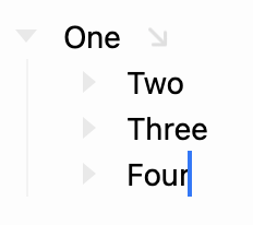
You should be able to see the guide drawn down under “One’s” handle? My intention is for them to be light, but visible. I think they are in the default color combinations, but if you have custom colors some combinations make them almost invisible.
Ah, got it now. Yes, they are pretty light for me. That’s fine, as I really want them “off”. Thanks for providing the option. Nice preview update!
1 Like
About guide lines: I find when you’re several levels deep their usefulness becomes muddy because it’s just a bunch of lines.
The ways I’ve seen code editors solve this is by making them visually different in some way: different colours (which isn’t terribly aesthetic), different line thicknesses (maybe depending on which line you’re on?), etc.
It’s one of those things that feels like it could be extremely helpful for navigating an entire screen-full of words by eye, but still has a little bit to go.
This could be helpful, but I don’t think it is right for a Bike default setting. Remind me when I get to implementing themes and I will see if I can allow setting individual guide colors through a theme.
1 Like