Spent last week and a half on website stuff getting ready for making Bike more public. End result is surprisingly similar to what was already there, but at least I’m more confident about it. Do let me know if you see where I can improve things.
I also released a few changes for Bike 30:
Scale guide and drop indicator lines with font size
Foreground/Background color settings require a license
Fixed Focus In/Out animations to animate text caret correctly
Fixed problems where pasting from Bike into other applications wasn’t working
User guide is still a mess. Once I get that in a better state then will make Bike forum public so anyone can try Bike out. Will address any problems that come up and hopefully be ready for 1.0 soon after that.
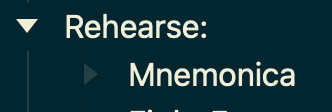
On items with no sub-item, there is a tinted triangle:
I would prefer that triangle to be a dash: — or even a “L” shaped line.
I can’t explain it well but the triangle (even a tinted one) makes me think & feel that the item should contain a sub-item. A line would be better, IMHO.
Ha, yeah I needed some for scripting demo video. Been a long time since I working on an AppleScript dictionary, easier than I remember. Will likely change everything a few times before AppleScript support settles down. But I am considering adding supported (AppleScript) scripting support for 1.0.
“Real” scripting API will still be javascript based (run in app context) and released after 1.0.
You are probably right, but I’m going to wait until I have theme system in place so these sorts of visual tests are easier to iterate on. Abstractly I still like it as it is, but hard to say for sure since I haven’t tested other views.