Since the disclosure triangles don’t rotate, I think I’d prefer the filled/unfilled circles of Taskpaper. I find that they more easily fade into the background.
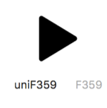
FWIW the current triangles seem a bit chunky to me. A caret might look better to my eyes, but I think a non-rotating caret might break expectations more than a non-rotating triangle.
I agree there’s something imperfect about using triangles that don’t rotate when in most contexts they do rotate. With that said I still prefer that they don’t rotate.
Carets go better with new macOS finder style, but they look to light to me. It would also mean that collapsed items wouldn’t pop out so well since not so many black pixels.
Bullets are also a reasonable approach, and make some sense without rotation, but I just tried and for me I just like the triangle’s look better. They more distinctly say “outliner” to me.
Post 1.0 I plan to add theme support, and I expect themes will allow you to change the default handle shape. There’s also ideas to explore around item types (for example if there’s an auto-numbering ordered list type, how does that numbering interact with handle) … or just using handle shape as a customizable decoration. Dave Winers “Drummer” outliner allows you to assign arbitrary font-icons to items.
So in summary, probably keep as is, but longer term should be customizable and I might revisit defaults when adding future features.
FTR I think a non-rotating icon is the right choice for this kind of app. (TaskPaper’s stubborn refusal to adopt UX fluff is the reason I love TaskPaper.)
And that theming option seems like the right way to allow customization
The only other disclosure triangle change I’d like to see: slightly-rounded corners, like SF Symbols.
In the latest preview you can customize handle by putting handle.png into Application support folder. I think around 32x32 size is good base size. To find the application support folder go into preferences and there’s a button to open it in Finder.
Eventually this will be done through a stylesheet of some sort. Right now I’m just looking for a better default then what I currently have. I still like what I have quite a lot and don’t really expect to change it, but I’m willing to try. Please post anything that you come up with and I’ll give it a try. Thanks.
My complaint about the current triangle is that it’s too obtuse, so I can’t as easily move my attention from marker to content. Something closer to an equilateral triangle would clearly point to the content.
As of Bike (220) you can try alternatives by placing an image named “handle.png” into Bike’s application support folder. That folder can be hard to locate, but if you open Bike’s preferences panel there’s a button that will open it directly.
With this “handle.png” feature, is there a way to specify handles that do rotate? My brain internalized flippy triangles that flip from the Finder circa System 6 any triangles that don’t flip feel wrong to me. I get the outliner history of triangles that don’t flip — I have been reading Dave Winer’s blog since like 1994! — but they will never feel right to me.
My other problem with Bike’s style of handles is that the handle for a node with no children is exactly the same as the handle for an expanded node that does have children.
I’ve always thought that a grayed-out triangle semantically implies “no children”. That makes sense to me — no children, so there’s nothing to expand or collapse, so it’s grayed out. But my instincts say that if there are children, the triangle should always be black, and either point right (collapsed) or down (expanded).
These are my personal preferences and they’re based on my own instincts/sensibilities/experience. Not saying Bike’s defaults should change to match them. (But I’d like it if they did!)
I don’t think I’ll change handle options for 1.0, but will revisit when adding stylesheet support in some later release. I’m worried I’ll create a mess of options that just all break again when I do styles.
My two goals with handles are:
Fade into the background, I just want to focus on my outline text. I think they do this best when they all look the same.
I want a strong signal when part of my outline is folded. That’s something I can’t see by viewing my outline text, and so that’s when I do want a handle to look as different as possible.
I agree with this take—in 1.15 Preview 154, I’m seeing the triangles rotate, but then they turn grey once “opened.” This is visually confusing to me. I would rather they rotate but just stay black. Grey would indicate there’s no children. Turning grey AND rotating when there ARE children—I don’t understand how that makes sense.
Bike’s been inconsistent on this. I believe Bike started out with current (1.15) behavior, then changed to (dark means has children) and then I changed it back to current behavior in Bike 1.12. This will be styleable in the future, but I expect to keep the current behavior as the default.
I have a few reasons for this:
I think the biggest difficulty with outliners is that you can get confused by hidden content. The current design is intended to make areas of hidden content stick out. Anytime you see a bright black control it means click to see hidden content. Anytime you don’t see a bright black control you are guaranteed that there is no hidden content. This is true for both handles and for focus buttons.
This design has a secondary effect, more often handles are light grey and fade into the background. For me, this makes it easier to focus on the outline text content. For me outline controls should be secondary to text content and fade into the background, except when they are indicating that content is hidden.
Yes, I can see that, that actually makes sense when you put it that way. As long as the outline indentations are visually noticeable enough to make it obvious when there are visible children. I can think of it as the triangle turning black (solid) as if it is getting filled in with the content that it is folding into itself.
I’ve noticed something today that seemed like a bug but is probably intended behaviour, but I’m wondering if it can somehow be made more obvious. I don’t know how to describe it with words, but the issue is that I couldn’t see that I had an empty row dictating the level of indentation for the next row after I press return.
My brain is having a hard time keeping track of all the edits in that video .
Is the root issue the rule that inserts new rows at the indentation level of first child (if that child exists)? And in particular the issue is that if the first child has not text content, then it’s difficult to see that indentation will be applied until you actually press return?
If this describes the problem, I think this same issue has come up before. I agree showing the handle in this case for the empty line probably makes sense. Anyway, please let me know if I have understood the issue correctly.
Sorry, I had a hard time reproducing the exact steps. Yes, I think we understand each other. But the more I think about it, the more I’m not convinced it’s an actual problem rather than a design feature of Bike I appreciate (hidden triangles), but needed to understand first.
I was expecting Bike to ignore children and make a sibling to the current row when I press return. After trying out OmniOutliner and Drummer, I see that the behaviour is the same as Bike’s which is to make a child at level of first existing child. Even Craft seems to follow the same logic. But markdown apps like Bear and Ulysses do exactly the opposite. I guess that confused me
I don’t think I would want to change any of Bike’s behavior. But I do think that I will make handle visible in this specific case …
When no text content
When first (and only) child of a parent row
Or when first child of a parent row, AND indentation doesn’t match next child
So basically just make the handle visible in cases where it will affect editing. Generally I think it’s a bit of an “error” to have outline in this state. So it also will just help to point out that something weird on this row.


 .
.