This may be addressed in your new beta, but in the first beta the icons are not lined up with the text. I’d guess icons are 6px or so higher than the text. In addition the info at the top is squashed in a way that makes it “ugly”. For both issues see screenshot below. Using iPhone 17 Pro Max in portrait mode. (In landscape mode the list of projects, tasks, etc. looks fine.)
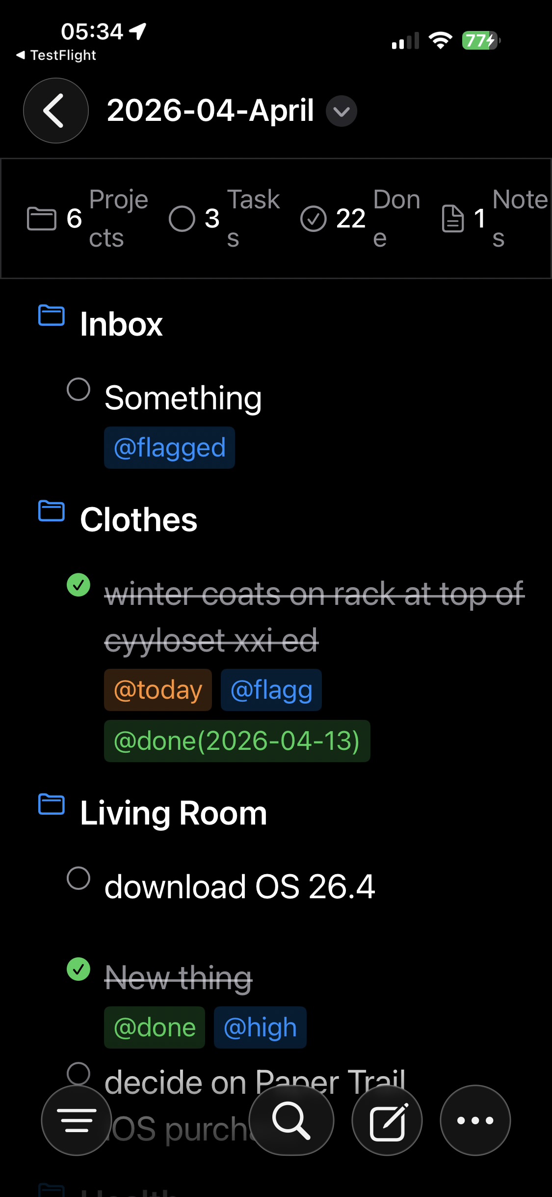
Thanks for flagging that. There’s a lot of accessibility work still to be done, and better support for larger type sizes is on that list. This specific problem will be fixed in the next beta - I agree it’s ugly and would be jarring when in use.
Hello. The approach you are taking with this app looks very interesting. Might you at some point be opening up TestFlight again for more beta testers? If so, I’d love to join. Thanks!
I’ve opened up some more slots. Keep in mind that it is still an early beta, with a lot of features, and certainly a lot of polish, still to come.
TaskPaper Beta
1 Like
Just put the latest release onto TestFlight. Had hoped to have it out sooner, but life etc …
- Added much-requested floating Quick Add button - turn on in Settings
- Change Quick Add button to be a + as a more recognisable new item icon - thanks for the various feedback on this
- Corrected line spacing and alignment, especially with larger dynamic type sizes. Thanks @mitchellm for highlighting this.
- Added a Quick Add option to context menu - will create a new item of appropriate type and indentation depending on selected row. Feedback on logic for the new items appreciated.
Holy crap, this looks nice! Can I get into the beta somehow? 
There should still be spaces on the beta. Link 2 posts up
Thanks! I got it. Icons looks weird a bit, but the app looks pretty well made.
The app is still very much a beta, and still needs quite a few features and a lot of polish adding.
Can you expand on which icons look weird, and in what way? Always keen to get feedback at this stage. Thanks.
The app icon feels off with the iPhone in it. Also, Apple will probably complain about that since they’re pretty strict about developers using their hardware icons.
Oh, agree with you there. I was quite surprised it even got through TestFlight review 
It was just a quick LLM one I did as a placeholder, as I was short of inspiration.
The new beta is looking much better! Thanks for the improvements. Some things don’t work (or work as expected) but I’m guessing those are features that are still being worked on. (Very sorry that I can’t remember exactly which features gave me a problem … I tested out on a walk yesterday.)
I’ve had a couple of feedbacks around UI misbehaviours that I’m just starting to look at. Sorry it’s taken while but the Day Job has been demanding some attention…
Some things I’d value feedback on:
- When you edit an item it brings up the full raw text (- prefix for a task, and : suffice for a project). Is this helpful, or would just the text be more use (the item type would still be preserved). I’m starting to lean towards the latter now.
- When quick adding a task via the button, if the file is empty it adds the task at the top level; if all tasks are the same indentation, it appends to the list at the same indentation, but if there are projects or varying levels of indent it uses/crates an Inbox project for the task. Is this optimum, or would it always be better to use the Inbox project (which will probably be what happens 99% of the time)
Also, now I hopefully have a bit of time, anything else you think should be on the already long list of things to add/fix?
- Would prefer raw text, but in its current implementation deleting
:at the end of the project title does not change the project to an ordinary task, so it does not matter a lot, thus it adds about noise. But I would prefer a more dynamic approach like changing from a project to a task by deleting the colon. - Regarding automatically creating anInbox project I have mixed feelings. I’d prefer no automatic editing, though some user may prefer it. So, maybe it could be optional
Feature request: Improve indentation handling when moving tasks
When I drag or move a task to another location, its original indentation is preserved independently of the destination. For example, if I move a task under an already indented item, the moved task does not become nested relative to that new location as expected.
It would be helpful if moved tasks could adapt their indentation relative to the destination while preserving their internal subtask hierarchy.
Alternatively, it would be useful to allow changing a task’s indentation after moving it, for example with a swipe gesture to indent or outdent the task.
Thanks; really helpful feedback.
The indentation issue is already addressed and will be in the next beta. Totally agree with you about the indentation not making any sense  . I’m still looking at a few options for changing indentation by touch rather than through the menus; swiping is one option. I’d like to use a drag gesture, but I think it would be too imprecise and could get conflated with an up/down drag. I need to play wth it more.
The logic for where a quick-added task goes has been improved slightly in the next release. Making the inbox optional is an interesting idea, but still leaves the question where a task goes if there is no obvious placement. I guess top or bottom with zero indent, but on a large file would this lead to it being lost?
I would prefer the top of the file and no indent, which makes easier to process later. I currently have Apple shortcuts which prepends dictated/typed text to the top with @inbox tag at the end of the line
I’ve used @inbox in the past with various shortcut utils, and more recently with Raycast and AI tools, so should probably make it an option (if only for you and me!). The top is the obvious choice for discoverability. Thanks.
For indenting-outdenting the blocks, maybe a persistent keyboard toolbar could be helpful compared to the menu? What do you think?
Buttons for creating a task, a project, indent, outdent, @ tag, etc.
Not sure this is the aesthetic I’m looking for; it would require holding state of a currently selected task. I want to keep the interface simple and easy to scroll through.
It might work better on an iPad, especially with a hardware keyboard (but so would key combinations, which are also on the list).
I’m toying with a couple of other options to make such things easier:
- A set of buttons at the top of the context menu for quick access to common actions; eventually a customisable set.
- A set of floating buttons that appear when first tapping a task, that would then require a second tap to edit, or tap the buttons for common actions
1 Like