Another vote here for disappearing interface. I really like the way iAWriter does this. There’s no search area there, but the top bar, which includes access to the library and preview, just fades out when you start typing, so when you’re writing there are literally no interface elements. If you move the mouse near where the top bar should be, it fades back in again. Combining this with a hotkey for activating search for those of us who are keyboard centric would I think work very well for TP.
2 Likes
Big vote here for NewToolbar2.png (or something similar). Personally I would love to remove the title bar completely. If you can combine a simple search icon into a colour matched title bar that would be awesome!
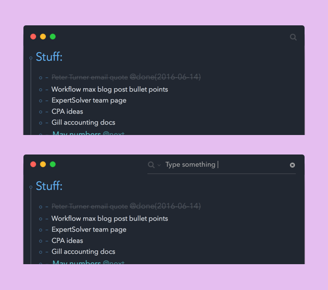
I don’t use the sidebar myself, and have a dark theme applied. So based on those two things, here’s what I would love to see for search (and removing the standard app titlebar frame)
4 Likes
For the most part I’d imagine TaskPaper-ers prefer keyboard shortcuts anyway, so perhaps it’d be viable simply to hide the search box along with the toolbar entirely? In the current version you lose access to search when you hide the toolbar, because hitting ⌘⇧F has no effect. Instead, that combo could pop down a floating search box, Chrome-style.
The problem with this suggestion is that it’s much more common to leave a search “active” in TaskPaper than it is in a Web browser or a normal text editor. It’s necessary to keep the search query visible while you’re working, and a floating panel becomes unwieldy if it sticks around too long. Displaying the current search in place of a title bar, as shown in @mposborne’s mockups, might be the nicest approach.
1 Like
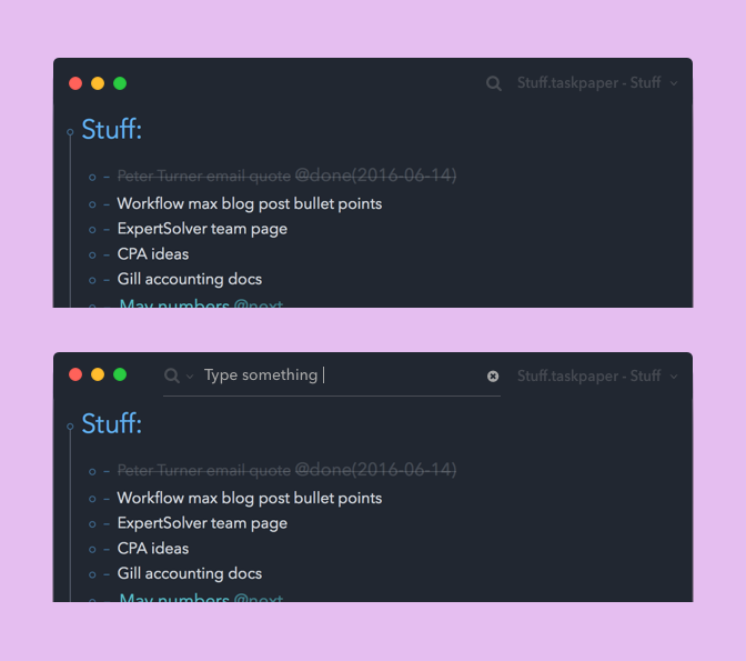
That mockup looks nice. Thanks for submitting. But one constrain that I think TaskPaper has is that it needs to always display the filename/icon in the window titlebar. It’s not necessary to show the standard titlebar background, but do need to at least show the titlebar text and icon.
1 Like
Maybe something like this? Search box pops up as @00dani suggests, whether by hot-key or menu etc., (or click on red text); Search text/criteria then remains on the page (just under the section header)…
Possible, but I don’t think I want to mix the search text in with the content text. I see search text as UI which should be kept separate.
Right now I’m still in the process of cleaning up and converting large parts of the cocoa side of TaskPaper to Swift. I’ve got at least a week or two more of that. Once I get that done then I’ll start getting active with search bar UI thoughts again.
1 Like
Sorry Jesse i’ve had a busy week and haven’t been able to come back to you. That’s a very valid point. I actually never noticed that before myself, I never use the title bar filename/dropdown thingy, but to retain such a feature i’ve modified my mockup slightly as to how that might work. Obviously there would be a minimum size constraint to fit everything in, depending on the proposed width of the search box and the filename length. But you could probably drop the file name, while maintaining the dropdown arrow at these minimum widths, much like how you would show and hide certain things on a responsive website.
Also I see currently you appear to have a minimum window width set at about 300 pixels so you could always increase this minimum a little bit.
2 Likes
maybe i am late to the party, but i´d love to see something like the sublime text command/Goto palette (fuzzy search!) implemented. Ideally, it would combine filter, goto, commands, …
Example:
- Invoke Palette -> List of Projects
- Type your search Term -> List of Findings
- Type “@” -> List of Tags
- Type “#” -> Taskpaper Search Syntax Mode
- Type “+” -> Your own custom commands/scripts?
- …
This is on my own wish list too. I’m not working on it now, but it’s on my list.
1 Like
That´s great!
But my suggestion would mean to get rid of the search toolbar in favour of this sublime-text-inspired “action/search/filter”.
Although I am truly late to this party, I’ll cast my vote anyway. I quite like NewToolbar2. Add a vanishing UI when not in use and it’ll truly make for a cleaner interface. I’m all for that.
I also like the mock-ups done by @mposborne. The only issue I have with these mock-ups and the vanishing UI concept is: how will they work/look when we factor in the sidebar.
Hi Jesse, some choices for hiding the toolbar might prevent you from using Sierra’s new native tabs in the future. Not sure though.