This is an interesting one because I use one representation for display (because it looks nicer) and another for storage (for compatibility). I will have to use the storage one for clipboard.
Again, something I have never thought to use! Will fix soon.
Will try to match official behaviour. It does follow logic, as it’s computer code, but my logic is clearly wrong as I indent relative to the line above, assuming that projects will have indented lines beneath but i guess that’s one assumption too far. I should go by what the doc has rather than any ideal scenario.
I noticed this too. Will see what I can do.
We are sufficiently in the weeds now, I think we need to move to GitHub for detailed working through the remaining issues.
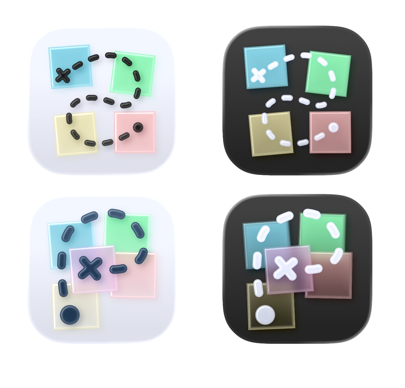
(Oops, it came out a bit pixelated — but that can be fixed.)
I tried to recreate what you had did. But I also experimented with a variant:
I wanted to add some more depth, as that’s something Liquid Glass likes. (However, you can’t have more than 4 layers…)
I also tried to make the trail into a P — and to make it thicker, so it would be more visible in small sizes.
This was just something thrown together quickly — so feedback is appreciated! And if it becomes good enough so that you want the proper .icon file, just let me know.
Nice work @Erlend — I like them! The P is a cool idea, even if the execution here IMHO needs a little more work.
As a developer with limited time, I’m not in a hurry to support iOS/macOS 26, which I feel is going to give everybody a very bumpy and rough 2026. Particularly on Mac. I will try to install it in a VM soon, though I realise we are so very close to release. I also need to buy a new iPhone as I’m still rocking an XS from 2018.
I did imagine the coloured paper moving in parallax with the trail. I think I prefer the glass in the P icons, but my original layout. Food for thought!
I’m about to start another real work project, so my time on this will slow down but it will progress as I’m really enjoying using my own app to track and organise progress on my own apps (my main one is a pixel art app for macOS that is very far along)! The circle of life.
Yeah, the placement is difficult… (And I’m, by no means, a professional!) I interpreted the way you tilted the notes to mean that you wanted it to look a bit “messy”. But making things messy (while still looking OK) is harder than making things neat. I also tried to not make the P-trail too uniform either.
The idea I went for was to make it so the beginning (dot/yellow note) was at the bottom (in terms of depth), and then stack them on top of each other until you’ve reached the goal (the X/pink note). And as the trail needed to touch each note, they were also in a vague P-shape. But as App Composer only allows for 4 layers (and the trail had to be the top one), I had to make it so the yellow, blue and green were in the same layer (which meant these couldn’t overlap).
I’d be happy to make adjustments if you want me to! I do believe you can ship with icons from Icon Composer (.icns file) even if the app isn’t built for OS26. And if not, I can create exports.
I’m on a 13 Mini myself — so I haven’t been in a hurry to try the betas this year either.
Any news about new versions will be delivered by TestFlight.
As I mentioned on GitHub, I work on multiple apps at the same time so your patience is appreciated.
If something is not working—and is not already reported on github—please file an issue there. If you’re asking when the final app or a feature you want will be released, then please be patient.
I’m happy that you’re using and looking forward to improvements in the app.