I’m quickly falling out of love with this design and am beginning to appreciate TaskPaper’s design… will likely take out the display mode setting in choice views and instead just copy when TaskPaper does.
Hmmm I’m going to be honest, even though I can’t emphasize enough how excited I am about heading navigation, I still don’t grasp the difference between ‘list’ and ‘outline’ beyond ‘outline results are cleaner because they don’t have that second line of grey text beneath each result’.
I just tried a test where I tried to navigate to a second-level-deep heading using both list + outline separately, and neither surfaced the correct heading, but I’m not understanding why.
Another example: I’m not sure what it means for outline mode to ‘display results with indentation in natural order’. Are the results supposed to appear indented?
I think this is a good indicator that I should remove those options and just pick a single option ![]() But here’s the logic:
But here’s the logic:
-
Flat list option. This is what every other “choice box” that I’ve fun into uses. First the search pattern is matched against all items and match scores are calculated. Second those items are sorted by score. Third those items are displayed in that sorted order. Since items are not out of context (ie a child might be sorted before a parent) each item is also displayed with the ancestor path in light gray. A nice thing about this approach is that all the top matches are together at the top of the list. A bad thing about this approach is that it is pretty hard to tell where items are coming from in a big outline.
-
Outline list option. The search pattern is matched against all items. For each matched item the matched item (and its ancestors) are inserted into the list of matches. Nothing is sorted by score, instead the original hierarchy of items is just being filtered. The advantage of this presentation is it’s much easier to see the outline structure. The disadvantage is that it’s difficult to find the top scoring match… it’s likely not at the top of the list of item. Right now I am selecting it, and then maybe scrolling to show… which causes its own confusion.
What I’m working on now:
I think I will replace these options with TaskPaper’s approach which is:
- Initial list of items is presented in outline.
- When you start searching the outline structure is filtered (like above), but then it’s also sorted by match score. This makes top matches always show up near the top of the list… maybe not at the very top, since ancestors are also inserted into the list, but always close to the top.
This sorting of results while still maintaining hierarchy is a bit more complex to explain, and that’s why I initially rejected it. But while a bit hard to explain, I’m finding the actual results easier to browse and make sense of. Top matches are near the top. Matches are always shown in containing hierarchy.
1 Like
Can you give example where this happens? I do think the scoring order could be tweaked some, but I haven’t seen cases where things that should have been matched are not matched.
I’m using only the outline list approach and like it a lot. It seems natural and easy for me. Flat list doesn’t fit for me at all. The combo approach you are describing might work fine. To be fair I’m working with shorter outlines … maybe in the case of long ones the combo approach you describe would be better … hard to know until we can try it out.
I’ve just posted version 149 which removes choice view display settings and instead always shows outline. When a search is active the outline is sorted by match score quality. So outline items will change order, but for any item you’ll always see it’s containing hierarchy. Details bit complication, but I think it works pretty well in practice.
I think, unless I all of the sudden change my mind, this version is getting close for release. So nows the time to speak up if you want some tweaks or see some bugs! ![]()
Edit Also I’ll be away for most of day, so my responses will be delayed.
1 Like
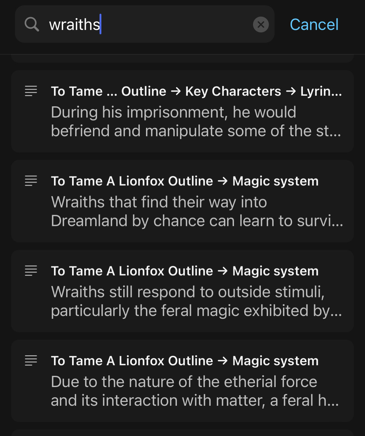
Just tried playing with this. I think the outline approach is great. I was able to find things I was searching for in my ungodly project file I copied over from Taskpaper.
A few things to note:
- Exact matches returned some unexpected results. E.g. I have the term “beta readers” that appears in multiple points in the outline, and the search returned exactly-matching items that are positioned lower in the outline before items that are higher up. This is still manageable because I can see the ancestry of the item I was searching for, but still unexpected (I would expect to find items higher up in the outline first). Maybe this has something to do with outline depth. I can’t tell which of the “beta readers” items are deeper indented than the others, but at least the two top-level results are the same depth.
Also, maybe a visual distinction between matching items and ancestry would be useful? I can see the highlighted match text, but I understand the basics of how cmd+P works just because I read the forums
- If I set the focus setting to include items <= 10, I just get the level 1 list. It works fine until level 9.

Sorry, I mean in the “Focus Heading” choice box.
I’m going to leave this for the next release when I really focus on the outline path implementation. The basic problem is all values are strings at the moment, so it’s doing a string compare.
1 Like
This is intentional, but maybe there is a better approach.
They are out of order because I’m giving an extra bonus based on item length… shorter items get a bonus. I might change how exactly I calculate that bonus, but it seems to me that some sort of bonus is useful. Of course the fuzzy matching algorithm has all sorts of bonus built in, so adding another makes sense to me.
I guess I could be convinced that there’s logic to not using any bonuses for prefix, suffix, and exact match searches. I think that is what you are asking right?
Yes, though it was just an observation. I guess I was expecting results to be return in order as they appear in the outline because outlines have deliberate hierarchy when we build them. That said, the app Craft for example returns results in an order I don’t quite understand either. I think a clearer distinction between actual matches and the containing ancestors would be the most beneficial change. I’m including a screenshot from the iOS version of Craft to illustrate what I mean, though I understand it’s quite an UI overhaul ![]()
I think generally that’s not how this style of UI works. They almost always sort by some scoring metric.
I did have a similar option in one of the recent preview releases, but in the end decided against it. It’s too much work for my brain to translate from what I see in the editor (where hierarchy is defined by indentation and newlines) to that style of single line hierarchy separated by delimiters. I did just look at Craft on macOS and they provide an interesting solution, showing each match in context of actual document thumbnail. That’s a cool solution, but more work, and I’m still not sure that it helps me make sense of things as fast as I can with current setup.
For now I think I will continue to sort by match score. I’m looking now to see if I can find a better match score algorithm.
Eventually you will be able to filter your outline by a search, and that will preserve outline order. I could also imagine a find+replace implementation (like what MSWord and many Code Editors have) that would show many matches and preserve outline order.
Just for this particular “Go to” UI I want “closer” matches to show up first and be automatically selected.
To be clear, I don’t really have a preference to showing results in outline order. Once you get used to the tool, it becomes second nature ![]()
It’s a cool gimmick on macOS, but Craft is intended to be more of a visual-document-oriented app than Bike (currently ![]() ). I suppose it makes sense there if you want to make quick visual changes to the way a document looks, not sure if it benefits finding headings any more than Bike’s UI does.
). I suppose it makes sense there if you want to make quick visual changes to the way a document looks, not sure if it benefits finding headings any more than Bike’s UI does.
I did a few more rounds of test searching and I can’t find any differences between using Craft’s Search / Quick Open function and Bike’s Focus Heading. I can find matches quickly in both, which is excellent. The only thing I don’t still understand is how decides to Bike truncate a heading (like…this to return match) vs. when it displays the heading text without showing the highlighted match. See below for example:
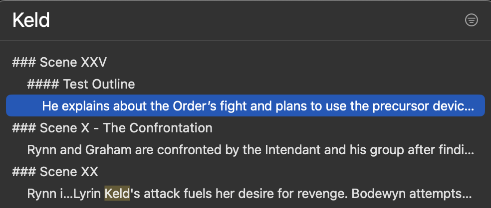
I was just wondering about that this morning… it’s a bug, and I think I fixed it for the next release. The “goal” is to make sure that at least the first match is visible. I also want to make sure that at least 6 letters from the start of the string are visible. So what I try to do is:
- Is a match visible in the visible text? Then done.
- If not then delete text from position 6 until the first match index becomes visible.
The bug is that I wasn’t doing that correctly. For one I wasn’t accounting for text indentation. I also wasn’t accounting for some other spacing. I expect in the first “He explains about the …” there is a “k” a few characters later in the text after the truncated part.
There are three more words after the truncated part before the first K appears. There is another full sentence after the truncation before the first K appears in the second match. Let me know if you need the whole text.
I think that might still be the same bug that I fixed. But if you have a chance, yes, please do send me the text. I just need text of that paragraph + whatever your font settings are.
I think this is fixed in latest preview 150.
1 Like
I’ve just posted version 150 with a number of tweaks, and then I also added back some display settings… but different than the last ones!
The option are now:
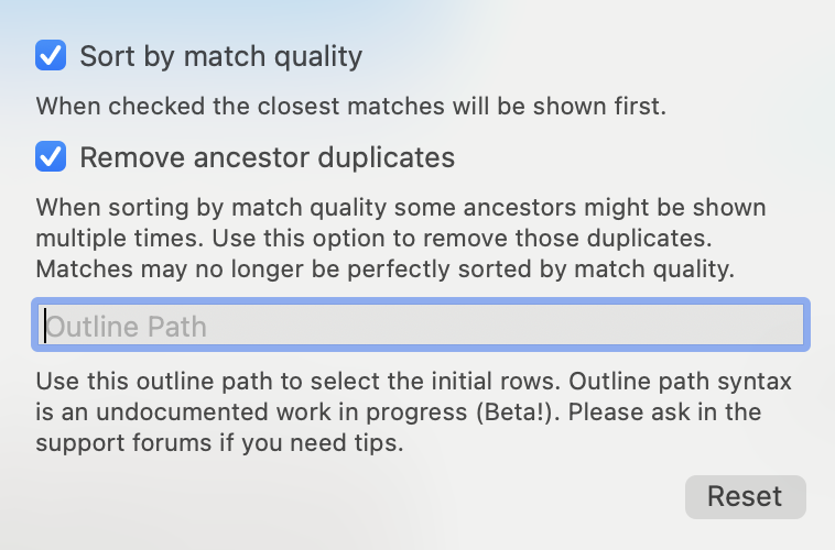
Please try out some “Go to heading” in a large outline with outline path cleared so that there are lots of rows to filter through. Then add some filter text. Then click the choice view settings and try the various “Sort by match quality” and “Remove ancestor duplicates” options. The updates should live update.
Do you have a preference? Do you think that it makes sense to keep options, or does it just make things more confusing? At the moment I’m leaning towards a default of:
- Sort by match quality: Yes
- Remove ancestor duplicates: No
That combination has the advantage of always showing top matches near top of screen. It has the disadvantage that the same ancestor might show up multiple times in the matches, maybe looking like a bug… and just making for longer lists.
If you set Remove ancestor duplicates to Yes then the duplicates are gone. The cost is that only the highest match is guaranteed to show up at the top of the screen. Generally other high matches will also be sorted to the top, but they also must be fit into the hierarchy, and fitting into the hierarchy has propriety. End result is that often the second highest quality match is often not the second ordered match in the results.
2 Likes
Just realized there’s a bug where the choice view doesn’t disappear when you click away from it. Fixed for next release. That should arrive tomorrow.
1 Like