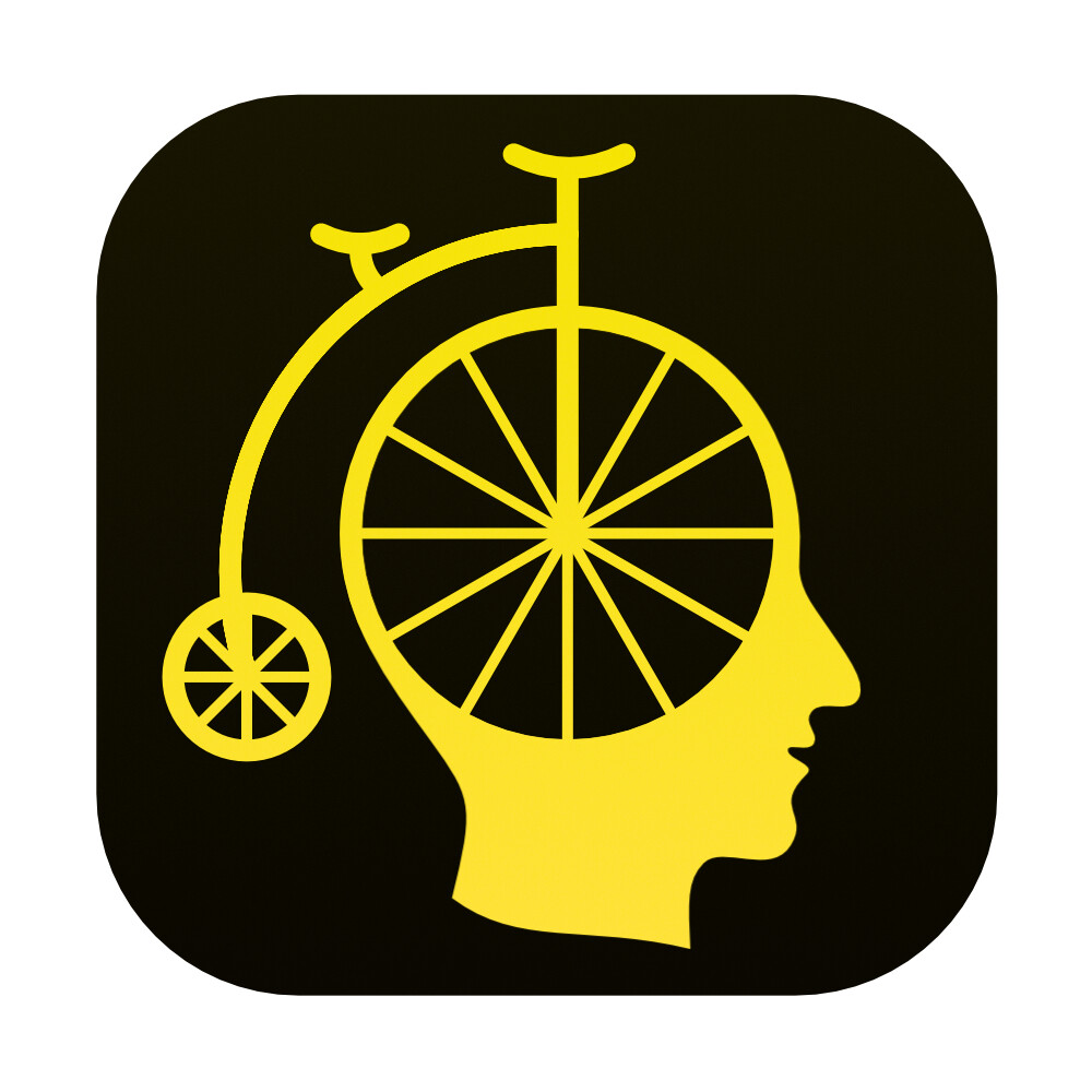
I agree: it’s the yellow background. It stands out and I love it!
3 Likes
The icon rocks, Jesse. It has character and all the better for it.
3 Likes
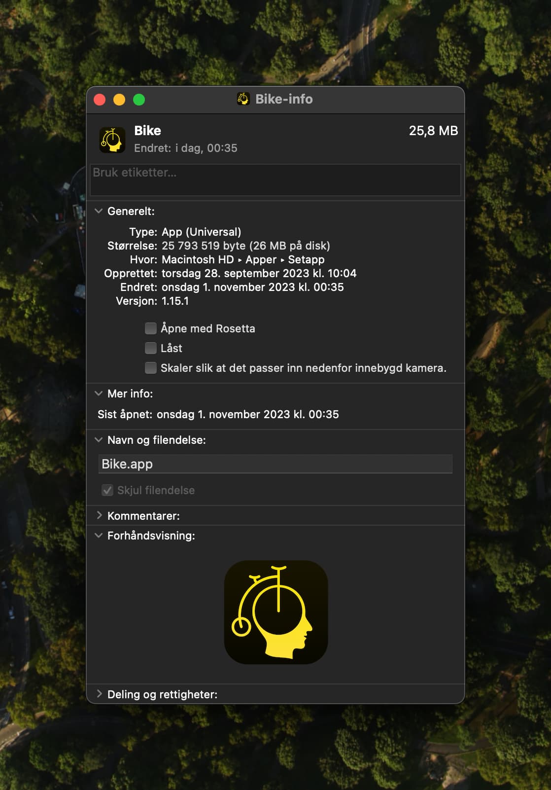
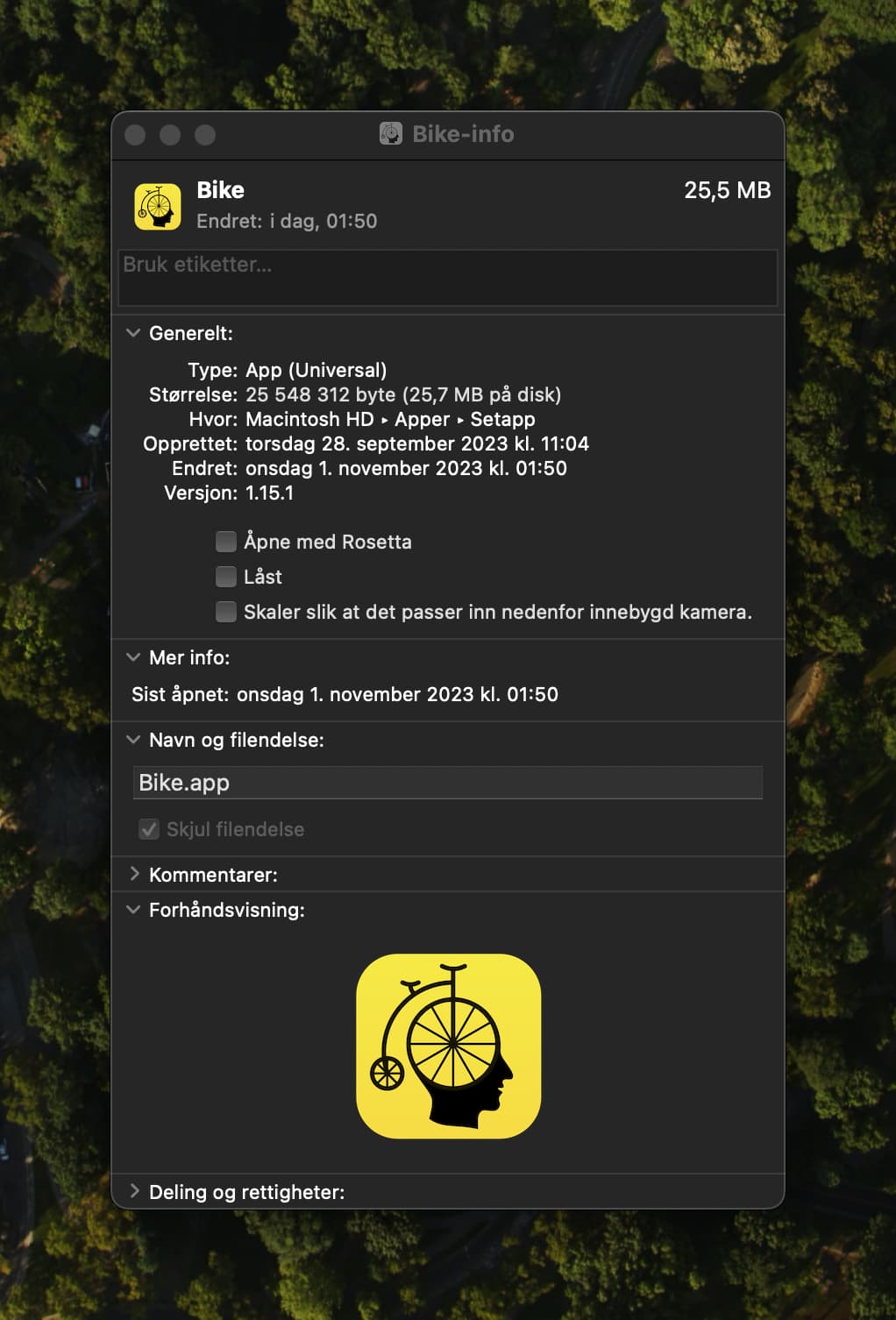
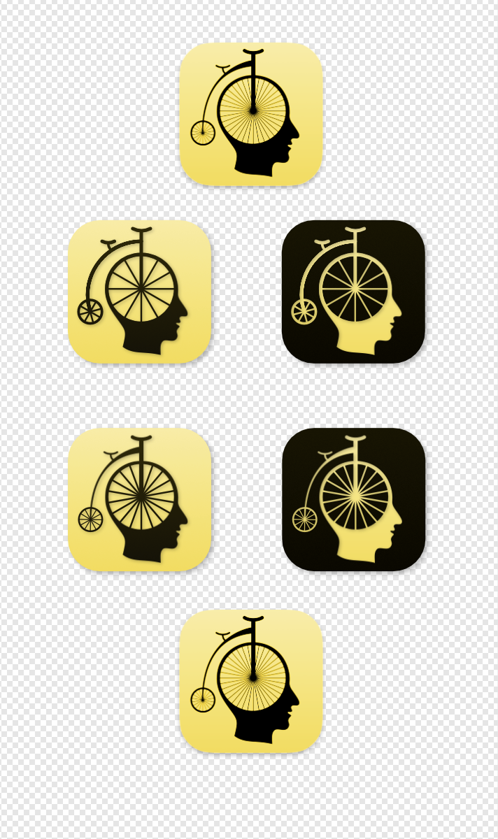
I’ve had a recent uptick in requests to improve Bike icon. Not sure that I’ll change anything, I still like it, but here is link to icon source files (as requested by some users) in case you want to experiment with your own version:
I had some time to kill before the Scary Fast event (that starts at 1 AM in Norway  ), so I worked a bit.
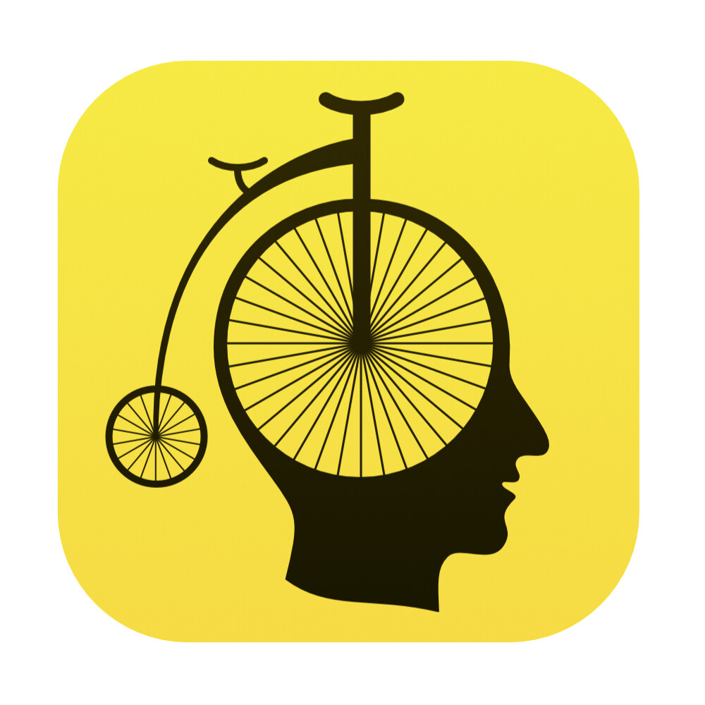
As you like the bike as is, Jesse, I didn’t simplify it (I also didn’t have time for more now!) - but I did some minor adjustments:
- The current yellow is very yellow, so I muted it just a bit - but I tried to still keep it pretty darn yellow.
- The current black is also very black (perfectly black, actually). I made just a bit brown, which I think fits well with the old-timey feel of the bike.
- To me, the original logo is a bit weighted to the right. The entire artwork is centred now, but as that is more weighted to the right, I felt it looked a bit more balanced shifted to the left. (Now the big wheel is almost centred.)
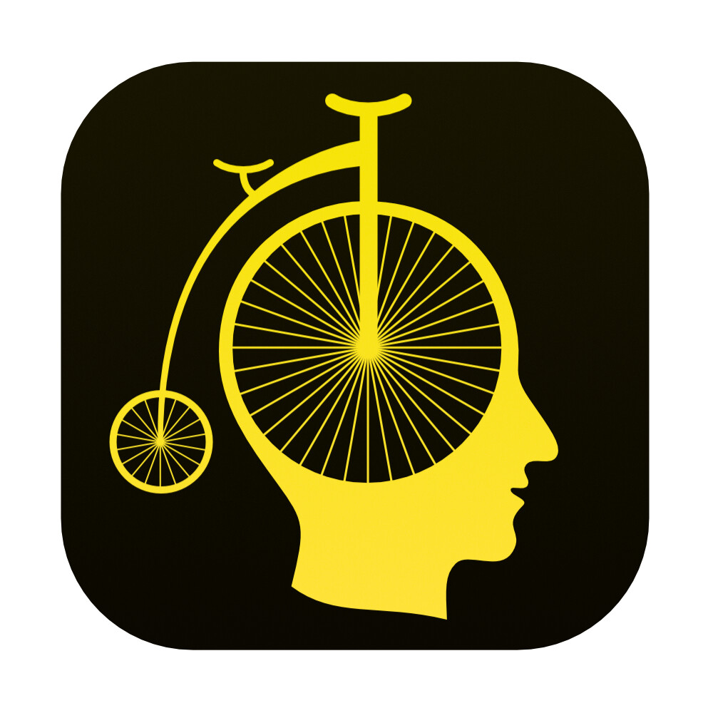
- Lastly I made two versions: Original black on yellow, and an inverted version.
Here’s the original logo above my adjusted and inverted:
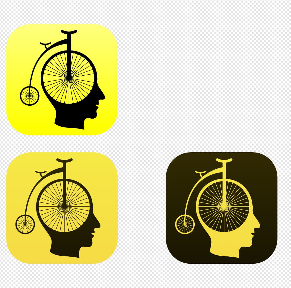
And here’s the files (the inverted edited a bit after feedback from NickSloan. It’s now less brown and richer yellow compared to the normal one.):
(Crop it a bit closer if you think the icon becomes too small!)
Edit: I saw that the forum changes the files to .jpeg! Here’s a Dropbox link for the PNGs.
Feedback appreciated, as I didn’t have time to work that much on it, and I’m pretty tired. 
2 Likes
I’m with you on the subtle lateral adjustment Erlend and also the change of yellow but not the browning of black. I think your reversed version works best, partly because the symbol itself and not the screaming background becomes the prominent element. But in this case I would dial up the yellow again, though to a richer bright yellow, not the original acid lemon.
I think both colours work well on the black on yellow (so non-inverted), including the browned black. BUT I agree that they don’t work as well on the inverted one. I was a bit lazy/rushed, so tuned the colours for the normal version, and then just used the same gradients for the inverted. 
But on the Inverted I agree with you: the black should be blacker, and the yellow richer. (And even though the version then won’t have the same colours, they would feel like the same.)
Will make a new version later today! (And update the post.)
Edit:
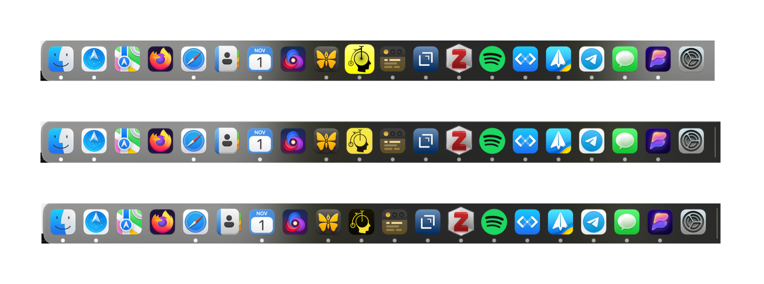
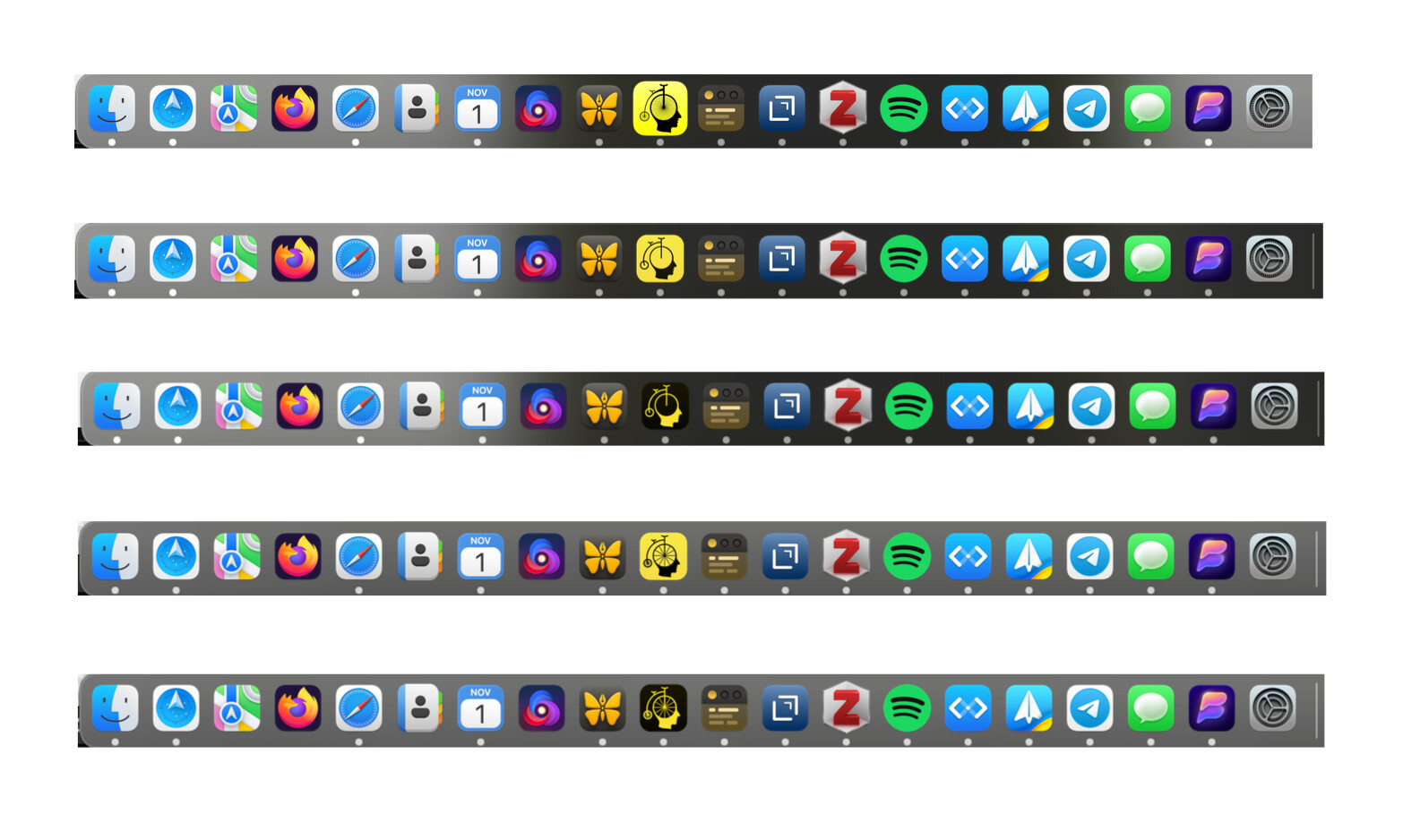
I changed the inverted one a bit, and updated the original post. Here’s pictures of the icons in my dock: 
(I think the inverted one looks more black and less brown when it’s small, compared to when view large in the forums here)
Thanks for sharing these modifications. I think I’m sold on the alignment fix, and warming to the color change, though I haven’t actually tried in app yet, just looking at images here.
Generally just looking at the images the dark one is very appealing. Though when I see it in dock image it all of the sudden is not as appealing and I like the light/yellow version better.
Comparing the old bright yellow to the new gradient yellow/orange… When I see them next to each other part of me still likes the clean/clear colors of the original. At the same time when I look at the new version on its own my color calibration sense quickly adjusts and I like how it looks too. In particular it looks good to me in the dock, and if others like it better I would consider switching.
I’m curious to hear what others think. In particular I’m interested to hear what people thing who have a bad reaction to the original icon.
Yeah, I have exactly the same opinion as you: I like the inverted when viewed larger, but the regular in the dock (for some reason.)
I would consider shipping with the regular, and perhaps having a link to download the inverted in settings. (Some apps, like Nova, also dynamically change with light/dark mode, which could be an option.)
I’m also interested in hearing what those who reacted badly to the original thinks. But, as I kept it pretty darn yellow and kept the busyness in the logo, I fear some won’t like it anyway.  (I kept those due to time, and the fact that you said you liked it.
  ) But perhaps they like it a bit more?
BTW, here’s the colours I’ve used now (the gradients are all the way from top to bottom):
Regular:
R-Yellow-top: #F6EA45 - hsl(56, 91%, 62%)
R-Yellow-bottom: #F6DB45 - hsl(51, 91%, 62%)
(So it twists the hue 5 points.)
R-Black-top: #312A02 - hsl(51, 91%, 10%)
R-Black-bottom: #181501 - hsl(51, 91%, 5%)
(So same hue and saturation as R-Yellow-bottom, but darker - and the lightness goes up by 5 point.)
Inverted:
I-Yellow-top: #F5E400 - hsl(56, 100%, 48%)
I-Yellow-bottom: #F6DB45 - hsl(51, 100%, 62%)
(Same hue twist, but 100% saturation and lightness adjustment.)
I-Black-top: #181501 - hsl(51, 91%, 5%)
I-Black-bottom: #0A0800 - hsl(51, 91%, 2%)
(I-Black-top is the same as R-Black-bottom, and then I-Black-bottom is even darker.)
Here’s what I would use as “standard colours” for when gradients don’t work:
(This is the same as R-Yellow-bottom and R-black-bottom + I-Black-top.)
Bike-yellow: #F6DB45 - hsl(51, 100%, 62%)
Bike-black: #181501 - hsl(51, 91%, 5%)
I’ve also updated the Dropbox link with updated files.
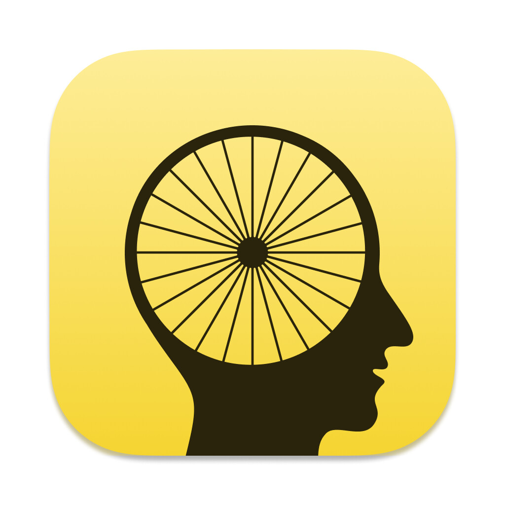
Now I get the time to sketch out my idea for a simplified version.
- I removed the spokes, as they kinda disappears when small.
- Then I made every stroke the same width (as the “head circle”).
- I also made a version that changes the bike frame to a (part of a) circle as well. I like how this gives some more space between the big wheel and the frame (especially when small). And I also just think the shape is pleasing.
Here’s some renders of the simplified versions on the website (with the old in the video as a comparison):

Here’s a screenshot of the “circle frame” in my dock, compared to the original. I especially think it’s nice in that small size.
Here’s the four different versions, also in the Dropbox if anyone want to try them out:
1 Like
Now I get the time to sketch out my idea for a simplified version.
Thanks, it’s fun to see and try these out.
Few thoughts… first I will apply some of these changes. I think color tweak and centering are helping. I’m experimenting with slightly less color tweak, but still similar.
My first reaction on the simplified is that I like, but soon after I miss the spokes. I don’t know if I’m getting it across, but what I’m going for with Bike (and maybe icon helps communicate) is:
- Old fashion, under promise, over deliver.
- Outliners were the big thing on old pre OSX Mac. I see Bike as coming from that tradition.
- With Bike I’m trying to create an outliner that has a bare bones old style feel, while at the same time providing great performance and modern innovative features.
- All that’s to say that the spokes while a bit busy, seem to fit into that goal/aesthetic.
- Maybe there are other ways Bike’s icon could reference back to pre OSX outliners while still feeling at home on modern macOS?
- I don’t know how much sense this all makes

One thing that I might try is add a preference to customize icon color. Kinda pointless, but also maybe fun.
I’m looking for other apps that allow you to customize icon colors. Any good ones that I should know about?
3 Likes
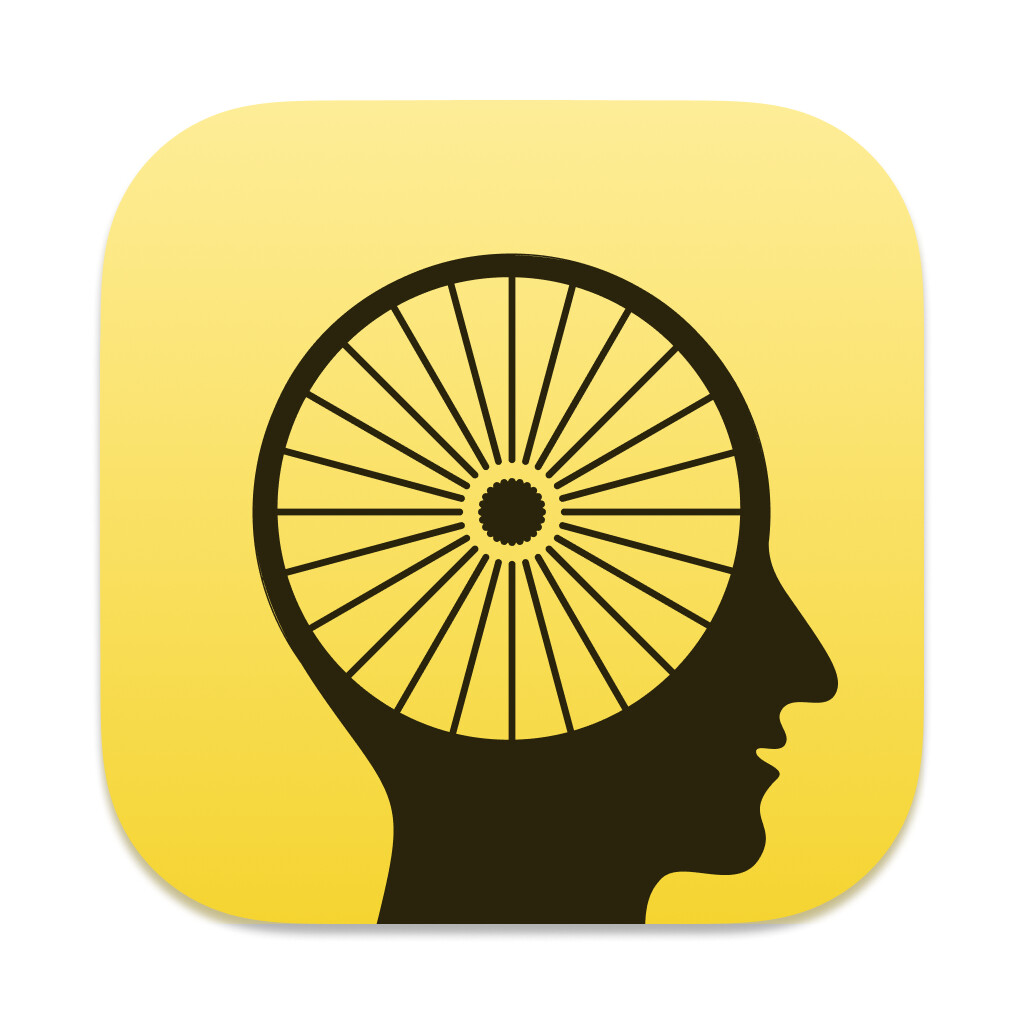
I added back the spokes, and gosh darn it - I prefer it with them as well.
Here’s it on the website:

(I also made sure the wheels are actually “touching ground” ant the same height.)
I made the spokes with half the stroke width, and used 12 for the large wheel and 8 for the small one.
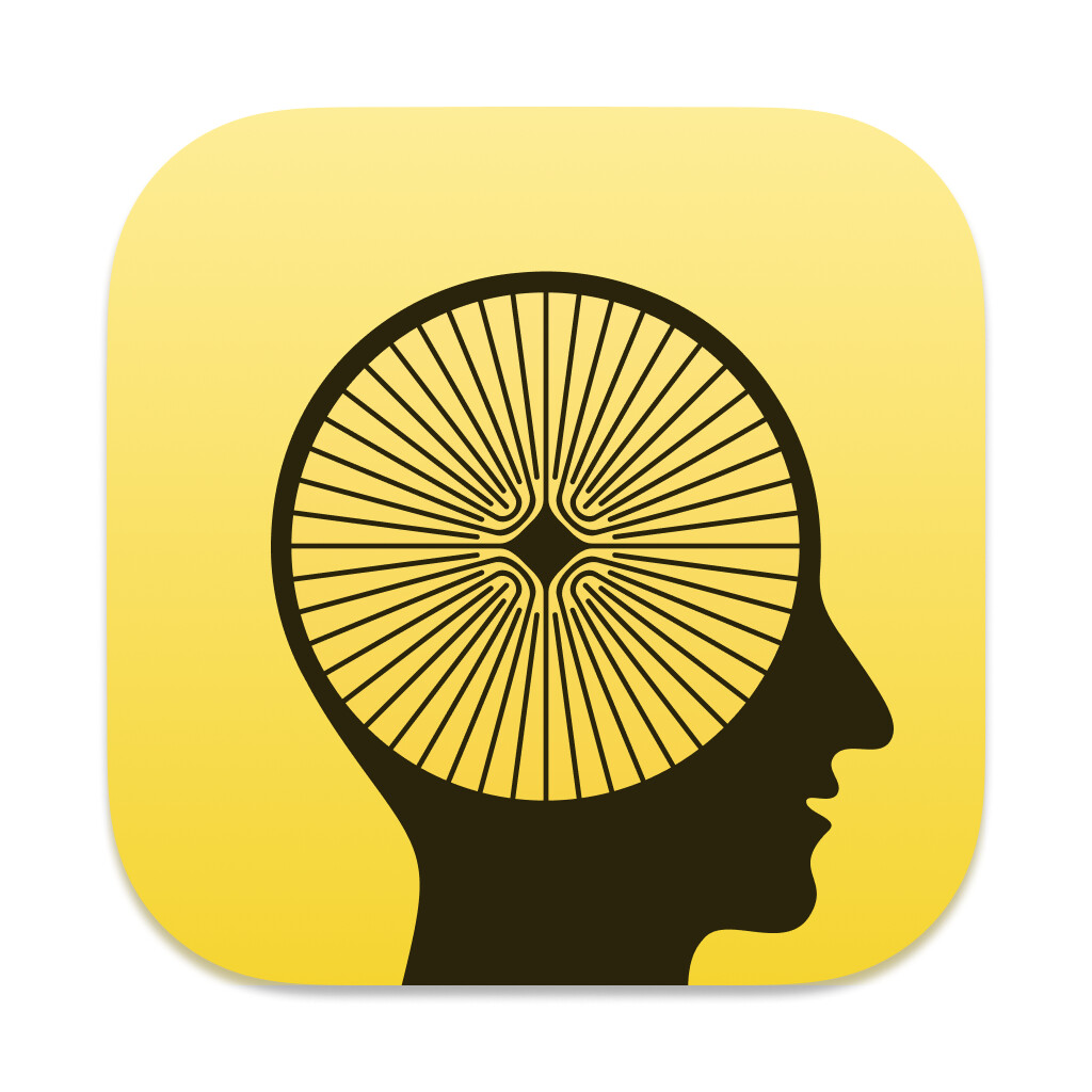
Here’s something interesting, though:
Rotating the spokes on the small wheel 15 degrees makes it line up very nicely with the frame - but for really small sizes, the bottom one (with no rotation) actually looks the best, due to it having so few pixels.
No rotation:
15 degrees rotation:


Here’s a new dock comparison:
IMO the “new spokes” makes you actually able to see the spokes, even in this small size.
More specific on your comments:
Yeah, those are interesting thoughts! And I think it shows in the software.
Here’s an analogy I think you’ll appreciate: I’m pretty into well made cloths - which are often simply made, from natural materials. Like good leather boots, wool jackets, Japanese denim, etc. And while not as “technical” as more modern stuff, I vastly prefer it. Stuff like that has a certain heft to it, and I love that you can see how it’s made and that it’s easy to repair. Oh, and it still performs wonderfully.
Bike reminds me of these kinds of clothes. It gives me the same feeling as when I put on a pair of Alden shoes. It seems crafted, not only made.
What drew me to Bike, is that it was a breath of fresh air in a sea of bloated web/electron apps. And I just love the way it feels. So much so, that I’m changing more and more of productivity setup to incorporate it as much as possible.
1 Like
I’m applying some of these changes here:
It’s not all the suggested changes (In particular I still like the many spokes, and the tapered bike frame), but I do think it’s improved. Thank you!
Question, does anyone know how to adjust the margins in the #64 preview?
I don’t really understand Figma. I do understand that I have one master image, and it’s getting projected into the smaller sized icons. The issue is that that the projection includes the margin … empty space between yellow border and actual icon image edge. For the smallest size #64 I don’t want the margin size to be proportionate the the original. Instead I would like the content in the smallest size to stretch all the way to the icon image size … minus 1px all around. Anyone know how to do that?
I think if you keep just the foreground in the component and exclude the background, giving each icon its own background (which could be another, separate component), then you should be able to scale each instance of the component independently inside that icon size, by scaling and positioning it the way you want for that size (you can press K to select the scaling tool, and you can shift+drag a corner to resize in both dimensions keeping the aspect ratio)
1 Like
I’m old-fashioned, so I’m working in Affinity Designer - so can’t help with Sigma, sadly. 
I like the new icon, though!
I prefer the yellow going to lighter like this.  (I feared you would feel it wasn’t “yellow enough”, heh).
I edited my simplified version to match your yellow, in case someone wants to use that.
However, personally I prefer the more natural feel, shape and stroke thickness of the original bike.  But it was still fun to try and make a more minimalistic version! And perhaps some of those who found the original busy will like it?
I also tried to create a blend, with the elements I like the best from both versions:
- Top and bottom is the original icon.
- The top pair is the with the simplified Headcycle™ (
 that idea, along with every other, is free
  ).
). - Bottom pair is a blend.
If you want to implement some of the blend stuff, here’s what I did:
- I kept everything but the spokes from the original.
- I made the number of spokes (and thickness) somewhere in the middle.
- Big = 16 - 20 degree rotation
- Small = 12 - 30 degree rotation
- I made sure that both wheels “touch ground” and the same height.
- I rotated the small wheel just a tiny bit to have the frame blend nicely into the frame.
- Then I added an outer shadow to the normal logo, and a cheeky inner shadow to the inverted logo.
1 Like
Thanks!
IMO it rhymes with icicle and bicycle. 
Made some versions of my own, I like the spoke and the texture it brings so I tried keeping it. I removed the original ‘bike’ metaphor but kept the wheel. Also I made the neck go to the edge to eliminate the disembodied look.
Download link: Dropover Cloud Upload
Thanks for sharing. I’m unlikely to change at this point, but I like the interior of #2 quite a bit.
Yeah understandable. I just wanted to share with the community.
Even I use the #2, it is almost if the middle part is a small brain haha.
2 Likes