TaskPaper icon change

I will ask @jessegrosjean the following question. It is about MY workflow and is not meant in any way to critique TaskPaper or bring changes to TaskPaper that might offend others.

TaskPaper has become a key part of my daily living and organization style. Therefore it is usually running. When I want to get to it and I am involved in a task in another program, I will use the command tab method to go to any app (in this case TaskPaper) quickly. My problem is that the TaskPaper icon is a bit of a plain Jane. It’s attractive enough, but more than a few times I have tabbed past it as it doesn’t stand out very much.

I would like to color the TaskPaper icon that I see when I am using the command tab review of open apps. I can find tutorials on how to change a program’s icons in High Sierra. Apparently I have to unlock this capability first using Terminal “csrutil disable” for Apple to allow it (use at your own risk - I only pulled this info off a random website).

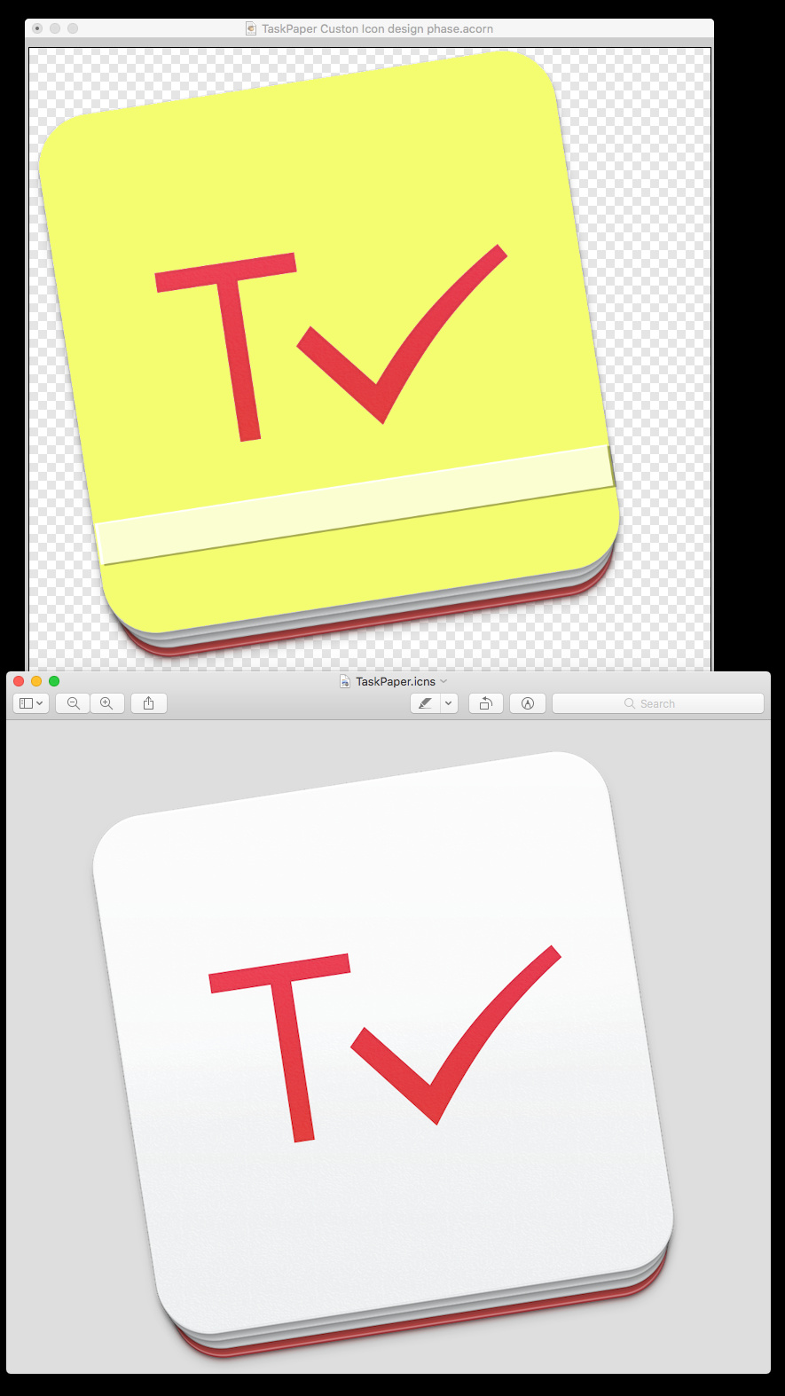
What I would like to know is, which icon should I be changing? Under TaskPaper/Contents/Resources/TaskPaper.icns, if I open this with Preview it shows several icons. Of course this makes sense as different icons are used in different methods of display. If I drag the icon file to Acorn, my graphics app, then it will change just a single icon - but which one should I be changing and is there a smarter way to go about this?

I am not asking to do anything really fancy, only to color the icon so it catches my eye better. I have attached a screen shot to illustrate my point.

1 Like

The TaskPaper.icns file should be thought of as a single image… it just has multiple representations for the different sizes that it’s displayed at. For example when it’s a 16*16 image in the Finder column view it will use a different representation then when it’s a large magnified icon in the dock.

Anyway I would go about it by just replacing the entire TaskPaper.icns with a new one that you create. There are probably a bunch of things to consider, none of which I can list here. But if you do some google searches you’ll get the info you need I think. Here’s the first that I found:

Thanks. It was really just that easy. Same as replacing a folder icon or any other file icon in Get Info dialog. I didn’t need to mess with the resource folder at all.

A final choice. For my purposes, in a command tab selection view, looks close enough to a stack of paper tasks in a binder to my eye. Now, back to the grindstone.

1 Like

(I think you and I might get on rather well mylevelbest: your preoccupations often chime with me). I agree about the current TaskPaper icon, but in my case I have just reverted to the previous one (red circle) which I find far more distinctive in the Dock.

Glad to hear it. Don’t stand too close on this forum and talk about the virtues of styled text though - unless you have on your asbestos underwear. Want the number of my tailor? :slight_smile:

For my final iteration of the icon, I noticed that many of them, but not all, had this Apple style induced partial rotation. Others did not; Finder (square), Firefox, Scansnap and other round icons. I de-rotated the icons (OK, I straightened them out). :wink: I find this makes it a slightly more obvious selection visually.

On a connected note, Doing this with TaskPaper turned out to be easy. I then moved to do the same thing with Curio. That, was not so easy. Actually it was easy once I discovered a trick I had not known of, restarting holding down the shift key during reboot. This puts the mac into “Safe” mode. Restarting a second time (no shift key) takes you back out of Safe mode.

For some reason I had not know about previously, booting in safe mode will do all sorts of system repairs under the hood that no one ever told me about. And, it can take quite a while to do it. I have an SSD of 1TB and it took well over 5 minutes the first time I did it. Normally it boots in under 30 seconds. But it reset the new custom icon (Curio). It also fixed an issue I had learned to live with, as I could not fix it, it where may right monitor had stopped going to a 1900 resolution.

I have a menubar app (Menubar Pro) that runs a bunch of useful terminal scripts all at the same time and then restarts. None of them was able to resolve the issue prior to booting safe mode and booting again. In that step I tried; freeing memory, rebuilding launch services, rebuilding spotlight index, update whatis database, and update locate database.

In that step I also; Cleaned system cache, cleaned all user cache, cleaned Font cache, cleaned dashboard cache, and cleaned DNS cache.

I also ran the scripts for all maintenance, daily, weekly, and monthly.

Safe boot alone fixed it.

Thanks for the offer! And the safe mode experiences. Not something I have done in a long while, but good to keep it in the arsenal.

Since you mention styled text, you might want to kern that Ta and Pa a bit closer. What would the text purists have to say about that?.

Actually, the Capital P and T are kerned just right. The right edge is spaced to the edge of the following lower case letter. The only way to do as you suggest would be to Artfully enlarge the first letters enough so as to pull the lower letters beneath the top parts. Too much work for my quick glance small icons - but doable.