Taskpaper 3 themes

For some reason I like to do plain text work in the old amber monitor colors of 30 years ago, with some gray for a middle layer : - )

( Bullets still black here – haven’t yet learned how to gray them )

// Base text
@font-family: Source Sans Pro;
@font-size: $USER_FONT_SIZE;
@text-color: rgb(249, 145, 87);
@background-color: rgb(45, 45, 45);
@line-height-multiple: 1.1;

// UI
@tint-color: rgb(153, 153, 153);
@interface-color: @tint-color;
@selection-color: mix(@tint-color, @background-color, 30%); // rgb(148, 192, 255);
@invisibles-color: mix(@tint-color, @background-color, 70%); // rgb(67, 119, 211);

I changed the bullets implementation at the last minute and forgot to apply styling.

In the next release styles that you apply to:

run[link^="button"] {
}

Will apply to the bullet.

1 Like

Playing with a solarized scheme tonight. It isn’t quite where I want it, but maybe someone can use it.

// Base text
@font-family: Source Sans Pro;
@font-size: $USER_FONT_SIZE;
@text-color: rgb(129, 144, 144);
@background-color: rgb(252, 244, 220);
@project-color: rgb(37, 146, 134);
@done-color: rgba(10, 41, 51, 0.5);
@link-color: rgb(33, 118, 199);
@today-color: rgb(189, 54, 19);
@next-color: rgb(115, 138, 5);
@waiting-color: rgb(89, 90, 183);
@line-height-multiple: 1.3;	

// UI
@tint-color: rgb(33, 118, 199);
@interface-color: @tint-color;
@selection-color: mix(@tint-color, @background-color, 30%); // rgb(148, 192, 255);
@invisibles-color: mix(@tint-color, @background-color, 70%); // rgb(67, 119, 211);	

editor {
color: @text-color;
font-size: @font-size;
font-family: @font-family;
background-color: @background-color;
line-height-multiple: @line-height-multiple;	

item-indent: 20px;
caret-width: 2px;
caret-color: @tint-color;
handle-color: @tint-color;
drop-indicator-color: @tint-color;
invisibles-color: @invisibles-color;
selection-background-color: @selection-color;
guide-line-color: mix(@tint-color, @background-color, 15%);
message-color: mix(@text-color, @background-color, 50%);
}	

item[data-type="note"] {
font-style: italic;
font-size: @font-size*0.9;
font-weight: lighter;
}	

item[data-type="task"] {
font-style: normal;
}	

item[data-type="project"] {
font-weight: bold;
font-size: @font-size;
color: @project-color;
}	

item[depth="1"].item[data-type="project"] {
font-size: @font-size*1.4;
}	

item[depth="2"].item[data-type="project"] {
font-size: @font-size*1.2;
}	

item[data-done] {
> run[display] {
text-strikethrough: NSUnderlineStyleSingle;
text-strikethrough-color: @done-color;
color: @done-color;
}
}	

run[link] {
cursor: pointer;
color: @link-color;
}	

run[link^="button"] {
color: @text-color;
text-expansion: 1;
}	

run[link^="filter"] {
color: @text-color;
}	

run[tag] {
font-size: @font-size;
font-style: normal;
font-weight: normal;
color: mix(@text-color, @background-color, 50%);
}	

item[data-today] {
color: @today-color;
}	

run[tag=data-today] {
color: darken(@today-color, 10%);
}	

item[data-next] {
color: @next-color;
}	

run[tag=data-next] {
color: darken(@next-color, 10%);
}	

item[data-waiting] {
color: @waiting-color;
}	

run[tag=data-waiting] {
color: darken(@waiting-color, 10%);
}	

item[data-hold] {
color: @waiting-color;
}	

run[tag=data-hold] {
color: darken(@waiting-color, 10%);
}
2 Likes

@walton, I noticed that you had this line in your theme, but it wasn’t used. Is there a particular reason for this?

@interface-color: @tint-color;

Isn’t that part of the default theme? As far as I understand, it has to do with styling the UI of the app not the content.

I wonder the original reason. It seems that a Less variable should not be part of the theme unless it is assigned somewhere. I tried playing with different things and I couldn’t see what it affected. This is a question for @jessegrosjean :smile:

I’m always renaming things a million different ways for various reasons. I actually think @interface-color originally comes from FoldingText’s default theme file. The goal is to have a color to use for “UI” elements in the text… things that when you click on them something else will happen other then just placing the text cursor.

For example in TaskPaper’s default theme @interface-color is used to color hyperlinks. With that said… it looks like I also added in @tint-color which at this point in time seems to be used for pretty much the same purpose. I’ve removed @interface-color for now and replaced with @tint-color in the case where I was using it.

Generally theme variables, names, etc are a work in process that will likely just continue to change over time. Each theme can define there own as they see fit. I include them mostly so that it’s easy to change the color scheme of the default theme with just a few edits. Plus it makes it easier for me to change and pick colors when building the theme in the first place.

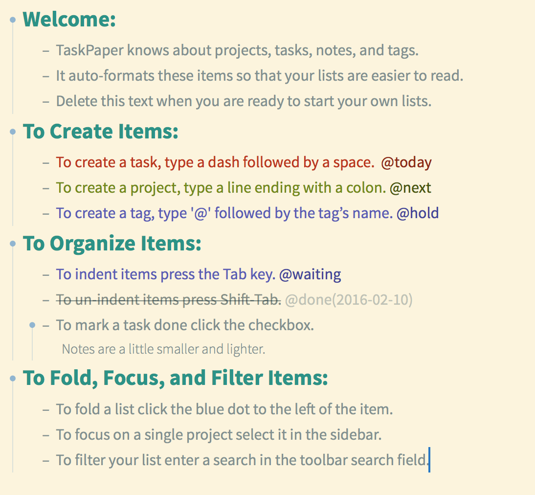
Theming has moved a long way since the post at the top of this thread (which seems to be beyond its edit date) but FWIW, the plain amber (now at least with gray bullets) is looking like this:

No guarantees that the following is reasoned or efficient – just happens to be the contents of my user.less at the moment:

// UI Scale
@base-font-size: 16;
@user-font-size: $USER_FONT_SIZE;
@ui-scale: @user-font-size / @base-font-size;

// UI Colors
@tint-color: rgb(153, 153, 153);
@interface-color: @tint-color;
@selection-color: mix(@tint-color, @background-color, 30%); // rgb(148, 192, 255);
@invisibles-color: mix(@tint-color, @background-color, 70%); // rgb(67, 119, 211);

// Base text
@text-color: rgb(249, 145, 87);
@background-color: rgb(45, 45, 45);
@font-family: Source Sans Pro;
@line-height-multiple: 1.1;

editor {
  color: @text-color;
  font-size: @user-font-size;
  font-family: @font-family;
  background-color: @background-color;
  line-height-multiple: @line-height-multiple;

  item-indent: 20px * @ui-scale;
  caret-width: 2px;
  caret-color: @tint-color;
  handle-color: @tint-color;
  drop-indicator-color: @tint-color;
  invisibles-color: @invisibles-color;
  selection-background-color: @selection-color;
  guide-line-color: mix(@tint-color, @background-color, 15%);
  message-color: mix(@text-color, @background-color, 50%);
}

item[data-type="note"] {
  font-style: italic;
}

item[data-type="task"] {
  font-style: normal;
}

item[data-type="project"] {
  font-weight: bold;
}

item[data-done] {
  > run[display] {
    text-strikethrough: NSUnderlineStyleSingle;
    text-strikethrough-color: @text-color;
  }
}

run[link] {
  cursor: pointer;
  color: @interface-color;
}

run[link^="button"] {
  color:@tint-color
}

run[link^="filter"] {
  color: @text-color;
}

run[tag] {
  font-size: @user-font-size;
  font-style: normal;
  font-weight: normal;
  color: mix(@text-color, @background-color, 50%);
}

Is there a way to change the background color of the sidebar tree. For a bonus, is there a way to change the tree element formatting too?

There’s no sidebar styling right now. In the future I might add, but it’s lower priority… I’m not sure what you mean by “tree element formatting”?

With the tree element formatting, I meant, being able to change the size, color, style, etc, of the projects being represented in the tree. I think you encompassed that when you wrote “sidebar styling”.

I just didn’t like how the sidebar looked with some of the themes. It just clicked on me to hide it for a better UI :smile:

+1 for sidebar styling…also would love padding and margins on all items and tags and border-radius on tags, in order to make the tags more pill-shaped. :slight_smile:

Is this supposed to style 2nd-level project titles? I can’t get it to work in my theme and wondering what I’m doing wrong. :-/

I’d just use this instead:

item[depth=2][data-type=project] {
    color: blue;
}

Also, this feature doesn’t existing in versions 3.0 and 3.0.1. It’s been added back to the 3.1 Preview release.

Ahhh, thanks! That clears things up.

Hi there,

Is there a way to modify the style of the bullet based upon a tag? Apologies if this has been covered elsewhere!

Thanks in advance,

Mark

Yes here’s an example that work work in 3.5 Preview:

item[data-done] {
  handle-size: 12;
  handle-color: green;
  handle-border-color: orange;
  handle-border-width: 3;
}

Thanks, Jesse. Very helpful!

Does version 3.5 handles LESS differently?
I used my own theme https://github.com/Behinder/Taskpaper and my font was large as intended but now my fonts are small , looks like size is not recognized when I copied my theme to stylesheets folder.