Sidebar custom styling, especially using the vibrant/blur/style, it somewhat difficult to customize. Getting it right might take more time then is worthwhile at this point. Before I decide to start digging into it I have some questions:
Does any Apple app allow for font-size customization in the UI as opposed to a “content” area where you type? I can’t figure any way to customize Finder sidebar font size or Mail sidebar font size… is it possible?
Does Apple use a vibrant dark outline view anywhere? Or if not Apple, does any app use it to good effect? Multiple examples would be great!
If I recall correctly, MailMate allows users to style the text in all areas of the app. Clicking on the sidebar and then choosing a font, styles that area.
Edit: Just re-read your question. Sorry I didn’t point out any Apple apps.
Apple Calendar (formerly iCal) has a medium grey sidebar background that is a little darker than the light theme sidebar. BusyCal and Mail appears to have the same sidebar backing as Calendar does.
Scrivener has a customization sidebar (called the Binder). You can change the colors. Also, Folders are larger and bolded.
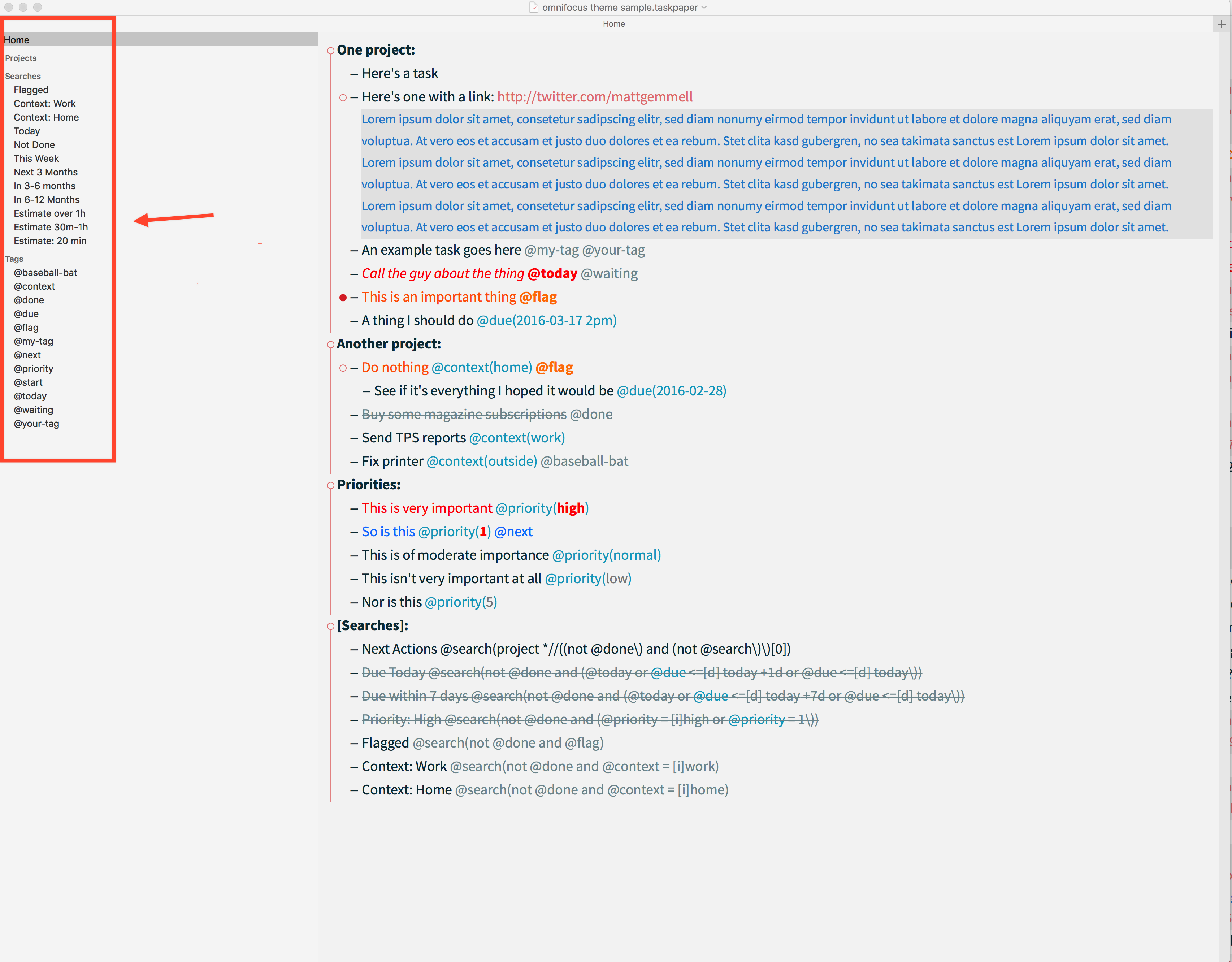
In this discussion I would observe that the sidebar being an issue at all is about TaskPaper3 being a victim of it’s own success. It is only because I can change the editor’s font color, size and contrast with the background, that the sidebar has become a glaring issue. That is only because the eye seeks balance or symmetry. More font control in the editor highlights no font control in the sidebar.
What I don’t like about Apple is the minimalist way Steve Jobs had with all things designed. Don’t misunderstand me, I am a real fan of Jobs and most of what he developed and I am a fan of Apple -for the most part. Calendar is an example of a real lack of creativity from a company that once touted it’s self as thinking different. Having a relatively small font on a sidebar matches the app designers intent for a relatively small font for the main users window. That is one reason I went with BusyCal, more creative options. That, and not having to check two apps (Reminders and Calendar).
I was using Logic for a good while. That was one of Apples Pro apps and it had really small fonts, If I remember correctly that minimalist, small font display was normal for Apple’s other pro apps. I would much rather get productive and customize my user interface where I can than worry about Apple thinking their product conforms to some standard of mythical cool and their forcing their users to be like Steve (bless him, I know he’s gone now). Apples first Superbowl commercial had a runner throwing a hammer into a conformity screen talking conformity to a bunch if IBM-ish suits. I think Apple could used a dose of their own medicine right about now (end rant)
Gyaz Mail allows total color change of background and font on message, list and mailbox panels, all of them.
I have been using the dark sidebar with white letters and it does greatly improve the contrast. I have a light background on my editor and I have customized text with tags, etc. I would say that changing sidebar background and font size is still nice, but I no longer consider it as vital. The white on black doesn’t really fit design wise but, it’s functional at least.