I think now that there is a navigation bar the navigation popup in status bar can be removed? Seems redundant to me.
I’m still working on visual presentation of navigation bar. Right now I’m truncating all labels to 4 non-whitespace chars. I like that it means the navigation bar looks regular… but other apps don’t do this. Maybe it’s a bad idea.
In the first context in which I tried it, I thought at first that it looked a bit too elliptic for immediate recognition of some 4 char labels (they needed some thought), but then when I clicked on a segment of the chain (and discovered the expanded text and even navigation menus) it turned out to be very clear and powerful.
Neatly done !
( Perhaps an option for 5 char or 6 char crumbs ? Tho I don’t know how deep people typically go … perhaps very ?)
UPDATE
The 4 char crumbs – now that I’m used to them – are growing on me.
( Turns out that my typical outlining contexts are deeper than I had thought … )
I actually wasn’t thinking so much about making deep outlines fit. In that case the path control will truncate as needed to fit into available space.
Instead the problem I’m solving for is that I want the bar to look “clean” even if you are focused into headings with very long titles. Event if they would physically fit into the navigation they start to dominate the screen when there’s lots of text.
I agree and think I’ll try that. I initially thought about doing that, but I could find no example where status bar navigation was shown at bottom. I’m sure it exists?
After living with the top navigation bar for a while I grew accustomed to it. At the same time when I just hid it now I had a nice “ahh” feeling on not seeing it. Anyway will try moving to bottom.
For people like me, who might (accidentally ) go crazy with a lot of structure/sections in a single document…the new Nav Bar makes it really easy to, uh…navigate to a different part of the doc.
Any plans for shortcut keys for the back/forward buttons? Or is there some configuration that I could do to enable that? (Sorry if I should already know the answer to that).
Wow Jessie. I love the navigation bar and I’m loving it at the top for what it’s worth. I have one file in particular that I started as a Bike Bullet Journal last May when you launched Bike (guess I’m approaching a renewal soon ) and the navigation makes it so easy for me to backtrack and search through entires to find something I need to refer to.
I understand those on the thread who prefer this at the bottom, but my eyes seem to adjust better to seeing the items I’m looking for at the top of the screen.
And yes, I’ve noticed the redundancy with one button at the bottom. I’d say that in UX (top or bottom) all the navigation bar items might best be in the same location. But hey, that’s your choice to make as the developer. I’m super happy with the new navigation bar on focus.
I think that happens to be my case too – intuitively an overhanging branch of descent through the tree structure, with the paragraphs hanging below like leaves and fruit.
( I don’t know if it looks feasible to have a top ⇄ bottom option there ? )
( ⌥⌘/ makes for a very quick visibility toggle, in either case)
Maybe, I’ll have to see. I think next preview release will try for putting it in bottom bar. Then we can discuss and decide on option.
This sort of thing at top is definitely the standard. After looking at path displayed in the bottom for 10 min my reaction is that I don’t mind the path, but I’m not used to having the Go Back/Go Forward buttons down there yet.
Anyway, I expect there will still be a number of tweaks and changes before final decision.
As mentioned here I’ve put Bike 1.12 on hold for a bit as I work on some longer term projects. I have been thinking about navigation thought…
I tried moving navigation bar to bottom status bar and it felt a bit weird. I don’t think that I will keep that option. Instead I think what I will try next is to make navigation more a part of the document, then a separate UI element.
What I mean is navigation will be placed right above document content with same background color, and it will scroll with document content. I think this means I won’t need a divider and I think lack of divider and scrolling will make navigation feel much lighter weight at top.
I expect I’ll also add an option to make this bar sticky. So it scrolls by default, but when sticky then it will stay at the top and get a drop shadow when you scroll.
I’m also considering making the navigation path only show two items: HOME > PARENT. I think the intermediate path elements add more visual complexity then help. And if showing only two I can dedicate more characters to the parent label which I think is most important.
Another feature I need to add is auto expand when you navigate to an item.
And yet another feature I’m thinking about is changing layout when you navigate to a row. It feels like it might be better to not show the focused rows guide line (and maybe instead draw a horizontal underline) and also don’t indent its children. This will give more space to type and make focusing into an item feel more like its own little document.
I’m not sure about any of these things, but I’ll likely test these ideas next. As always thoughts and feedback welcome.
I want outline navigation status visible even without the top navigation bar. Now if you are focused into a row you will see a “focus out” button at the end of the first line of the focus row.
I’ve also added “focus in” buttons at the end of the first line of any row that has children. I really like this UI since it doesn’t require any mouseover highlight state or option keys to distinguish between folding a row and navigating to it. It works better with short rows than with long… as does the navigation bar breadcrumb. For a tidy easy to navigate outline keep the higher level items short!
I removed mouse over highlights. There were a cool feature to add when I was first making app, but got old over time. Everything feels a bit better to me know that they are gone!
I changed the disclosure handle color scheme. Now handles are only “dark” if the row has children AND the row is collapsed. The intention is to only get your attention when something is being hidden from you… same dark color is used for the “Focus Out” button described above… since that’s another case where something is hidden.
Changed navigation bar spacing and truncating. I now truncate to 16 chars or less and try to hit word boundaries. I’ve also make changes so that it’s easier to visually chunk each level: 1. Added padding around each navigation item. 2. Replace any spaces in item text with thin-spaces.
Changed default light background color every so slightly so that navigation bars visually pop out against it.
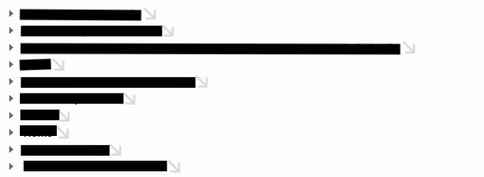
Just installed the new preview, first thing I notice are lots of gray down arrows at the end of each row in my document that seem, on first glance, to duplicate the effect of the small black “collapsed” arrow already present at the start of each row.
Then, clicking on this arrow focuses in nicely on the row, but curiously I was expecting it to also un-fold the rows content (though I see how mirrors the existing “focus row” behaviour, for some reason clicking with my mouse felt like an action that would intend to un-fold).
Though, when I am focused on a row and have this lovely distinct up-arrow at the end of it, that does feel super helpful to better see when I’m focused inside a row. Love that it’s clearer when I’m ‘inside’ a row, and I like that it feels “look there’s more inside this row” is starting to become more clear as well.
Temporarily expansion of a focused row (both when clicking and when focus using menu items) is definitely on my todo list, though I’m not sure it will make it into this release.
Generally I “think” I want:
When you focus into a row it is auto expanded and there’s no way to collapse it.
When you are focused into a row the expand/collapse handle is replaced with the new “focus out” button.
When you are focused into a row layout changes… guide line isn’t show. Maybe a divider is drawn under the focused row. The children rows are no longer indented an extra level.
The reason I haven’t just added these features with this release is there are lots of details to get right. In particular around animation, and that’s going to take some time and I figure better to get this current stuff out rather then hold it back.
I like some UI tweaks like navigation bar spacing and truncating, and the change of handle color scheme. However, I found that the “focus in” button is a little bit intrusive visually, especially when there are many buttons. I understand that the feature is handy for a user who is used to using the mouse or trackpad. Would you consider making it optional? (Like creating an option like ‘Show/Hide “Focus In” Buttons’ in the “View” menu?) Thank you.
Like everything I’m flexible and in the end I can provide an option if needed.
I would rather find a way to keep them visible, but make them less distracting. I generally think that focusing is at least as important as collapsing in outlines. We already have quite a bit of non-optional UI dedicated to collapsing handles and guides. I hope there can be some design that makes focus buttons all a standard visible part of the outline.
I will keep thinking, but if anyone has thoughts on an alternative please let me know.
From my point of view problems with the existing design are mostly that the control positions aren’t very predictable since they depend on line length. But benefits are you can navigate with mouse (or touch on iPad).
 ) go crazy with a lot of structure/sections in a single document…the new Nav Bar makes it really easy to, uh…navigate to a different part of the doc.
 ) and the navigation makes it so easy for me to backtrack and search through entires to find something I need to refer to.
 However, I found that the “focus in” button is a little bit intrusive visually, especially when there are many buttons. I understand that the feature is handy for a user who is used to using the mouse or trackpad. Would you consider making it optional? (Like creating an option like ‘Show/Hide “Focus In” Buttons’ in the “View” menu?) Thank you.