your visual cues make sense to me.
1 Like
It’s too distracting, not clean, long lists look like ruled paper now. Maybe we could tweak the color of the line (e.g. to make it invisible)?
In my initial post I included four images. Are you talking about case 2 (unselected gap) or case 4 (selected gap) … or both? To me the selected gap case is the more important and should be much of a problem because normally you don’t have your screen fully selected … and when you do it’s important to indicate gaps.
I’m less sure about case 2 … in some cases it’s nice to get a “hint” of those gaps too… but I can see how it would get distracting if you’ve got a long list of collapsed items.
Nice touch, those dashed lines
1 Like
At first I honestly thought that this change was a nonissue, but didn’t want to say anything just in case I discouraged @jessegrosjean or sounded unthankful for the work. Then, as I used TaskPaper, I found myself using this constantly. Great work. Little things like this make a huge difference in the long term!.
Not super thrilled with the UI for this scheme. I saw your original post about it, and I can see why you think this is necessary. First, I personally don’t need it and so think it should be a user-settable option. But second, more important (for everybody) is that the dotted line conveys the wrong meaning. It looks like a separator, not an indicator of something hidden. That’s because long horizontal lines are perceived by most (I’m guessing) people as design elements.
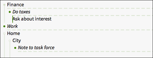
So, I have a list:
Home
	Iron shirts @done
	Bring shirts to cleaner @done
		Pick up shirts @done
Work
Collapsed, though, it looks like this:
* Home
  - - - - - - - - - - - - - - - - - - - - - - - - - - - - - - - - - - - - - - - - - -
* Work
Which looks to me like a divider between two sections.
Finally, re the thick/thin distinction: both ugly and at the same time the meaning of the visual difference is not obvious at first glance. You have to know (be told) what it means.
If you want to indicate something is hidden, I think you’d be better off with a small marginal indicator (like a caret >) or some tick mark on the vertical “grouping” lines (whatever they are called) that group levels on the left.
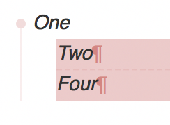
Here’s a snap showing how the dotted lines seem like section markers.
One solution would be to make this marker be controllable in the style sheet. Then I could make it invisible.
1 Like
It should be that you can just drag and drop an image into the post editor. Alternatively the post editor has an “Upload” control that will allow you to upload an image.
I’m less sure about case 2 … in some cases it’s nice to get a “hint” of those gaps too… but I can see how it would get distracting if you’ve got a long list of collapsed items.
Yeah, while I love having the visual reminder of the selected hidden items, I find the unselected dotted line rather distracting. If there was a way to theme the two different line states (so unselected is invisible but selected is), that would be perfect.
I apologize but I’m not particularly passionate about this new approach, it does not change my workflow using TP.
I’m more interested in this type of improvements.
But it seems that he has not had any following.
Thanks Jesse
I wonder if it would be better to leave a little whitespace around the hidden, unselected item? 
1 Like
This is really nice, I’ve tried the build today and it looks good. 
This version has been in preview a long time. Will it get finalized into a “real” version soon or soonish?
Is this the most recent build? (released or preview)
Yeah I think so. I need to carve out some time and figure out what I’ll do with this version. It fixes a bug thats causing some crashes so I need to post it. Problem is I got mixed feedback on the visible changes. I need to decide what to do about that, and that’s what’s been holding up a quick release.
Plus all my energy and excitement has been focused on the new (still a ways to go) work that I’ve been doing on the text editor. So that’s allowed me to let this slip. I’m just heading away for a quick tip with family to Boston for school vacation. But will try to get to this when I get back.
1 Like
Yes, this is the most recent build. As of April 14, 2017
Problem is I got mixed feedback on the visible changes.
Once you’re back, would you mind summarizing (or referencing) that feedback?
Thanks.
see earlier in this thread. Not huge complaints, but got me thinking at least 
Well you know what Yogi said: When you come to a fork in the road, take it!
You can’t please all people all the time. And fixing bugs is awfully important. I’m sure you already have a sense of how to move forward.
I’ve reworked this preview, new version here:
1 Like
Seems to be working just fine for me. Thanks for the updated Preview.