This is a revival of @pslobo’s initial post. Since I assumed continued development of it over the past 6 months with his blessing, I wanted to start a new thread so anyone who was interested wouldn’t miss out on the latest version!
- Download & latest release notes: TaskPaper-Atom-One-Dark (GitHub)
- Updated: 2016-09-03
- Version support up to: 3.5 Preview (237)
Apart from my own TODO items, I also welcome any feedback or suggestions.
Enjoy!
A dark StyleSheet/Theme for TaskPaper 3 heavily inspired by @pslobo’s excellent adaptation of Atom One Dark Syntax, which in turn I believe was influenced by the now infamous 2006 Monokai theme for Textmate by Wimer Hazenberg.
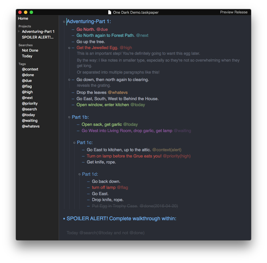
Colours/Colors
- Fountain Blue for items tagged
@next - Malibu for URLs and Projects (gradually faded from Project levels 1-4)
- Soft Purple for items tagged
@waiting - Pistachio for items tagged
@today,@activeor@now(this is especially useful in conjunction with this great script by @complexpoint) - Froly for items tagged
@due - Sunset for items tagged
@flag,@high,@hot,@priority(high)or@prio(1) - Whiskey for vanilla tags
- Chalky for context tags
- Mischka for text
- Bright Gray for selections
- Ebony for the background
Other Style Features
- Done tasks are dimmed so as not to distract from what needs to be done
- Done tasks also mutes all other colours that may have been applied from previous tags
- Notes are dimmed, non-italiced and slightly smaller in relation to tasks.
- Tags are always dimmed in relation to task text.
- Saved searches are a very subdued tone so as not to distract from the main list
- Guide lines and item handles are slim, subdued and tinted a faded Malibu blue.
- Paragraph spacing before and after Project titles and within notes is enhanced for clean separation.