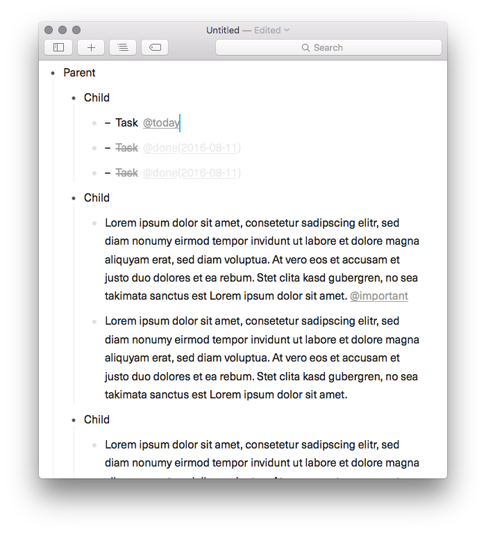
Currently in Taskpaper 3 when a user decides to “go in” to an item, in the focused view the selected item is displayed as the parent most item with all children items indents below it. Since the parents and children items relationship is exposed, it’s very easy to accidentally move the children to the same level as the parent, thus breaking the intended structure. And this can be problem when managing bigger files.
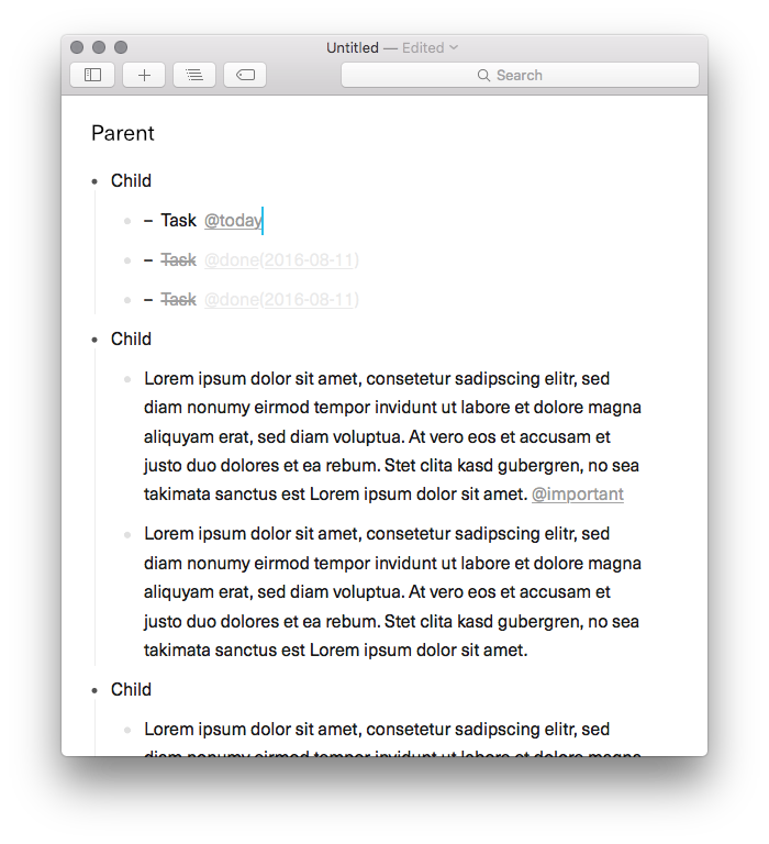
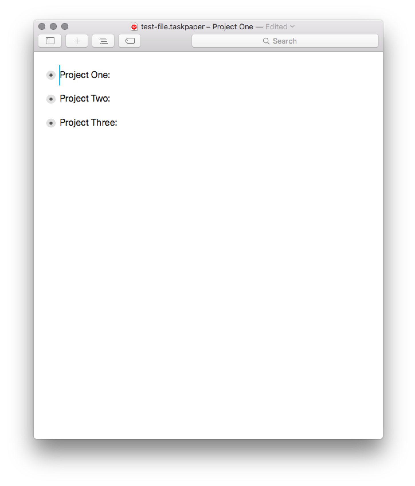
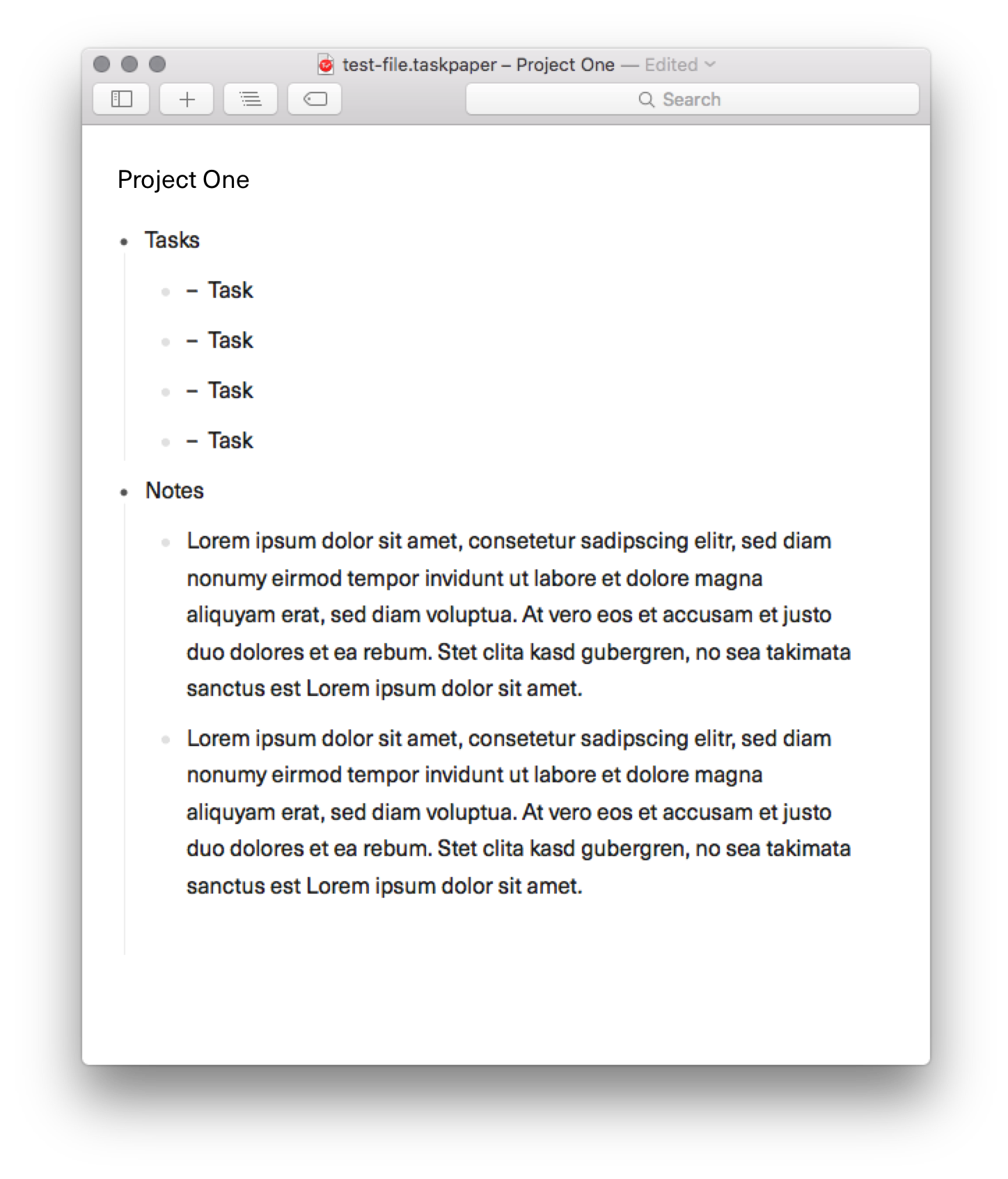
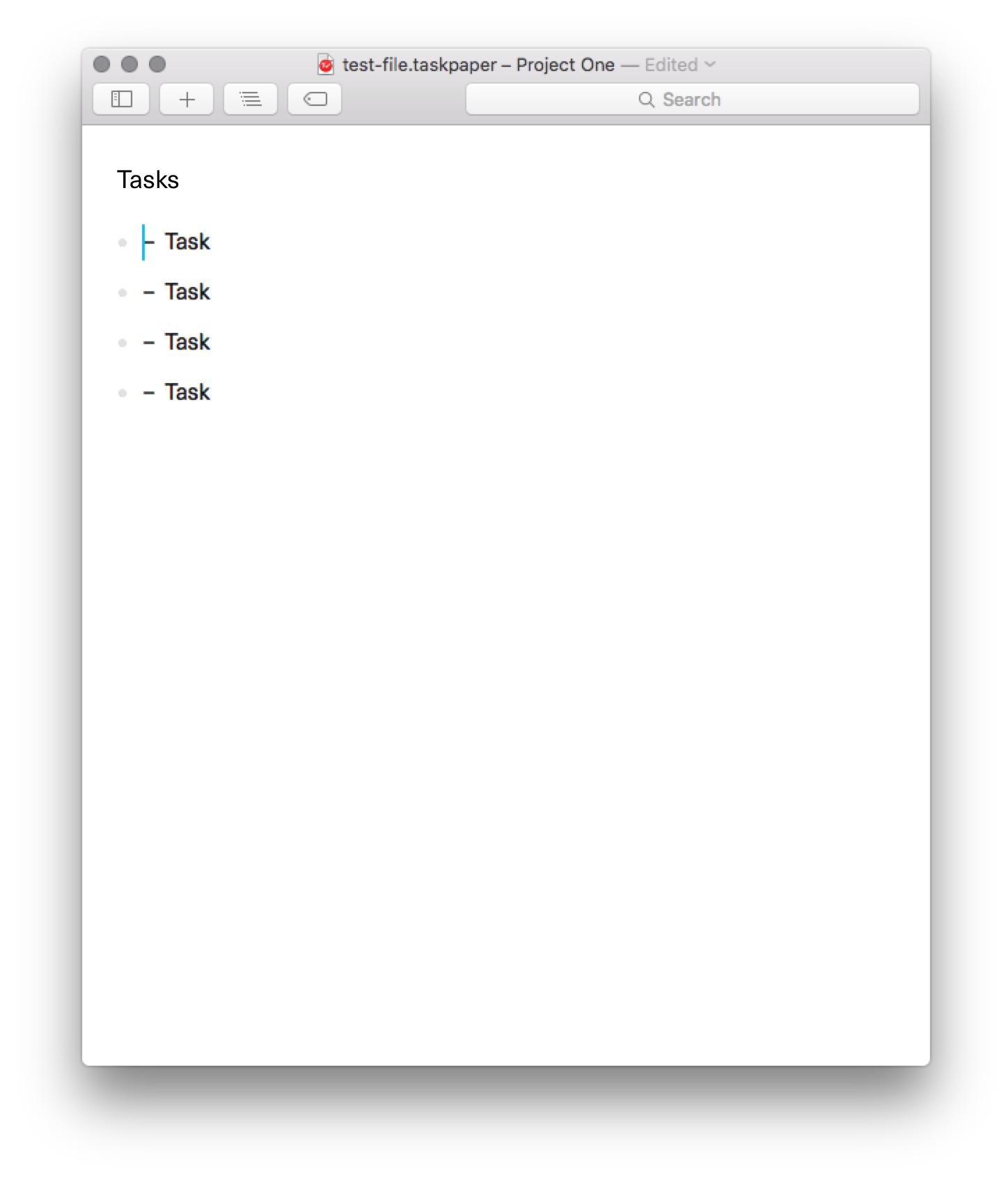
But the parent node could be presented a “title” note instead. This would make each “focused” state feel more like it’s own document and give an “absolute” minimum indentation for the children within it. So that when you are focused you cannot mess with the structure of the document beyond the parent node your are focused in. This works similarly to how Workflowy, Dynalist and even some Org-Mode setups work (to my knowledge). Here’s a simple mockup to better illustrate my point.
I feel this could work really nicely with Taskpaper and especially with the new sidebar updates that are being developed. And if this is too much of a structural change, does the theme’ing system give us the ability to build something like this? Basically styling the parent item differently than it’s children?
Really liking TP3 overall but wanted to share my thought with this great community.
I’ve went back and forth on this. My original implementation was a “pure” hoist … so the parent didn’t get displayed at all. That gave a nice clean view, but not seeing the parent or being able to edit was a problem.
I wanted to avoid special casing the display/edit of the parent view. I didn’t want it to be a separate field that you need to tab into … i wanted it to be a normal part of the editor content. And so that’s where the current design comes from.
With that said, your screenshots are convincing… amazing how much visual noise the parent adds to everything…
Anyway the theming system doesn’t yet allow for this sort of change. But it would be easy to add rules for that. The harder problem is editing… the problem of moving active children to parent is a problem, but it’s also a bit of a feature that I like. I need to think a bit more about it, but thanks for bringing this up. I also like the second view a lot better.
I had a feeling that this type of adjustment would be beyond the theming system. But I’m really glad you liked the screenshot example, like you said, it feels like small change, but makes a huge difference from a cognitive perspective. And I feel this simple update would make Taskpaper more approachable to new users. Since each “focus” would feel like it’s own “mini-document” and it would make it impossible to break the surrounding structure when focused. And together with Taskpaper’s “Move To” and “Go To” functionality users still have the ability to move items around as they please.
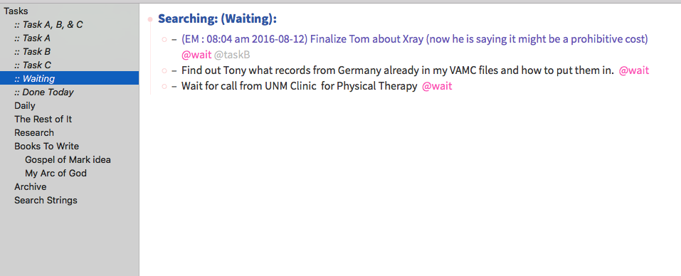
Adding to the visual suggestion idea, here is something else that I think would help. When selecting a search, show the results under the title of that search. When I am looking for all my tags that show items I have taken some action on but am waiting on a response or a time before I can take further action then I am not really searching any section anymore. I am focused on a specific search idea. I think it would help to see that search as a title on display at the parent level for that searches results.
I also think that the search results should not include individual section headers but only concentrate on the results of that search.
Added: Jessie, if you have a concern that not keeping results under their parent categories would confuse anyone then why not make each task string (in a search result only) that is clicked on become a search string? That would take the user instantly to the search item in context of where it could be worked with. Simply re-clicking the search on the sidebar takes the user back to the list.
I’ve been messing around with various implementations of this idea, unfortunately I never found one that I liked more then the compromises involved. The core issue is that I don’t want to special case layout/behavior in focused views. So the only way that I could really solve this was to display a “Home” root item in the default non focused view… but I like a blank screen when starting too much.
With that said I have a number of thoughts:
I have added a “focused” attribute. A custom stylesheet can use this to hide the bullet and guide line for the focused item only. (I’m not sure I like this idea, see (3) for better I think, but it will be possible anyway)
I could also add (already been on my list) a preference for “Delete” key to not un-indent… this way editing in a focused view would be safer… less likely that items are no longer moved outside the focused parent. But I still am not sure that I like adding this sort of option that fundamentally changes the editor behavior.
Thinking more, both those options seem like bandaids that add exceptions to the default behavior. What about instead just making an option for focusing such that the parent isn’t shown at all, and instead only the children are shown at visual level 0 (so they can’t be unindented further? This is the same as the “root” case in the current editor. Only would be possible with any parent item. That gets you the cleanest view by far in I think the most strait forward way. The only minus is that you wouldn’t be able to see/edit the parent text in this “extra” focused state. But I could make a command to quickly toggle this state, so would be easy to see hide the parent as desired?
So great to hear you’ve already explored this, amazingly responsive.
Option 1 seems like a good compromise if no other option is viable. Option 2’s “Delete” key preference would be great addition overall since it would help prevent accidental structural changes when just text editing overall, so I’m all for that.
As for option 3, i’d personally prefer the current behavior over this option. Because the name of the focused item acts as a title for the sub-items. And it provides contextual awareness of where I am in the document. I also prefer to work with the sidebar hidden most of the time, and items I focus into are not always Project items. So if the focused item would be completely removed from the focused view it would make the navigation and understanding of what we’re editing in our documents that much harder.
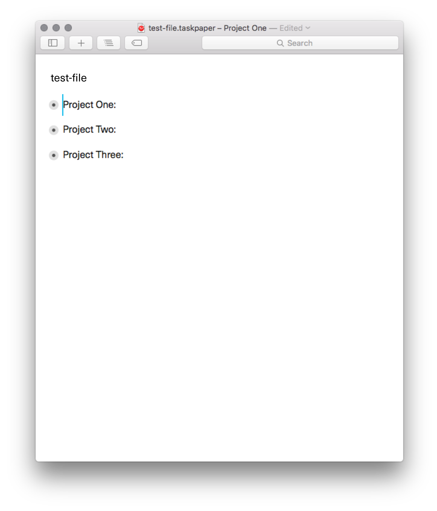
Because at the root of a document there is no parent node, the functionality wouldn’t be global through out the document. But the only exception would be at the root level, the parent node is not shown. Here’s a visual example of what I mean. I feel this could still be the best option, imho.
My worry is still that this design makes the hierarchy a bit less understandable. The default rule is that if something is a parent then it has a handle that you can collapse and a guide line down the side, this would change that. Please try out the 3.5 Preview release:
It’s not quite as nice looking, but I hope solves the basic problem you are having… it’s hard to edit a big focus item. In 3.5 you can double-click a project in the sidebar… when you do that it will “hoist” the project instead of “focus” it. That means you no longer see the project label (not great, but not terrible), but more importantly you no longer see it’s guide line either. And you also can’t un-indent it’s items to no longer be part of the hoisted project.
Anyway please give it a try and let me know your thoughts.
I’ve been using the 3.5 version for a few days and love the updates and changes you’ve implemented. I think the double clicking on the sidebar works really well. But I noticed that the title of the focused node is removed from the titlebar, but it was useful for context when the sidebar is hidden.
I think with your proposed options (adding a “focused” attribute + a preference for “Delete” key to not un-indent) and all the updates of 3.5, I’d say this request is more than filled. Thanks Jesse!